Dive into our world of fonts where technical precision meets artistic and cultural diversity. Our ever-evolving collection has a keen focus on world writing systems. Exclusively available at Black[Foundry], our typefaces come with varied licenses to fit every project’s needs.
Our Latest News
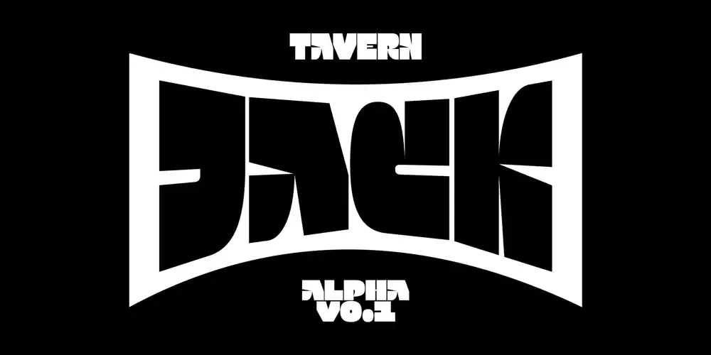
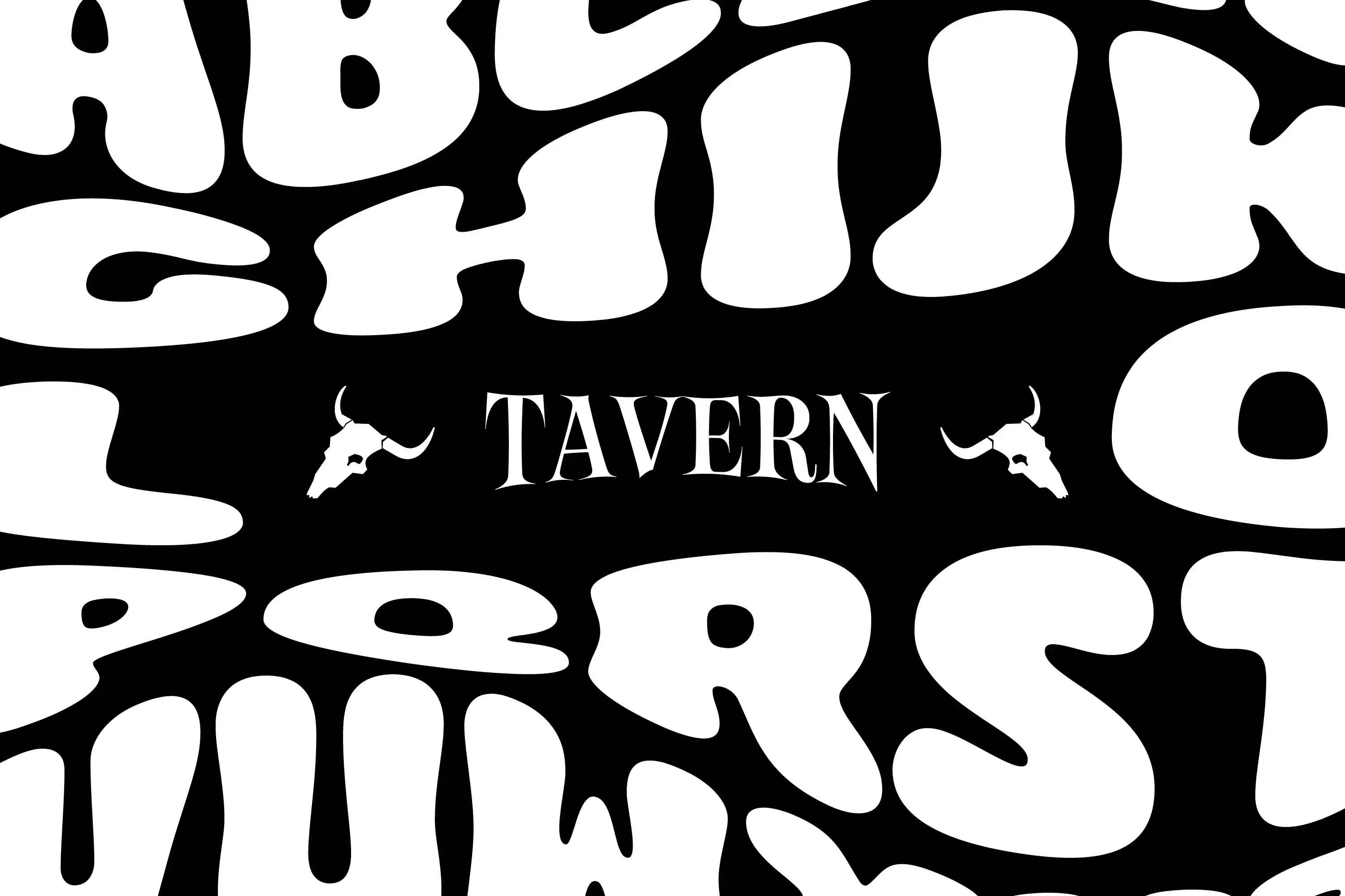
New Alpha font: Jack!
Introducing Jack, a typeface born from Tavern, the wavy and experimental tool crafted by Gaëtan Baehr. Rooted in brutalist design, Jack is bold, robust, and unapologetically modern. Its simplified forms strip away the unnecessary, creating a raw yet refined structure that commands attention.
Designed exclusively in capitals, Jack is optimized for wave effects with Tavern. It also features a width variation axis and four corner axes (top-left, top-right, bottom-left, bottom-right), allowing precise control over each letter’s shape for unique and unexpected compositions.
![Black[Foundry] at ANRT Nancy – February 17th, 18th & 21st, 2025](/_astro/black-foundry-at-anrt-nancy.nbdHVsrk_2nGJvI.webp)
Black[Foundry] at ANRT Nancy – February 17th, 18th & 21st, 2025
We are delighted to take part in ANRT Nancy this February!
On February 17th, 18th and 21st, Jérémie Hornus, Gaëtan Baehr, and Just Van Rossum will lead Fontra workshops, introducing participants to our open-source font tool and exploring its creative potential.
Location: ENSAD & Mines Nancy, ARTEM campus, Nancy (France).
Stay tuned for more updates!
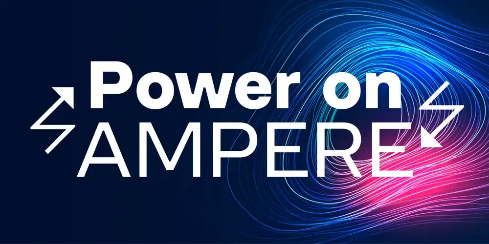
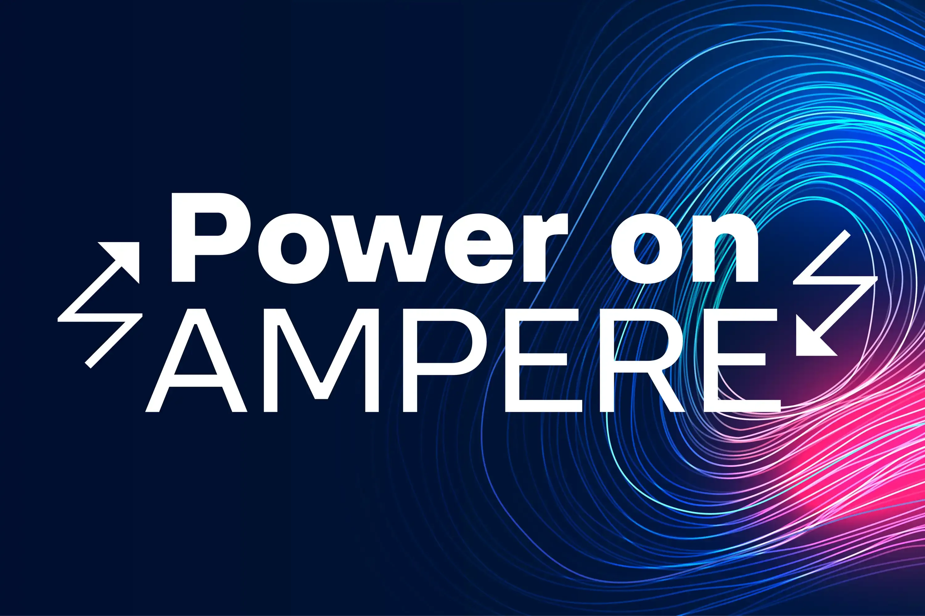
New Typeface: Ampere!
Introducing you to Ampere: a typeface of sleek geometry and uncompromising clarity, delivering refined precision that remains crisp in small text and bold in commanding headlines.
Ampere’s unique character lies in its subtle yet striking features. Inside corners are softened with squared reverse ink traps, a choice that tempers its sharp angles for a smooth, sophisticated finish without compromising on structure. Adding a spark to its utility, Ampere also includes a set of special “electric” characters inspired by its namesake, infusing a touch of energy into any project.
![Exclusive: Black[Arabic]](/_astro/exclusive-black-arabic.CH1GfqcG_ZvIctv.webp)
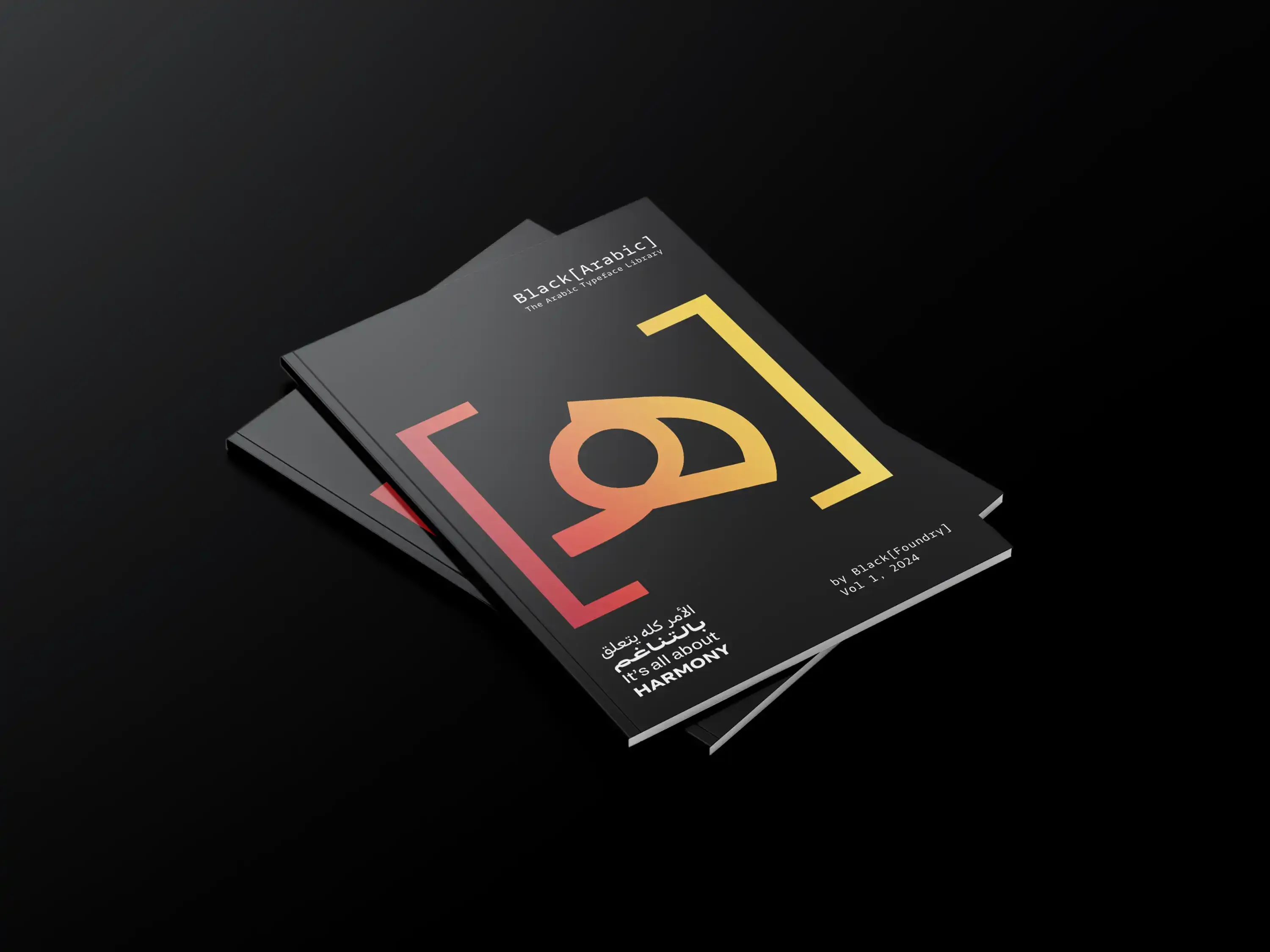
Exclusive: Black[Arabic]
Discover our retail catalog dedicated to Arabic fonts! Explore the diverse toolbox of possibilities we’ve designed for you. Click the link to access the full online version of Black[Arabic] Retail Catalog Volume 1.
It’s just the beginning—more exciting extensions are on the way!
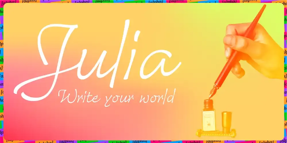
New Alpha font: Julia!
Julia is Black Foundry’s new cursive font, currently in alpha version 0.1. She combines fluidity, elegance, and readability.
Inspired by calligraphy, her design offers a natural flow through loops and delicate details, striking the perfect balance between originality and clarity.
Her uppercase letters are adorned with elegant curves and swashes, while her clean lines evoke a classical aesthetic with a modern twist.
Julia is crafted to help users express their voice, reveal their emotions, and shape their universe. Designed by Gaëtan Baehr, Julia was meticulously reviewed by the calligrapher Michel Derre, ensuring a visual harmony that works seamlessly for both short and long texts.
Currently available in Light weight, Julia is poised for growth—stay tuned for updates!
Grand Prix Stratégies du Design 2024
One more victory!
At the Grand Prix Stratégies du Design 2024, we took home the Gold Award for our project “Inria Poster” in the Visual Identity – Typography category.
Inria, a leading French research institute in computer science and automation, approached us to develop a new typeface to strengthen their visual impact and reflect their innovative DNA. This typeface seamlessly fits into their existing typographic system, which includes both sans serif and serif families. Thank you to Inria for their trust, and to the jury for this recognition!
We are Black[Foundry]. Combining design and technology, we create fonts that perform. Across borders, across touchpoints. For everyone and everywhere. Type designers of our times, we are skilled craftsmen in a connected world. Type+Tech® is our expertise. Black[Foundry] is our name.
Some of Our Clients
Arcom
Apple
Renault
Decathlon
Groupe TF1
Enedis
Jott
M6
Stellantis
Samsung
RMC Story
Live Sport
France Galap
Ikea
Dassault Systemes
They Trusted Us
“Black [Foundry] s’est positionné comme le partenaire de jeu idéal pour developper la Font propriétaire de Jott.
Arrivés en milieu de chantier de rebranding global, leur culture de la marque, de ses enjeux et des conséquences narratives sur les signes ont été un atout considérable dans le process créatif que nous avons partagé entre nos deux agences.
Chaque interlocuteur à trouvé sa place, avec souplesse, simplicité, pédagogie et une extrême précision.”

“Black[Foundry]’s know-how and experience are valuable assets that we regularly rely on to ensure the quality of the fonts we use in the in-vehicle systems of the PSA group.”
Since 2015, Black[Foundry] has allowed us to easily manage the Asian and Arabic writing systems.”

“Implementing a new typeface for such a multinational brand as IKEA is no easy undertaking. Fonts are used at every step of the value chain, which requires a universal fit for a multitude of digital systems.
We relied on Black[Foundry] to package the font files according to unique specifications and supply custom modules for internal installation.
In addition to this, Black[Foundry] was there to assist and consult internal IT teams in the process. The success of this journey largely depended on Black[Foundry]’s expertise, their professional precision, timely delivery and enthusiastic approach. They are the go-to resource for all needs in type technologies.”

“By creating two complementary typographic families, Black[Foundry] was able to translate a double request from us: to understand and retranscribe the essence of Inria and to reinforce its identity.
The design stage in short iterations allowed us to precisely define the typographic styles we wanted.
These fonts are also a vector of cohesion within the institute and their free licenses allow us both a better internal sharing as well as a simple and clear diffusion on a large scale.”

“C’est un beau projet que nous avons porté avec Black[Foundry] sur cette fonte qui matérialise notre philosophie de marque et crée un lien de proximité avec nos clients à travers le monde.”
Cette police constitue désormais un de nos codes de marque fort pour dynamiser
la perception de Dacia et incarner ses valeurs de simplicité et d’optimisme, de liberté et d’accessibilité.”
Do you have a specific request
about our services?