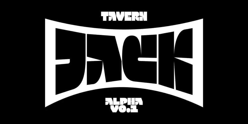
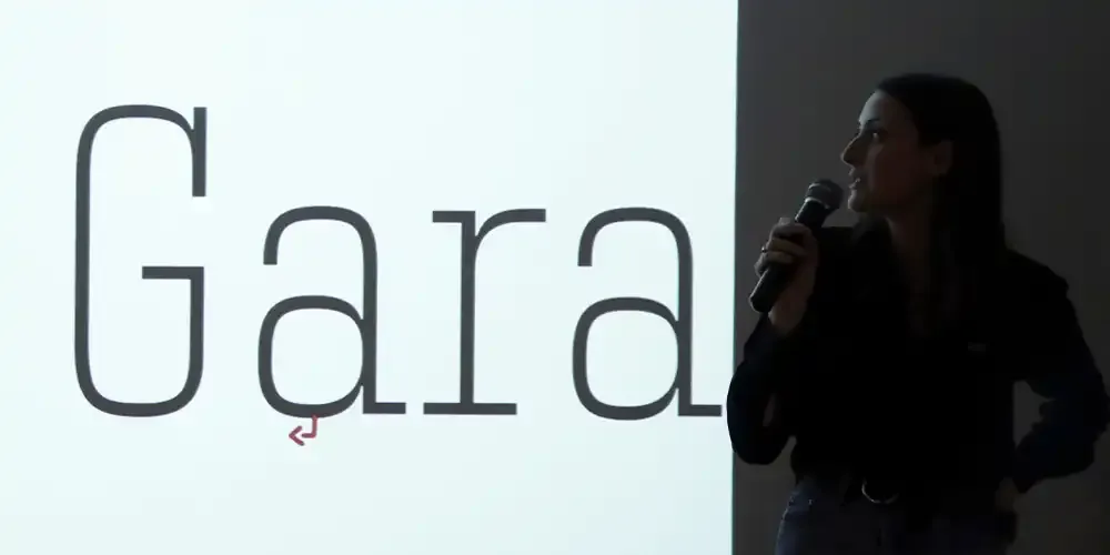
New Alpha font: Jack!
Introducing Jack, a typeface born from Tavern, the wavy and experimental tool crafted by Gaëtan Baehr. Rooted in brutalist design, Jack is bold, robust, and unapologetically modern. Its simplified forms strip away the unnecessary, creating a raw yet refined structure that commands attention.
Designed exclusively in capitals, Jack is optimized for wave effects with Tavern. It also features a width variation axis and four corner axes (top-left, top-right, bottom-left, bottom-right), allowing precise control over each letter’s shape for unique and unexpected compositions.
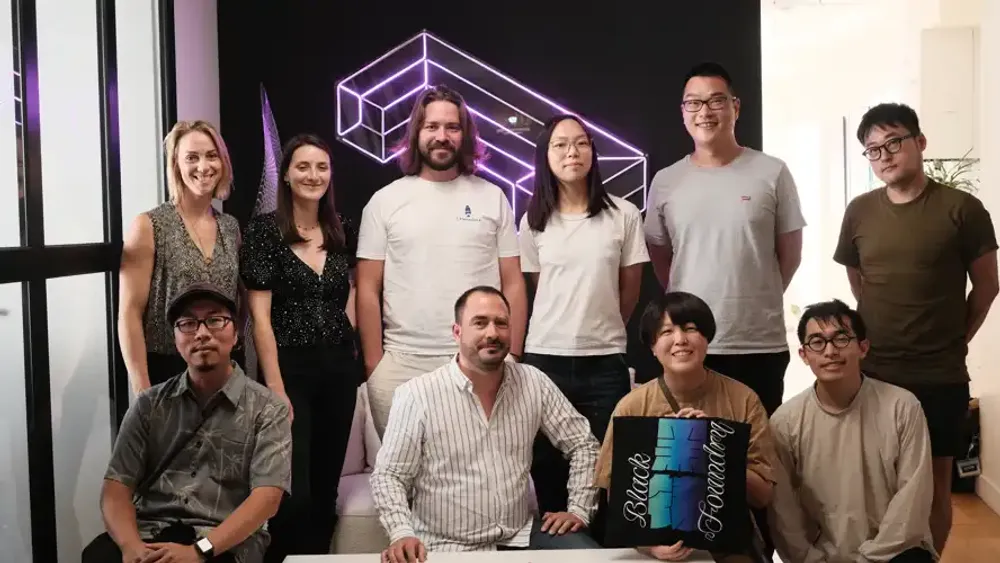
![Black[Foundry] at ANRT Nancy – February 17th, 18th & 21st, 2025](/_astro/black-foundry-at-anrt-nancy.nbdHVsrk_2nGJvI.webp)
Black[Foundry] at ANRT Nancy – February 17th, 18th & 21st, 2025
We are delighted to take part in ANRT Nancy this February!
On February 17th, 18th and 21st, Jérémie Hornus, Gaëtan Baehr, and Just Van Rossum will lead Fontra workshops, introducing participants to our open-source font tool and exploring its creative potential.
Location: ENSAD & Mines Nancy, ARTEM campus, Nancy (France).
Stay tuned for more updates!
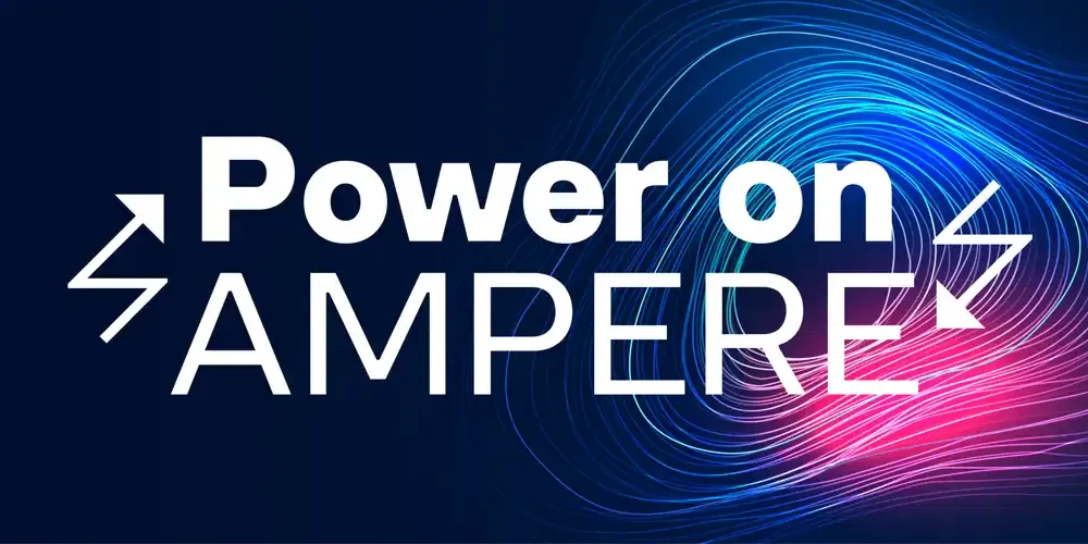
New Typeface: Ampere!
Introducing you to Ampere: a typeface of sleek geometry and uncompromising clarity, delivering refined precision that remains crisp in small text and bold in commanding headlines.
Ampere’s unique character lies in its subtle yet striking features. Inside corners are softened with squared reverse ink traps, a choice that tempers its sharp angles for a smooth, sophisticated finish without compromising on structure. Adding a spark to its utility, Ampere also includes a set of special “electric” characters inspired by its namesake, infusing a touch of energy into any project.
![Exclusive: Black[Arabic]](/_astro/exclusive-black-arabic.CH1GfqcG_ZvIctv.webp)
Exclusive: Black[Arabic]
Discover our retail catalog dedicated to Arabic fonts! Explore the diverse toolbox of possibilities we’ve designed for you. Click the link to access the full online version of Black[Arabic] Retail Catalog Volume 1.
It’s just the beginning—more exciting extensions are on the way!
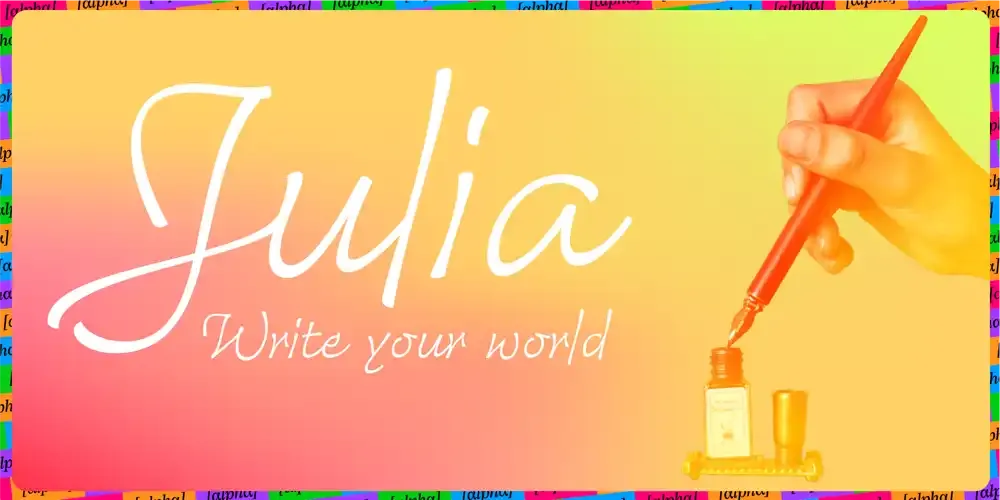
New Alpha font: Julia!
Julia is Black Foundry’s new cursive font, currently in alpha version 0.1. She combines fluidity, elegance, and readability.
Inspired by calligraphy, her design offers a natural flow through loops and delicate details, striking the perfect balance between originality and clarity.
Her uppercase letters are adorned with elegant curves and swashes, while her clean lines evoke a classical aesthetic with a modern twist.
Julia is crafted to help users express their voice, reveal their emotions, and shape their universe. Designed by Gaëtan Baehr, Julia was meticulously reviewed by the calligrapher Michel Derre, ensuring a visual harmony that works seamlessly for both short and long texts.
Currently available in Light weight, Julia is poised for growth—stay tuned for updates!
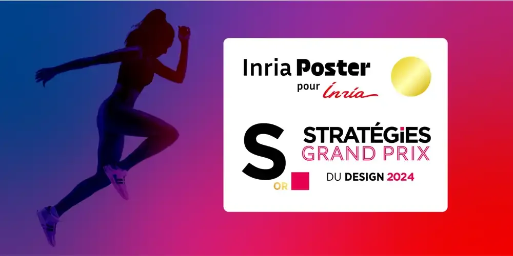
Grand Prix Stratégies du Design 2024
One more victory!
At the Grand Prix Stratégies du Design 2024, we took home the Gold Award for our project “Inria Poster” in the Visual Identity – Typography category.
Inria, a leading French research institute in computer science and automation, approached us to develop a new typeface to strengthen their visual impact and reflect their innovative DNA. This typeface seamlessly fits into their existing typographic system, which includes both sans serif and serif families. Thank you to Inria for their trust, and to the jury for this recognition!
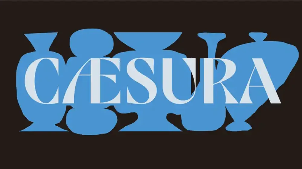
Caesura
Discover Caesura now!
Cæsura is a bold display typeface that draws from a rich blend of influences, seamlessly merging the stoic, structured forms of mid-century European signage with the fluid, expressive strokes of Japanese calligraphy. Available in a single Bold weight, it is crafted specifically for headings where its striking character and high contrast can take center stage.
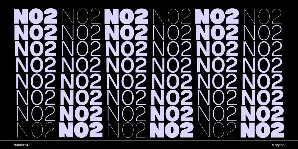
Numero 02
Introducing you to Numero.02!
Numero 02 draws inspiration from the historic Gothic №2 typeface by the Keystone Type Foundry (1888-1917). This type family pays homage to the origins of the “Gothic” appellation, a term historically used in the 19th century to describe sans serif typefaces. In contrast to the ornate and classical serifed typefaces of the time, these “Gothic” fonts were seen as bold, utilitarian, and modern—a departure from the past. The term came to represent a certain straightforward, no-nonsense aesthetic that was both functional and striking.
![Inria x Black[Foundry]](/_astro/inria-black-foundry.BdcZEBp1_Z1Qwxjb.webp)
Inria x Black[Foundry]
We invite you to discover a discussion between Sophie Barbier, creative director at Inria, and Gaetan Baehr, type designer. Together, they collaborated on the creation of Inria Poster, a new typeface designed to represent the identity of the Institute.
In this interview, they talk about their collaboration, the creative process, and the importance of combining art and technology. They explain how even a typeface can reflect values like innovation and precision.
Visit from Just font's team!
Tseng Kuo Jung and Chiang Chen-Yin from Just font, a Taiwan-based new-generation type design and typography education business, came to visit our studio in Paris! It was so lovely to have them here!
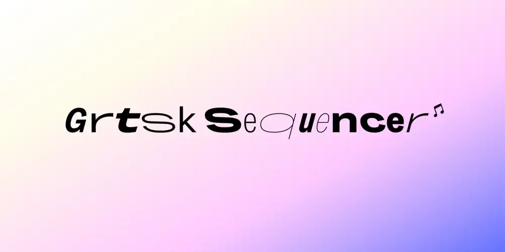
Introducing the Grtsk Sequencer
Experience the fusion of typography and music with the Grtsk Sequencer. This innovative tool transforms the Grtsk font—with all its multiscript versatility in Latin, Cyrillic, and Arabic—into a dynamic musical instrument.
With the Grtsk Sequencer, you can harness the three axes of variation (weight, width, slant) inherent to this font to create captivating melodies and rhythms. Whether you’re a seasoned musician or just curious, this tool offers a unique playground where letters and notes intertwine.
Take advantage of the clever automatic randomizer to generate melodies from scratch, or explore several customization options to craft your unique sound. You can even load your own .wav files and assign them to specific characters for even more personalized music.
Export your creations, share them, and reload them to continue your musical journey. Dive into this interactive experience and let your creativity flow with the Grtsk Sequencer. Unleash the musician within and redefine your artistic expression today.
Typographics Festival 2024! 🇺🇸
Throwback on the New York Workshop with Gaëtan Baehr and Jérémie Hornus
Gaëtan Baehr and Jérémie Hornus were in New York for the Typographics Festival 2024! 🇺🇸 Hosted at Cooper Union, this festival is curated by the typographic department known as Type@Cooper. We are thrilled to support this event, given its significant global importance in the field of typography.
Our Black[Foundry] team members, Baehr and Hornus, led an inspiring workshop that captivated participants and sparked their creativity. The workshop, held in a friendly yet focused atmosphere, brought together typography enthusiasts and professionals eager to refine their skills.
Participants learned how to easily create a variable font with multiple axes while maintaining a consistent design, and how to achieve this through effective teamwork. The sessions covered various aspects of type design, from the basics of letter drawing to advanced font creation techniques.
This workshop not only enhanced participants’ skills but also reinforced the bonds within the typographic community, highlighting the importance of knowledge exchange in fostering creativity and innovation.
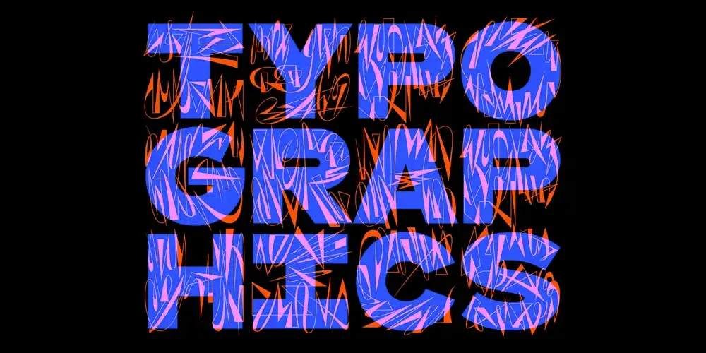
Sponsoring the festival Typographics 2024
Sponsoring the festival Typographics 2024 We are super proud to announce that we are sponsoring the festival Typographics that will take place in New-York City from the 10th to the 20th of June 2024! ⚡️
Typographics is a wide-ranging festival with many activities around typography to enjoy.
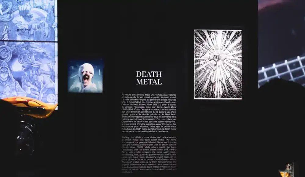
Bluu Suuperstar for "Metal" Exhibition at the Philharmonie de Paris
Nous sommes fiers de vous présenter notre fonte Bluu Suuperstar, mise en scène pour l’exposition “Metal” qui se tient actuellement à la Philharmonie de Paris. Quelle classe ! L’exposition vaut définitivement le détour, et notre fonte est tout simplement intégrée au décor. Smooth. 🖤
We celebrated our 10 years! 🎂
On Thursday, March 14th, we gathered to celebrate a very important moment for Black Foundry: a decade filled with passion, innovation, and collaboration.
This occasion provided us with a moment to reflect on our past achievements and to look forward with excitement to the future.
From the beginning, we have been deeply committing ourselves to this project—our foundry—and we have always envisioned it as a team adventure, promoting not only French and Latin typography but also embracing the international stage.
![Black[Foundry], winner again!](/_astro/black-foundry-winner-again.DWdJ-AUQ_Z13cWKB.webp)
Black[Foundry], winner again!
We are delighted to announce we won the German Design Award with two prizes!
Our project for Alpine cars won the Gold prize in the category “Excellent Communications Design-Typography Special mention” 🏆
Our project for the French brand Jott won the special prize in the category “Excellent Communications Design- Typography”🥉
We want to thank the German Design Council as well as all our team members Jérémie Hornus, Grégori Vincens, Gaëtan Baehr, Solenn Bordeau and everyone who to contributed to those projects. We are proud to incarnate excellence in our domain and being recognized for it.
Forever thankful,
Black[Foundry]‘s team 🖤
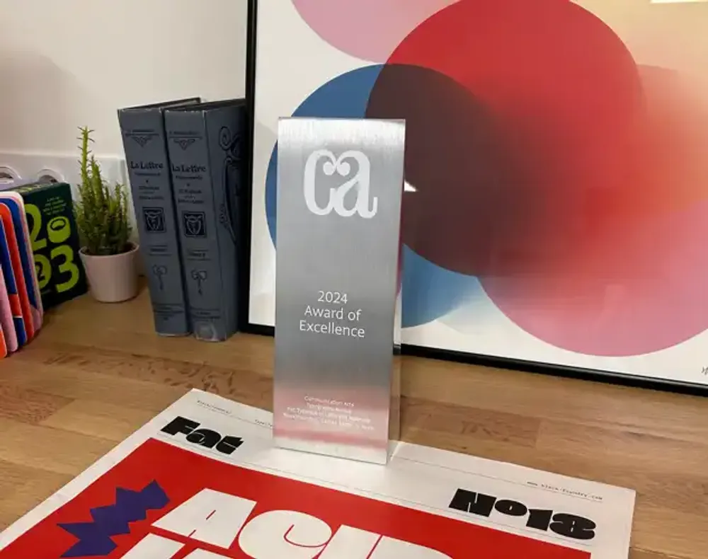
New Award of excellence from Communication Arts!
Our font Fat won the award of excellence from Communication Arts!
Our work has been selected by an esteemed jury of our peers in one of the most exclusive major creative competitions in the world.
We are so proud and thankful!
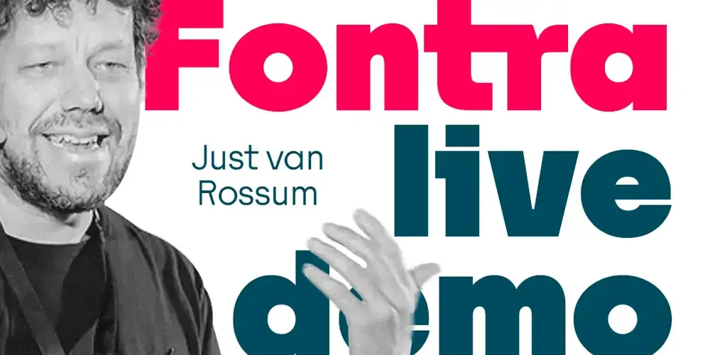
Fontra Live Demo + Q&A
Just van Rossum presents a live demo of Fontra, our WIP Font Editor.
The demo lasts 40 minutes, leaving 20 minutes at the end for discussion.
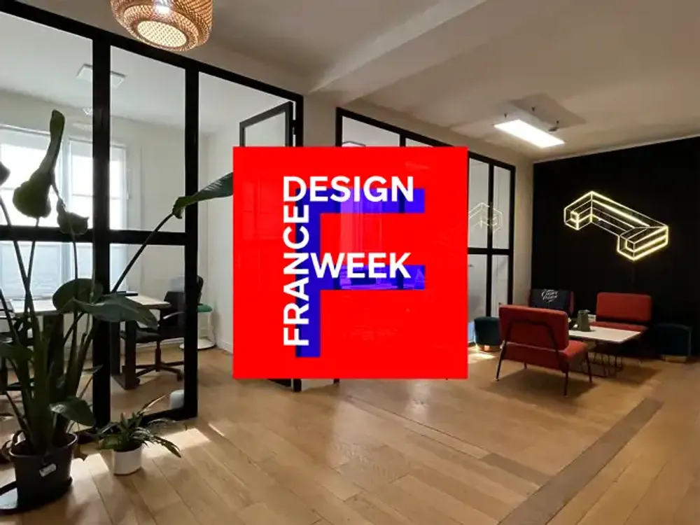
France Design Week x Black Foundry
À l’occasion de France Design Week 2023, pour célébrer le design dans sa diversité, sous le thème Vivant, vivants, nous vous ouvrons nos portes !
Venez rencontrer nos équipes et découvrir de multiples expérimentations autour de la typographie en tant que matière vivante :
Le Physarum : un outil expérimental qui fait interagir biologie et typographie, pour des rendus graphiques uniques !
La technologie des fontes variables : micro-interactivité, personnalisation de vos fontes, légèreté des fichiers, modularité, infinité de variations, mutabilité des formes…
Fontra & Type+Tech®
At Black Foundry, we believe engineering is as important as design.
We’re also developing a font-editor, cross-platform, open-source, it runs directly in the web browser, we named it Fontra! Variable Glyphs are at its core, it’s a powerful design-tool.
Fontra can handle large glyph-sets, useful for Asian fonts, and also enables live collaboration of a design-team on the same typeface…
Fontra is under active development and is becoming better every day!
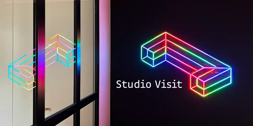
Studio Visit – ATypI off-program
We are happy to open the door of our studio to ATypI Paris 2023 attendees Tuesday 9 May at 4pm. To reach the studio, the address is 132 rue du Faubourg Saint-Denis, 75010 Paris.
To open the street gate just press any button of the code pad, then walk straight to the second courtyard, block E on the left, again press any button for the code, 3rd floor (there are works going in the staircase, please use the elevator), right door.
Looking forward to meet you!
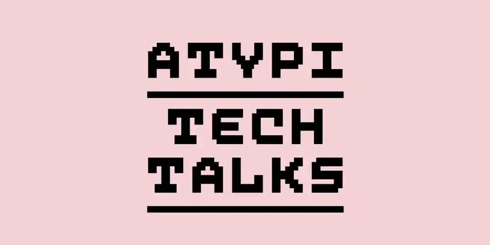
ATypI tech Talks
Co-founder of Black[Foundry], type designer and font engineer Jérémie Hornus likes both technical and design challenges.
He’s part of the super group that will explore automated kerning and spacing at ATypI Tech Talks 2022, Oct. 27–29. He will speak in particular about his approach for the tools we made for letter fitting assistance Black[Spacer] and Black[Kerner].
Tickets available, check the agenda.
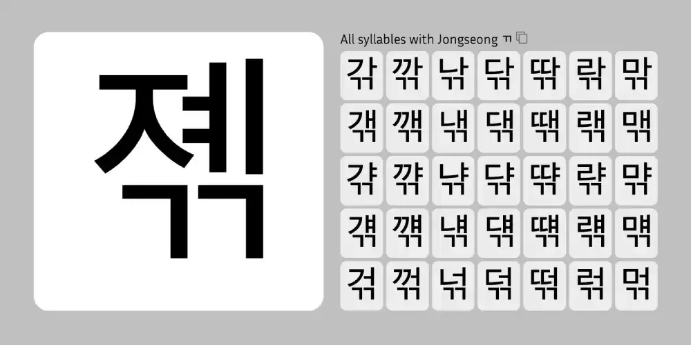
Hangul Explorer
We made a little webpage that allows you to navigate the huge character set by selecting Hangul Jamos.
You can also drop any font that supports Hangul on the page to see and walk through its glyphs.
Can become useful to understand the way syllables are made and check typeface design consistency, for example.
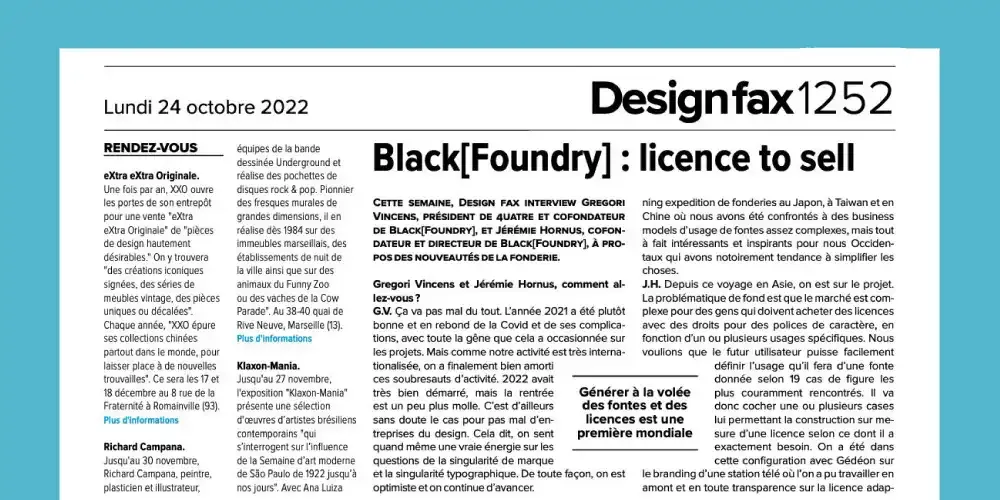
Read about us on Design fax
After two years of work, the co-founders of Black [Foundry] - Jeremie Hornus and Gregori Vincens - unveil in this interview our new modular licensing system based on usage to allow the user to buy only what he needs.
These licenses are automatically generated based on the options selected. The content is clear and easy to understand.
Type design: from design to communication
On the occasion of France Design Week, Black[Foundry] partnered with ECV Creative Schools & Community to give a lecture.
We presented to the students the steps that come with the creation of a typeface.
Solenn Bordeau, type designer, explained how to go from a sketch to a functional font. Robin Abreu, graphic designer, showed how to put a typeface forward in a communication campaign.
5 awards won
We are proud to have won 5 awards this year at the Grand Prix Stratégies du Design 2022: Two awards for “Dacia Block” an identity font created for Dacia.
Also two awards for “NouvelR”, a brand font covering 6 writing systems: Latin, Greek, Cyrillic, Arabic, Hebrew, Korean.
Last but not least, our typeface “Enedis” designed for the electric company of the same name also won an award.
Fontra
We are developping an awesome new browser-based font editor. We named it Fontra! Also happy to announce it is on a public GitHub repository under GPL-3.0 license.
If you are adventurous, and setting up a Python virtual environment doesn’t scare you: please join us. The software in under active development and is evolving fast, clone the repository to get the latest version.
Typrographics 2022
We are very happy to have participated in person at the Typographics NYC 2022 conference and to have been silver sponsor!
On this occasion, our team, represented by Just van Rossum, Jeremie Hornus and Gaëtan Baehr, presented two engineering projects we worked on this year. “Fontra”, an online font editing software. And “Physarum”, an online lab for playing with our Tosh typeface.
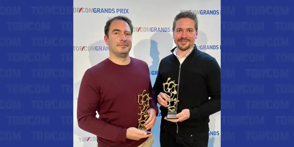
Double gold awards at TOP COM 2022
We are very proud to have won Double Gold at TOP COM 2022 for our work on Dacia and on Renault typefaces « Nouvel R » and « Dacia Block ». Congratulations to the design teams at Black[Foundry]!
We won these awards in collaboration with: Landor & Fitch for Renault, Carré Noir for Dacia.
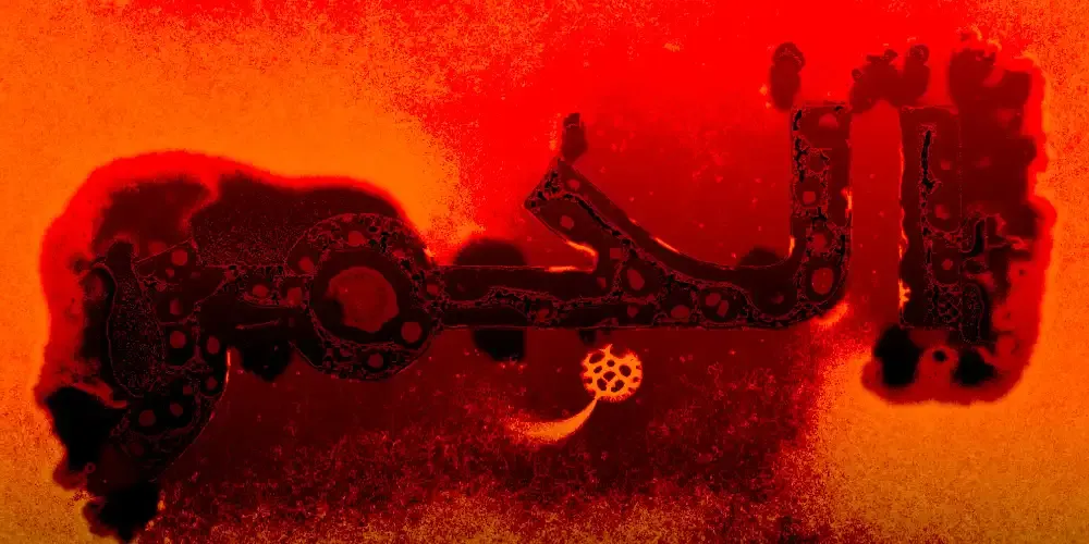
Play with Tosh Physarum
Tosh Physarum is an experimental project based on WebGL where typography and biology interacts together and react to the user input to create original and unique graphics.
The output can be totally different depending on the parameters and the user interaction. There is a palette with a list of tools that can be used to customize the output.
Play with Tosh Physarum by clicking on the link above!