Bluu Suuperstar for INQUA
Inqua, the International Union for Quaternary Research, is a global organization at the forefront of Quaternary science—the study of Earth's environmental changes over the past 2.6 million years. By fostering collaboration and innovation, Inqua bridges the past and present, addressing pressing global issues such as climate change, biodiversity loss, and human adaptation.
Brillante & Grtsk: Inspiration for Beauty
In the cutthroat world of cosmetics, beauty isn't just skin deep—it's ink deep, etched into every letter of your branding. Fonts are the unsung heroes of packaging design, telling your customers, "Yes, this lipstick will change your life," before they even open the cap. Enter Brillante and Grtsk, a duo so iconic they could headline Paris Fashion Week.
Egitto & Tosh: Inspiration for sport
When it comes to sports branding, your typography needs to do more than look good—it needs to exude power, precision, and passion. Enter **Egitto** and **Tosh**, a dynamic duo built to make an impact both on and off the field. Whether you're designing for a championship team or creating slick event collateral, this pair delivers a winning combination.

Clother for Pequignet
Pequignet, a renowned luxury watchmaker, has chosen the Clother font for their website redesign. This choice aligns with their brand's commitment to elegance and sophistication. Clother, a modern and versatile typeface, has become an integral part of Pequignet's digital presence, enhancing readability and aesthetic appeal.
Grtsk for M6
The usage of our Grtsk typeface by Gédéon for the broadcasting company M6 showcases how a well-designed font can enhance a brand's visual identity. M6, known for its innovative and dynamic programming, has integrated Grtsk Exa into its show titles and announcements, creating a cohesive and striking visual experience for its audience. M6 licensed three different weights (Thin, Regular and Bold) of ...
Clother for Leboncoin
In their latest redesign, leboncoin has chosen the versatile and elegant Clother font, designed by Black Foundry, for their advertisements and overall visual identity. The redesign, orchestrated by 4uatre, leverages Clother's unique qualities to enhance leboncoin's brand presence.
Exquise FY for Authology
Authology has embraced the elegance of the Exquise FY font for their brand redesign, utilizing it in their logo and across their social media platforms. This choice highlights the perfect synergy between Authology's brand values and the refined aesthetic of Exquise FY.
Ilya FY for Jho
The company Jho's features the Ilya FY font. It is used for their new logo, and thus plays a prominent role in their brand. Ilya FY was chosen for its ability to embody the brand's ethos and elevate its visual identity.
Angus for MindMe
Mind Me's brand prominently features the Angus font, a choice that enhances the brand's visual identity and user experience. Here's a closer look at why Angus was selected and how it's being utilized effectively.
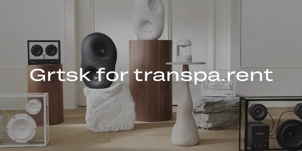
Grtsk for Transparent
Transparent, a leading Hi-Fi brand known for its minimalist and high-quality audio products, has chosen the Grtsk font for their website's text content. From titling and body copy to small caption text, Grtsk enhances the digital experience with its modern and versatile design.
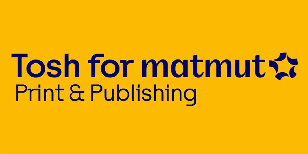
Tosh for Matmut
Matmut, a leading insurance company, has chosen the Tosh A version of the Tosh font for their rebranding efforts. This strategic choice was driven by Matmut's need for a contemporary typeface that genuinely mixes sturdy and lively elements, perfectly aligning with their new market positioning.

Grtsk for QuidelOrtho
When QuidelOrtho embarked on their rebranding journey, they turned to the expertise of Siegel+Gale to create a new visual identity that would embody their innovation, precision, and commitment to healthcare excellence. Central to this rebranding was the choice of a versatile and contemporary typeface—Grtsk.
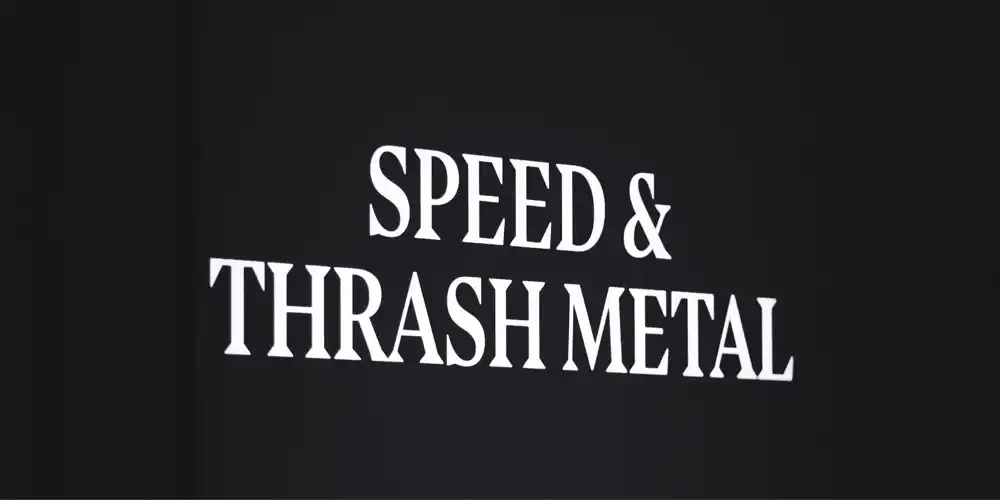
Bluu Suuperstar for Metal Exhibition
The Philharmonie de Paris, in its exhibition dedicated to Metal Music, has chosen the typeface Bluu Suuperstar for the venue's signage and most of the captions and explanation texts. The selection of Bluu Suuperstar, particularly in its Medium and Black weights, perfectly complements the intense and dynamic nature of the Metal genre.
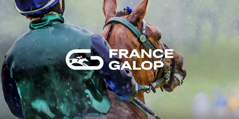
Grtsk for France Galop
France Galop has recently unveiled a new logo and visual identity that perfectly encapsulates the elegance and dynamism of the horse racing world. Central to this fresh branding is the versatile Grtsk Typeface, which has been employed in various weights and styles to create a cohesive and impactful visual presence.
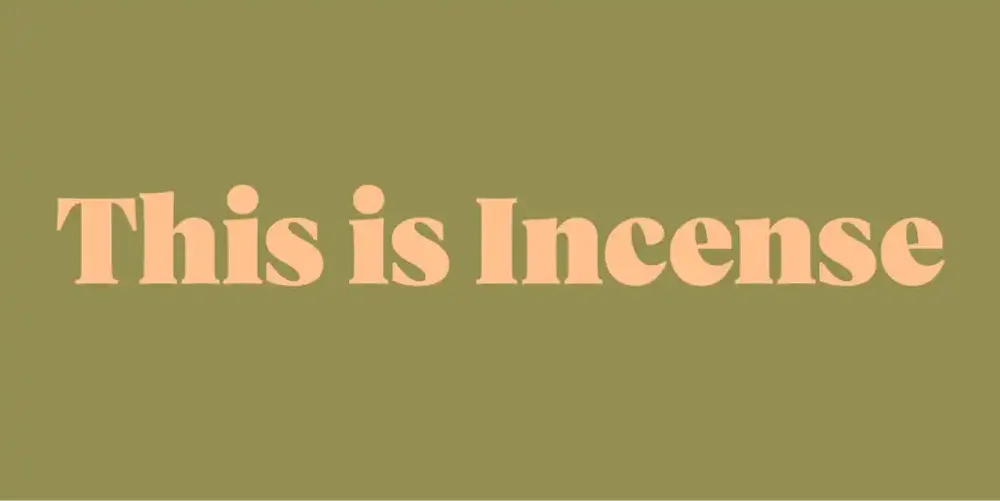
Vesterbro for This is Incense
Gentle Habits, the company behind the "This is Incense" brand, has chosen the Vesterbro Poster font for their brand logo. The decision to use Vesterbro Poster was driven by its bold and impactful characteristics, perfectly aligning with the essence of the "This is Incense" brand.
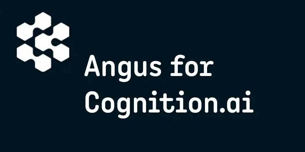
Angus for Cognition.ai
When Cognition.ai, a pioneering company in the field of artificial intelligence, sought to establish a distinctive and forward-thinking brand identity online, they chose the Angus font. This decision was driven by Angus's unique blend of modernity, sophistication, and clarity, perfectly aligning with Cognition.ai's innovative spirit and technological excellence.
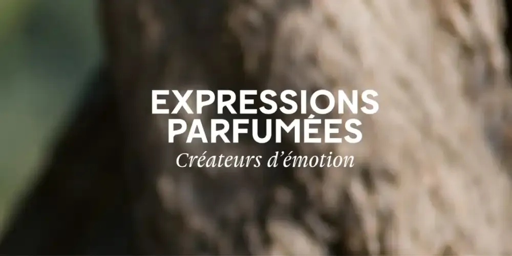
Gauthier for Expressions Parfumées
Expressions Parfumées, a renowned name in the world of perfumery, has chosen the Gauthier Italic font for their brand logo identity, logo baseline, and text titling. This choice underscores the brand's commitment to elegance, sophistication, and a sensory-rich experience.
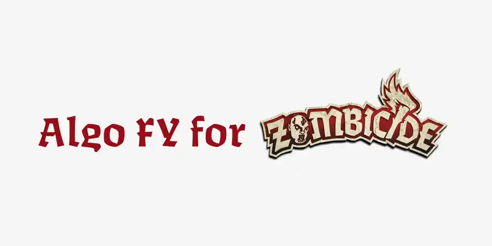
Algo FY for Zombicide
The Zombicide games have incorporated the Algo FY font into their design for the Fantasy Zombicide games. This font is prominently used across various elements such as titles, game cards, manuals, and the Zombicide logo used on the Fantasy games.
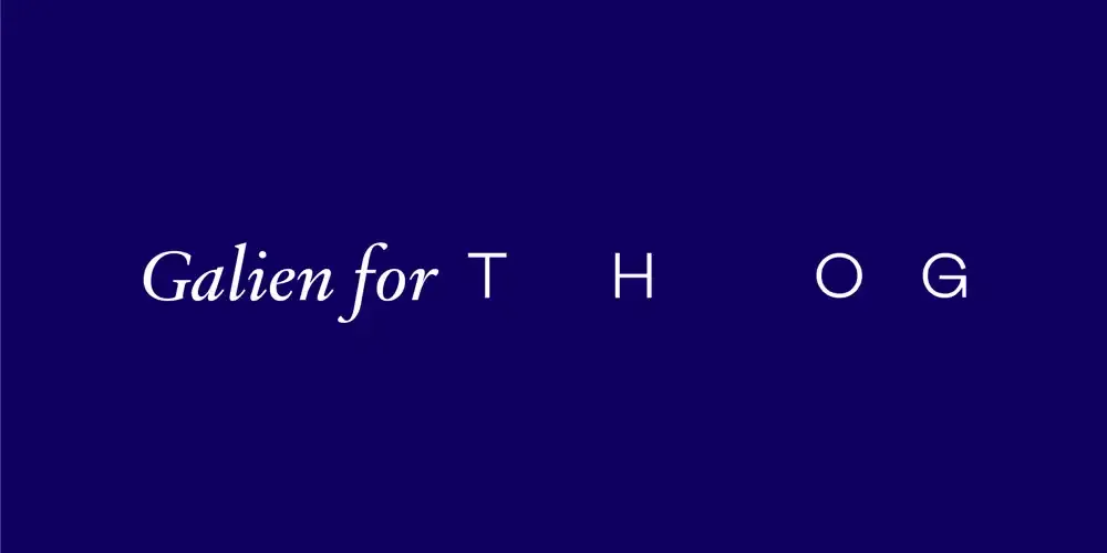
Galien for The Hand of God
The Hand of God, an independent post-production studio, has undergone a stunning website redesign that incorporates the elegant Galien font. The Hand of God collaborates with top photographers, agencies, and renowned brands. They specialize in fulfilling precise visual requirements for their clients, ensuring high-quality results in various projects including editorial, campaign, fashion, sport, a...