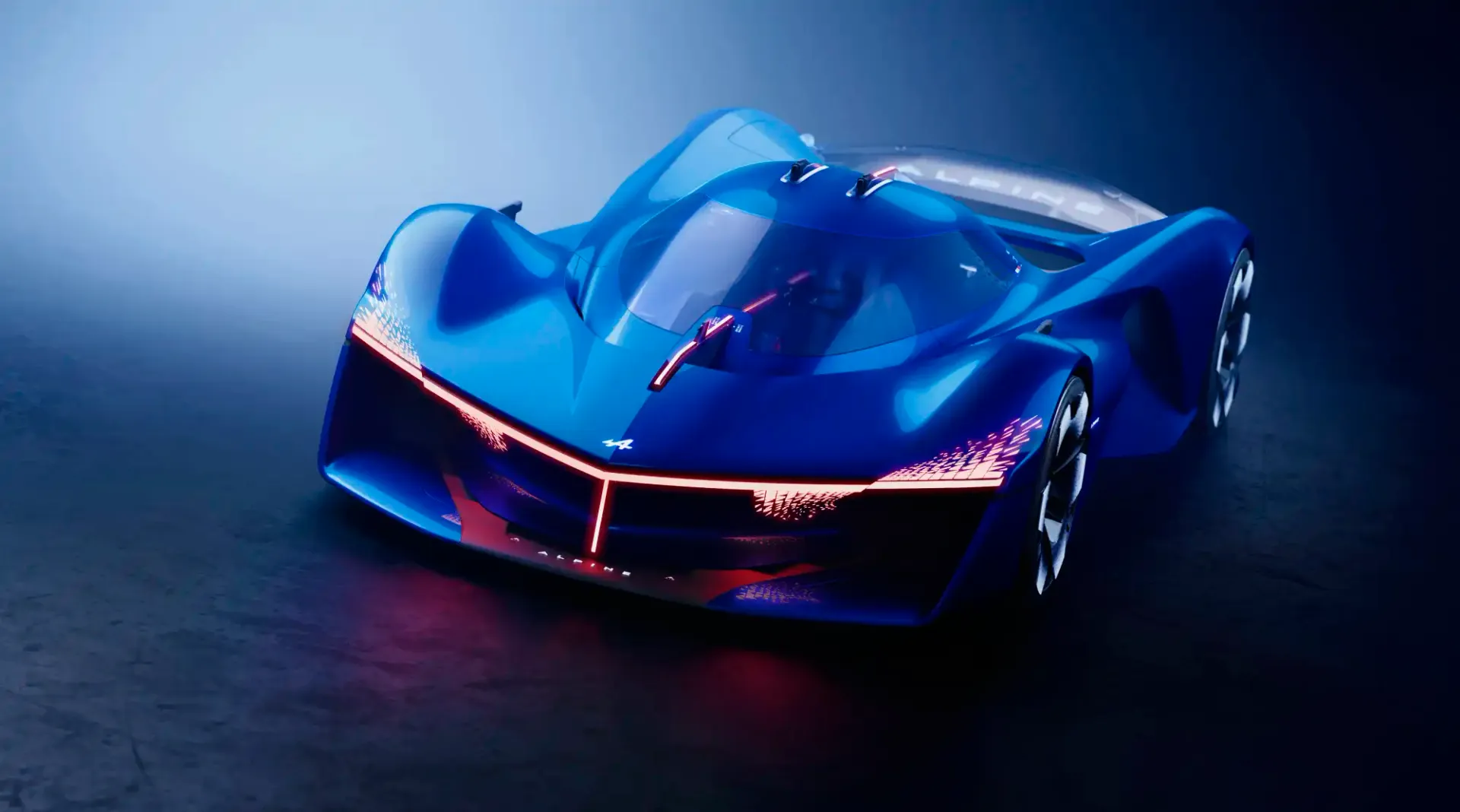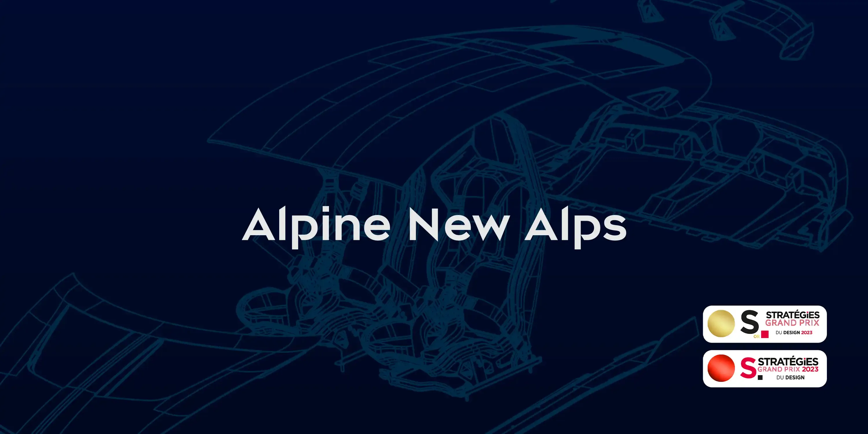
Alpine New Alps
A typeface crafted for the new Alpine brand.
Challenge
Alpine contacted us to create a custom font to highlight the nobleness of the Alpine brand, as part a rebranding. They propose a new sportsmanship: the brand of racers widens the prism of this cars lovers community to electric engines, e-games, sports… The new color palette - 'blue shadow', 'tonic alps', 'grey snown', 'pure white' - reveals minerality, purity, luxury, technical requirement, and wealth of perception embodied by the brand. "Alps are pure art", vertiginous and audacious like Alpine.
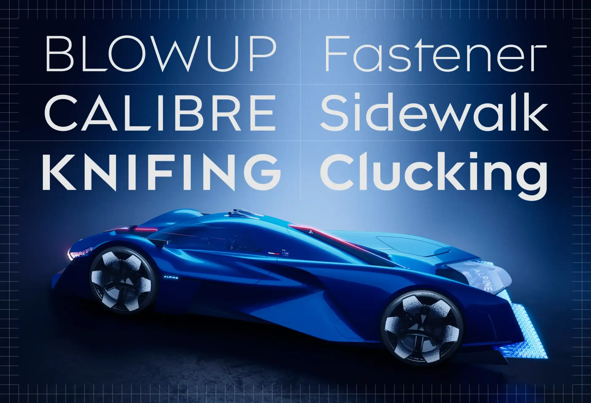
Our challenge was to create a custom font encapsulating the boldness and shapeliness of the brand.
Solution
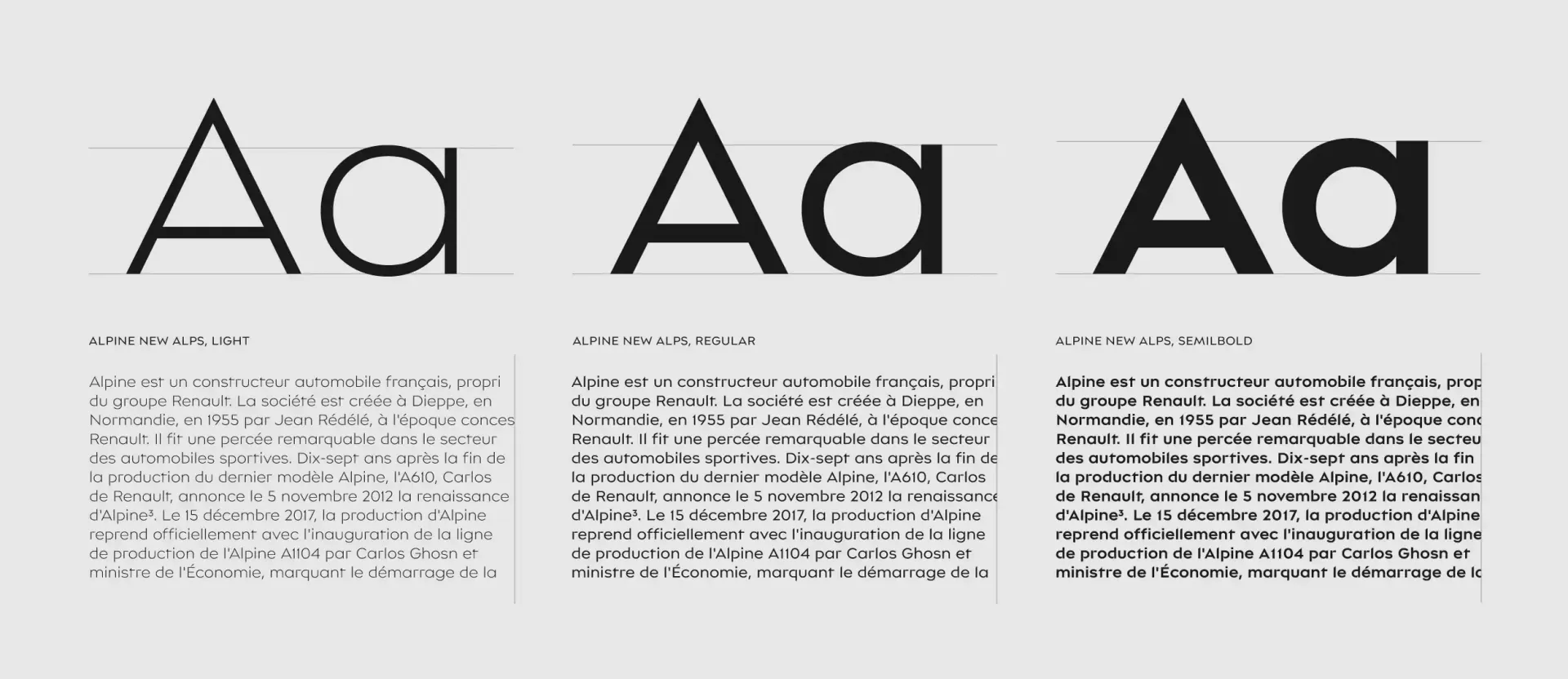
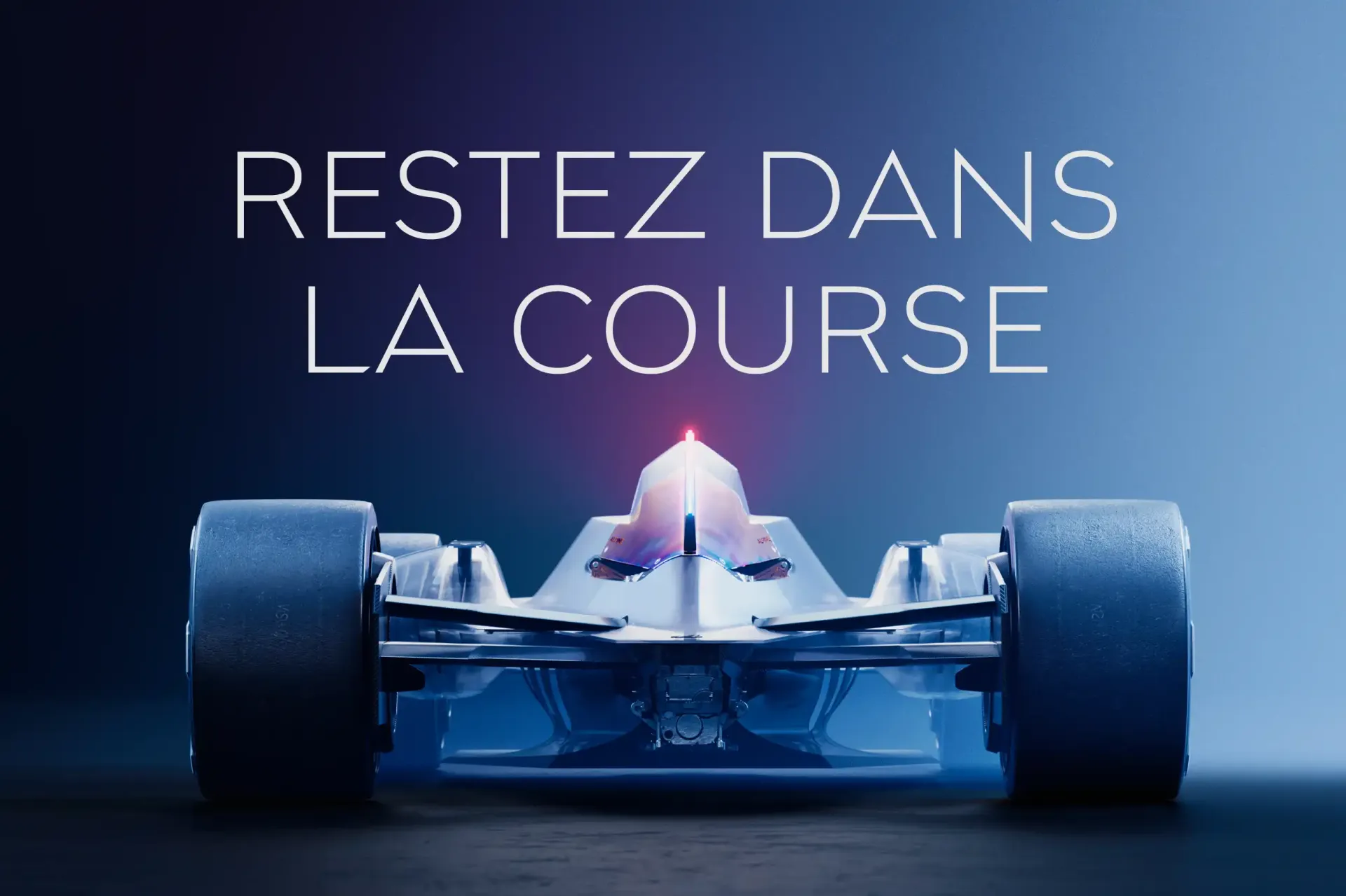
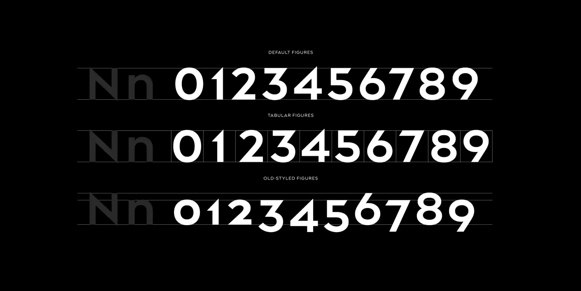
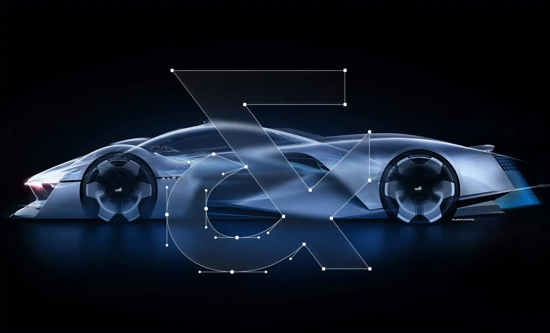
In order to design a typeface personifying specifically the new Alpine brand, we settled on a refined, contemporary geometric design, with sharp details bringing a more unique texture. The terminals of the letters' strokes and stems are radical, evoking the chiseled and steep landscape of the Alps mountains. This sharpness is also found in the symbols, giving coherence to the whole glyph set, and bringing a theatrical power to the design. In addition, balancing white space between the letters was at the heart of the design process; the spacing is carefully adjusted in order to reach purity and gracefulness. Similarly we decided not to have a Bold weight to favour a lighter Semibold weight instead, for a better refinement of the typography.
To sum up, Alpine New Alps is available in 3 weights (Light, Regular, SemiBold) in extended Latin that allows the brand to communicate widely to its community, on numerous supports.