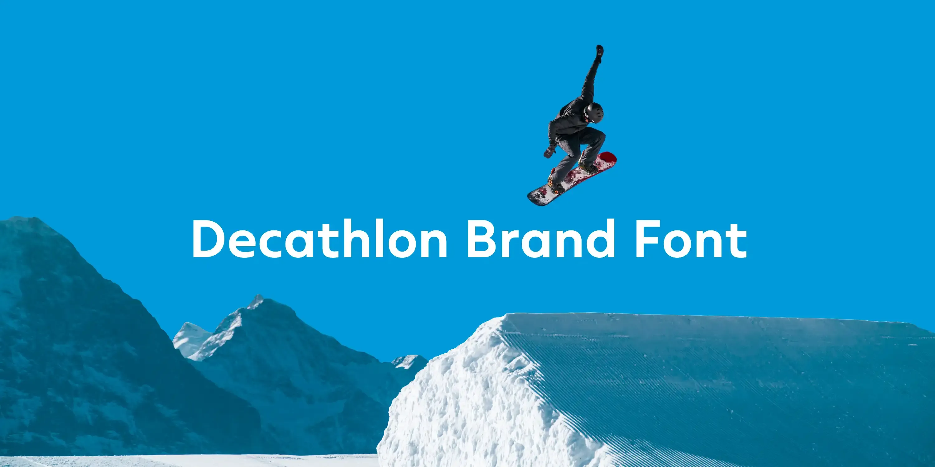
Decathlon Brand Font
Variable brand font for Decathlon.
Challenge
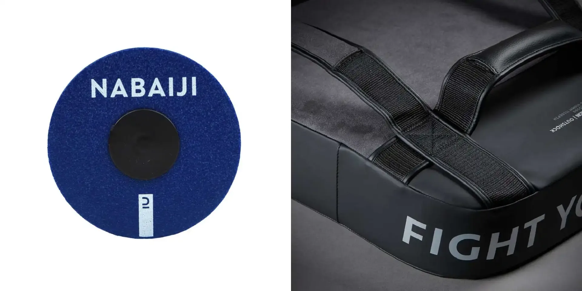
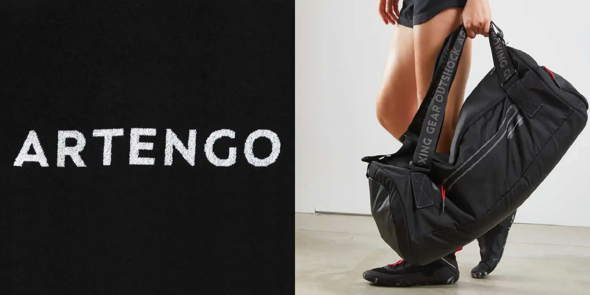
For years, the various brands of the Decathlon group have developed by creating their own universes for each passion brand. Decathlon contacted us with the goal of giving more visibility to the Decathlon brand, including on the products, though the typography. The idea was to gather and unify all their daughter brands and the range of products under the the mother brand Decathlon, while retaining each daughter brand their freedom.
Solution
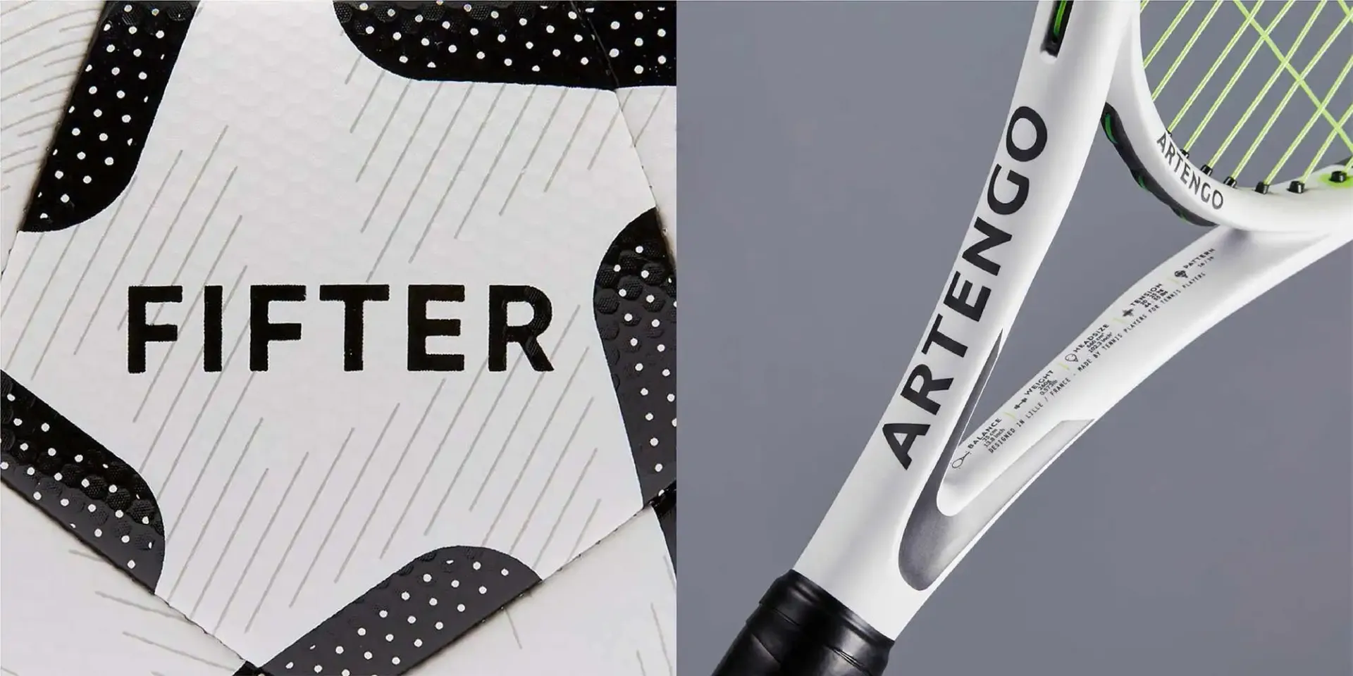
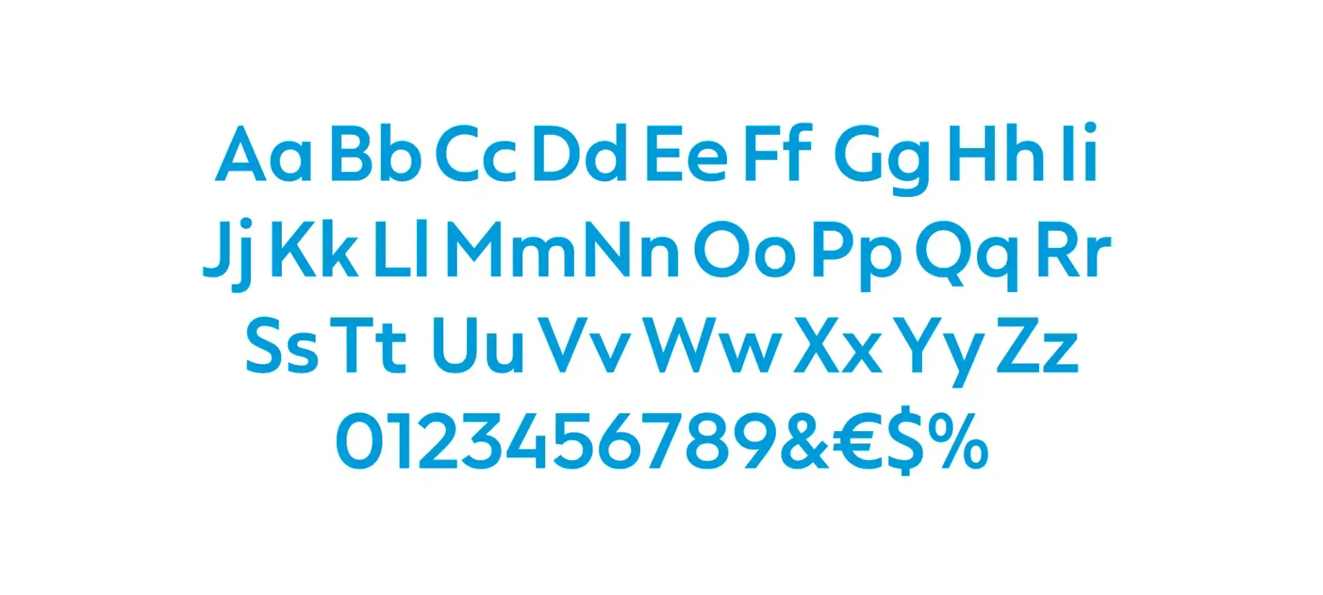
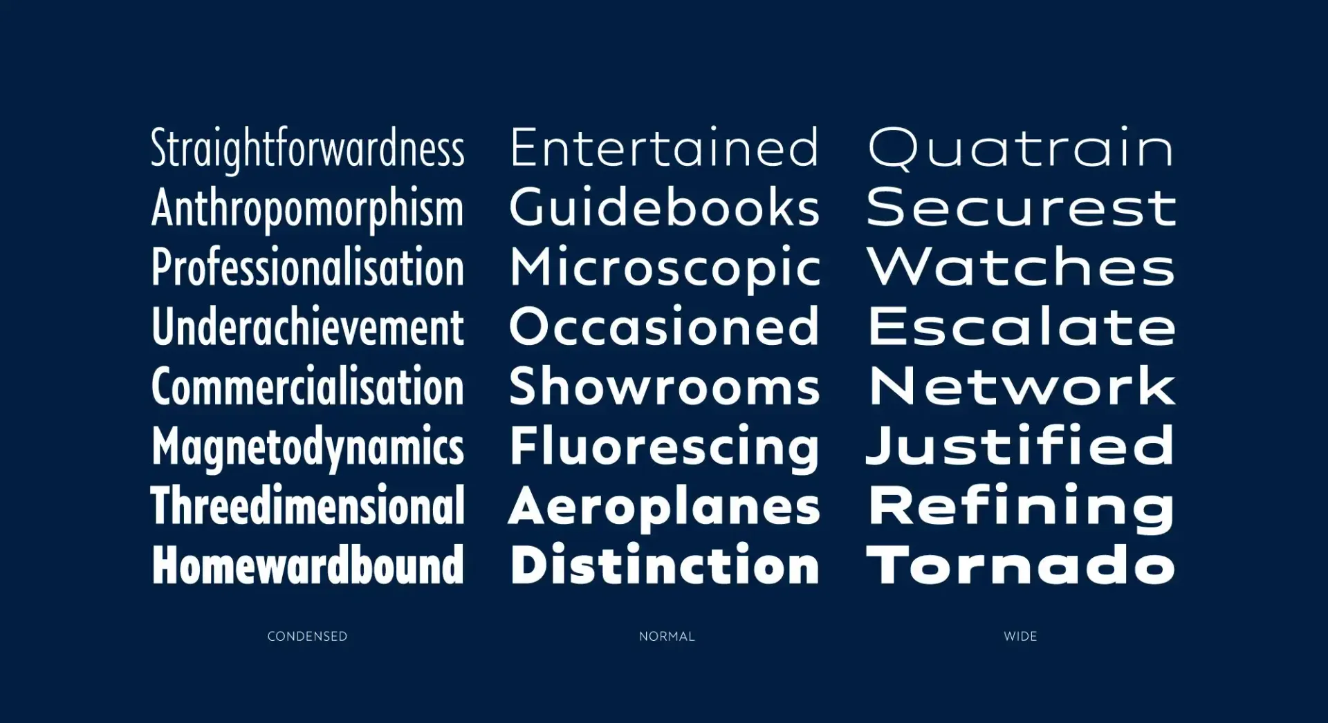
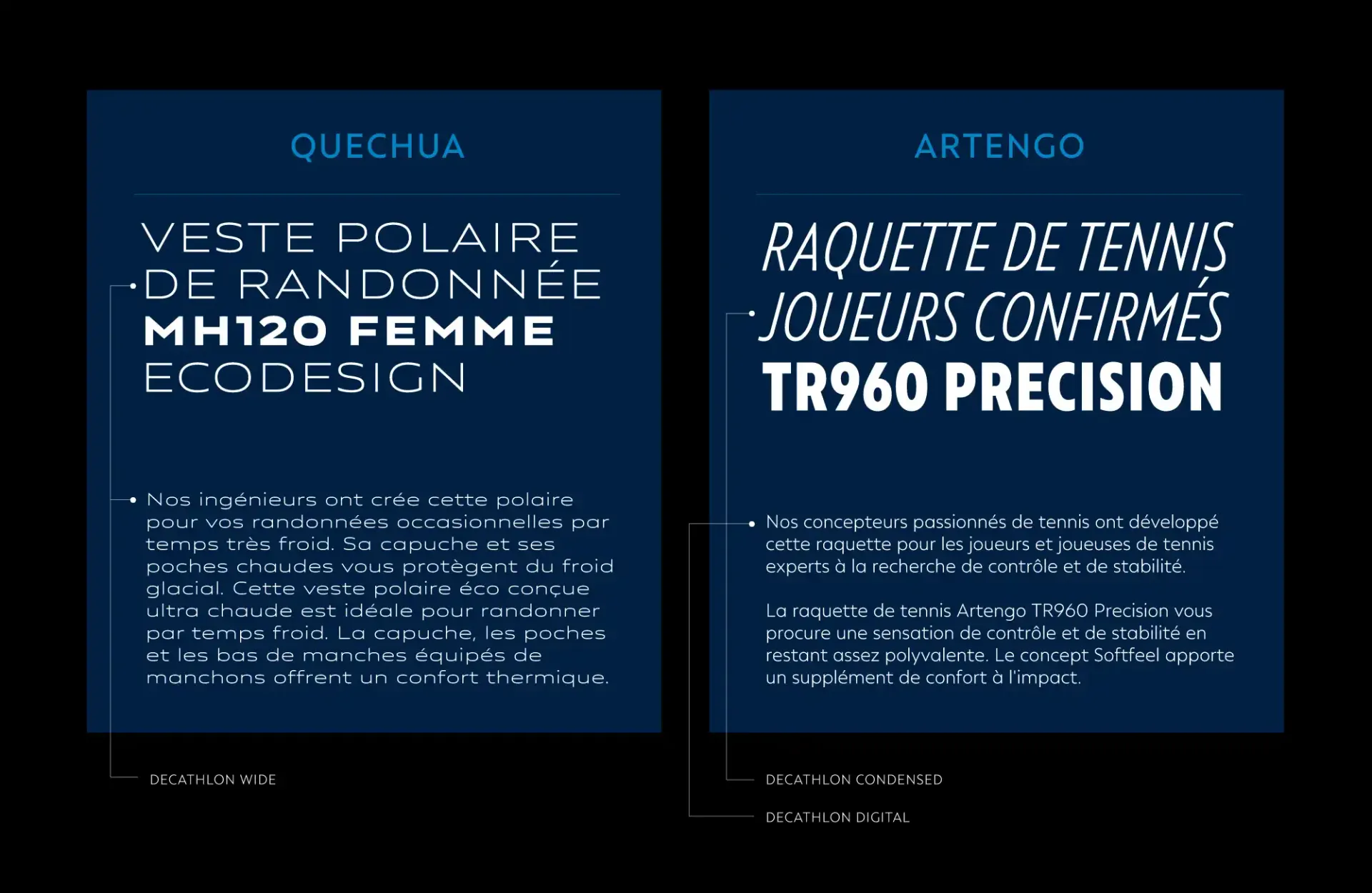
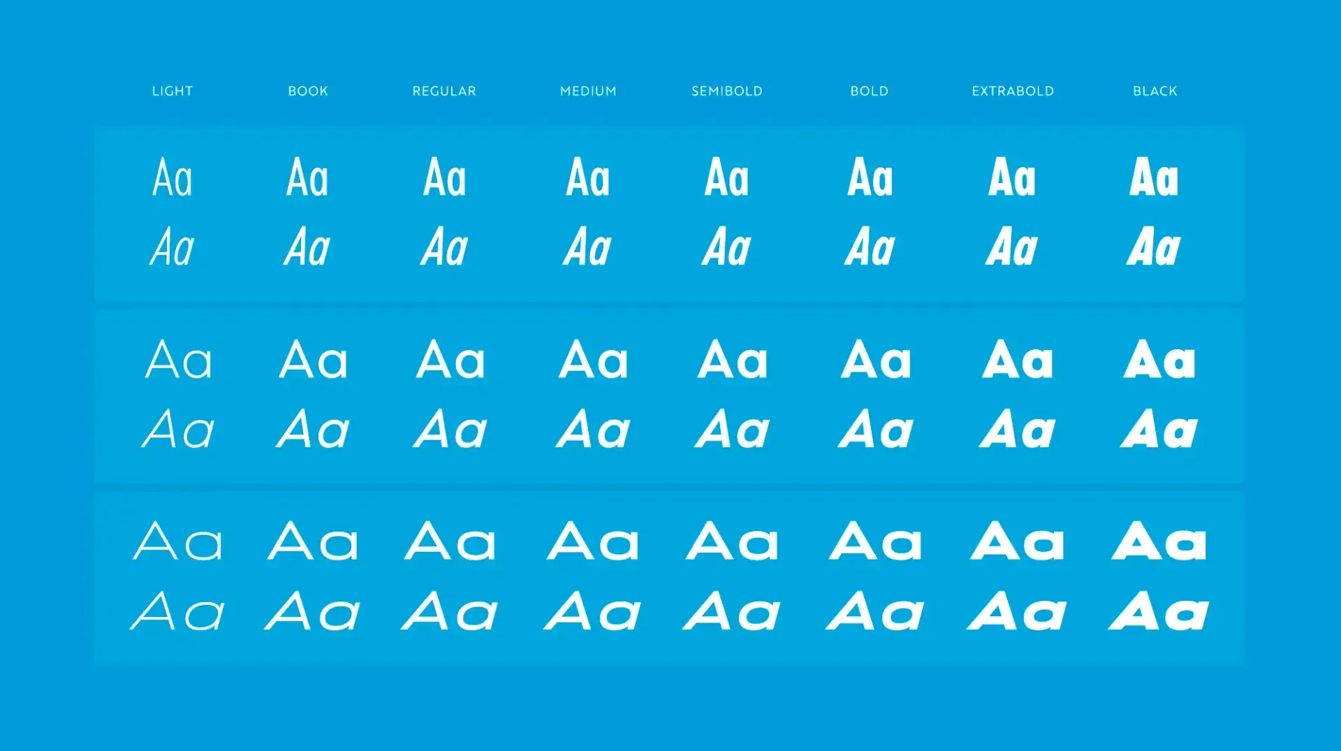
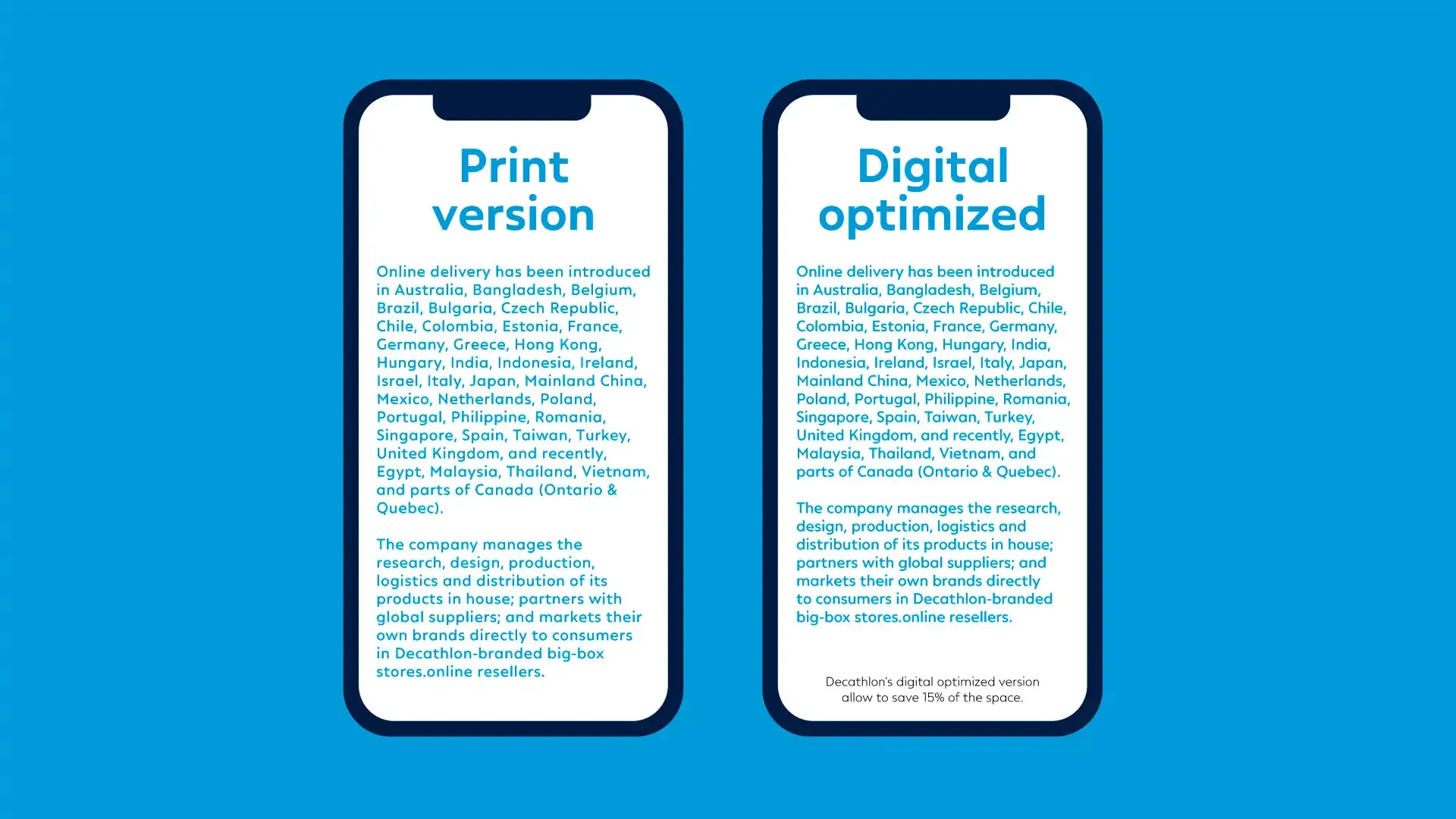
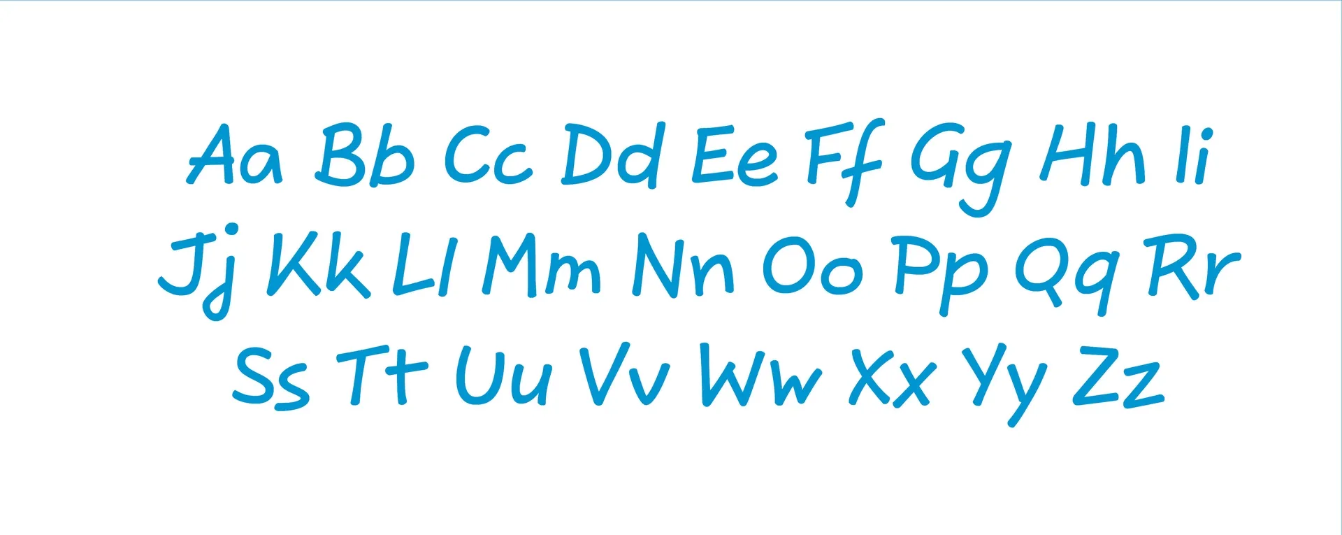
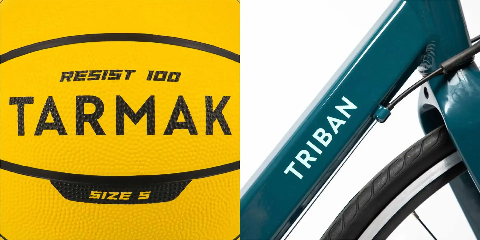
We started designing an uppercase only typeface, and completed the typeface a couple of years later with a full set of lowercases and wide range of styles with more weights and widths so that it can be used on various contexts from print and digital communication, to products. The design itself speaks essentiality, pure and geometric, sporty, and sturdy enough to endure various on-product printing techniques as well as highly legible on-screen for longer texts on the web.