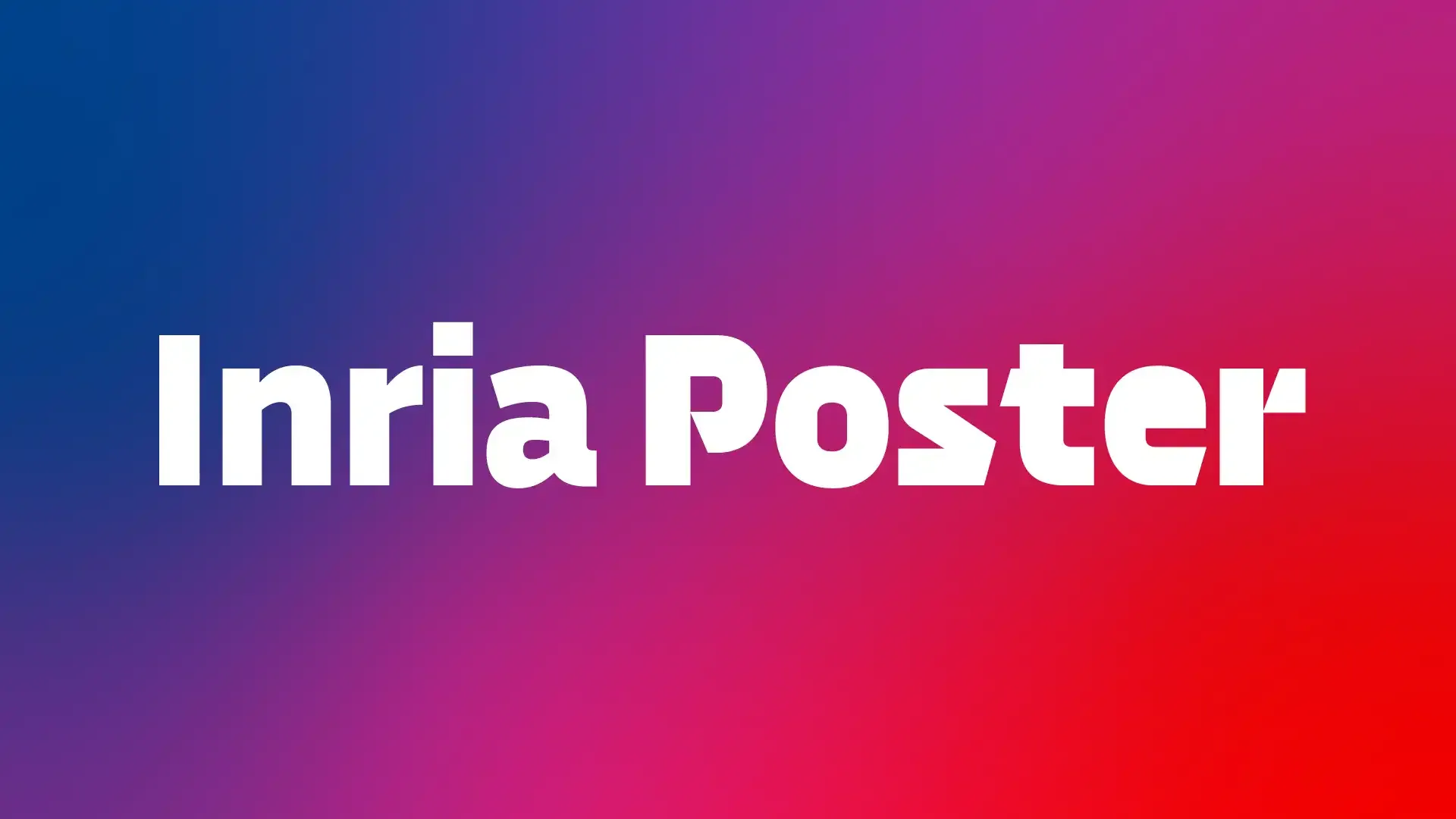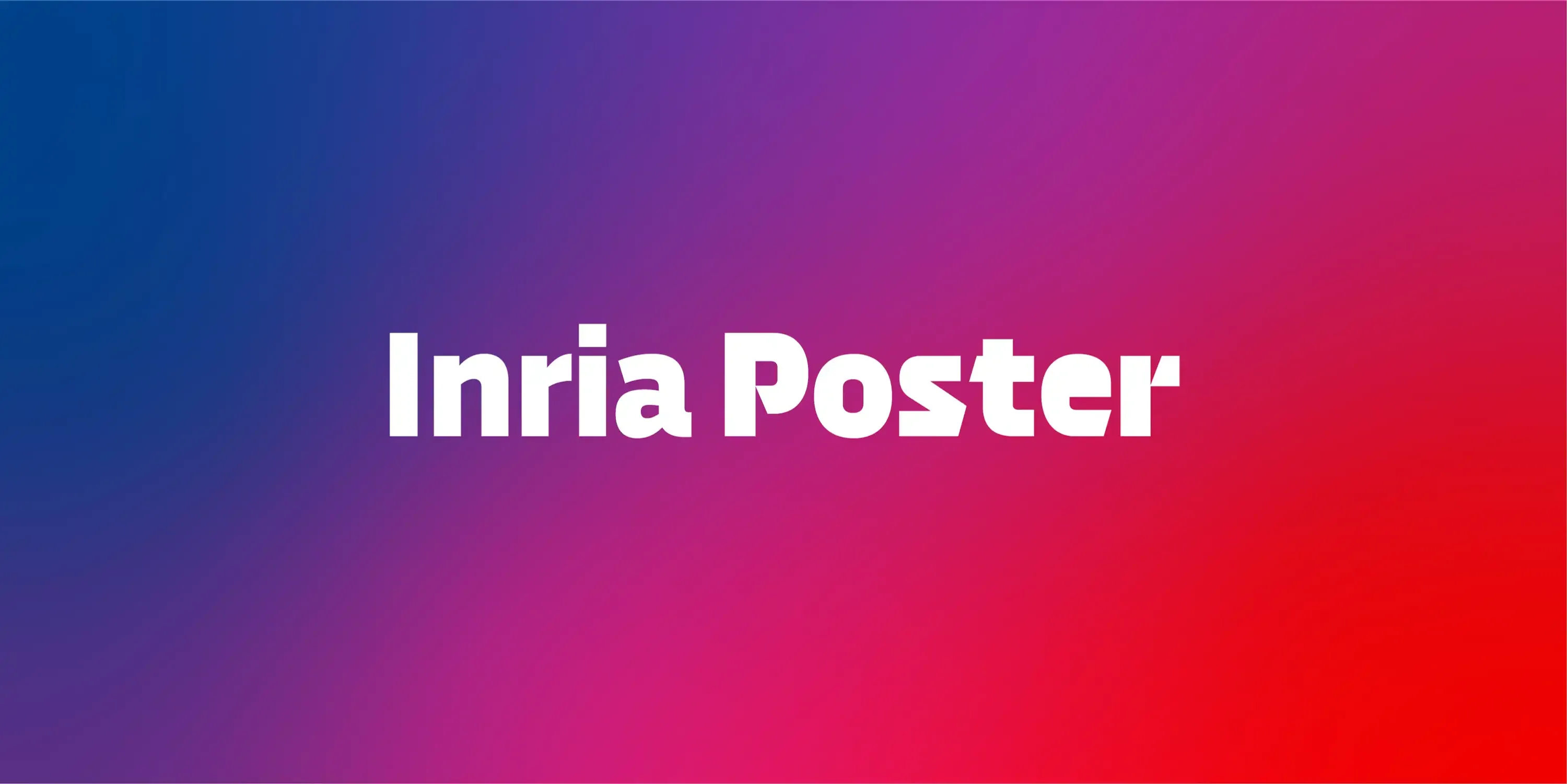
Inria Poster
Between the digital and the human.
Challenge
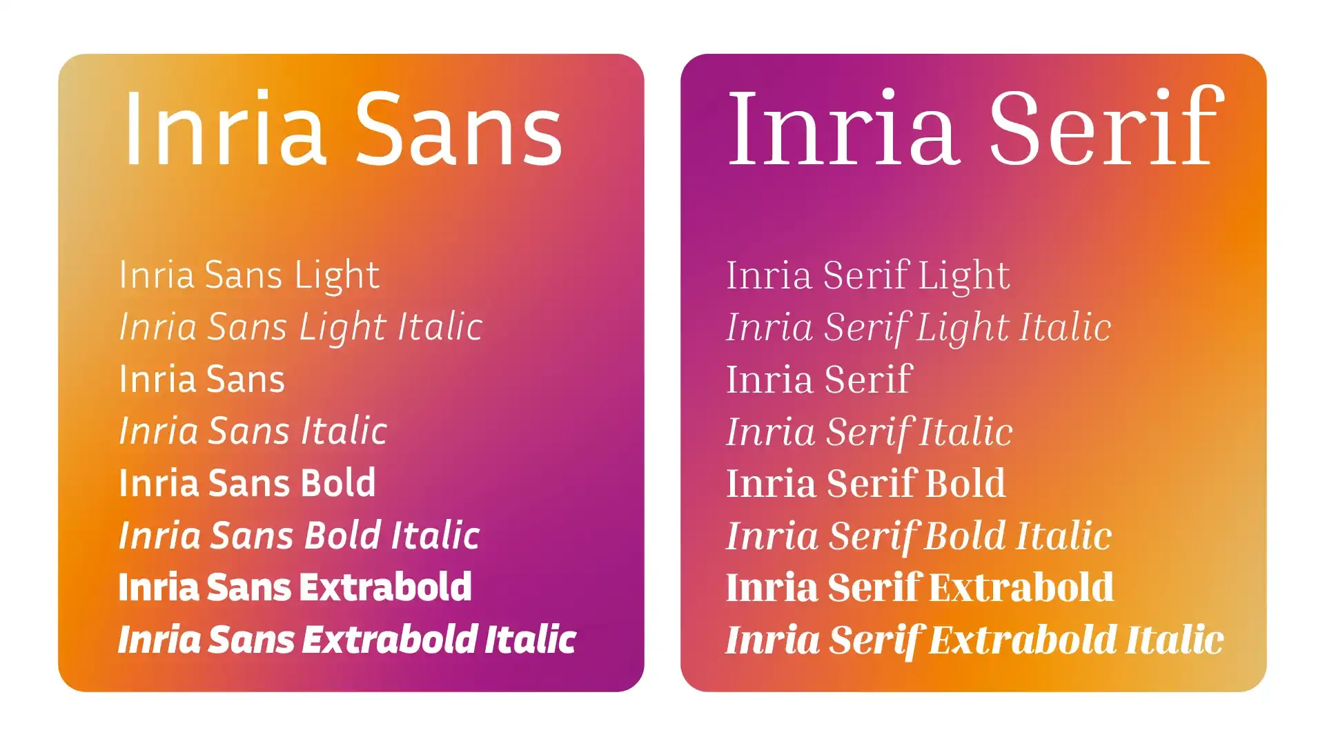
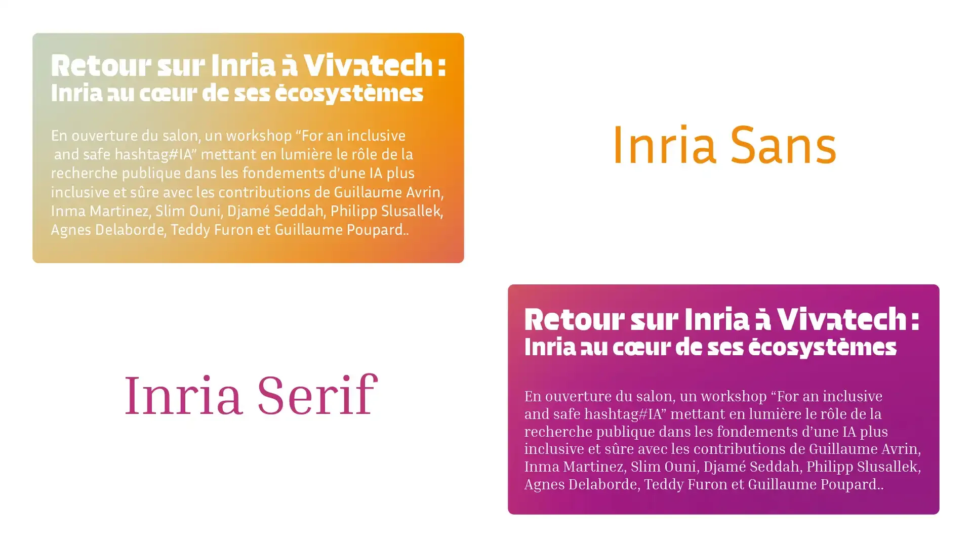
Inria, the French Institute for Research in Computer Science and Automation, while reworking their graphic identity, needed a new typeface that would have a greater visual impact, be stronger, and more recognizable. This typeface needed to represent the company's technological and avant-garde DNA, while blending well with their existing typographic system, which includes both a sans serif and a serif family.
Solution
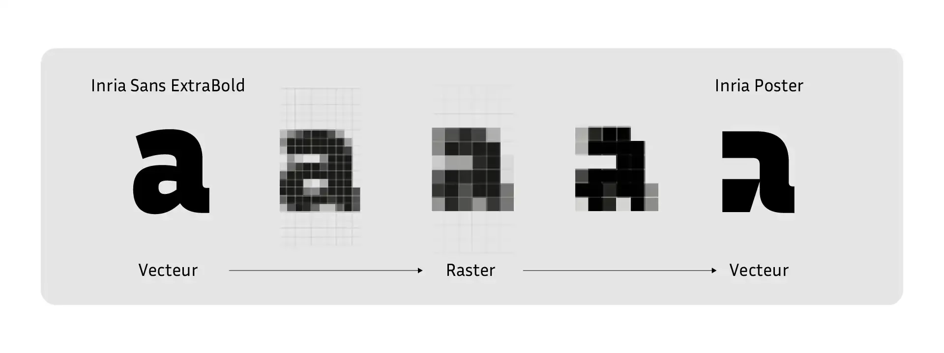
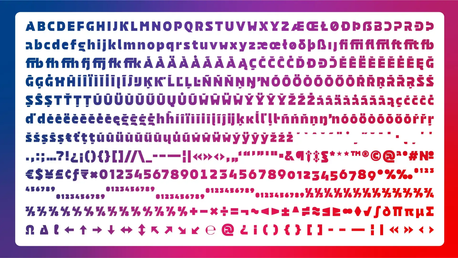
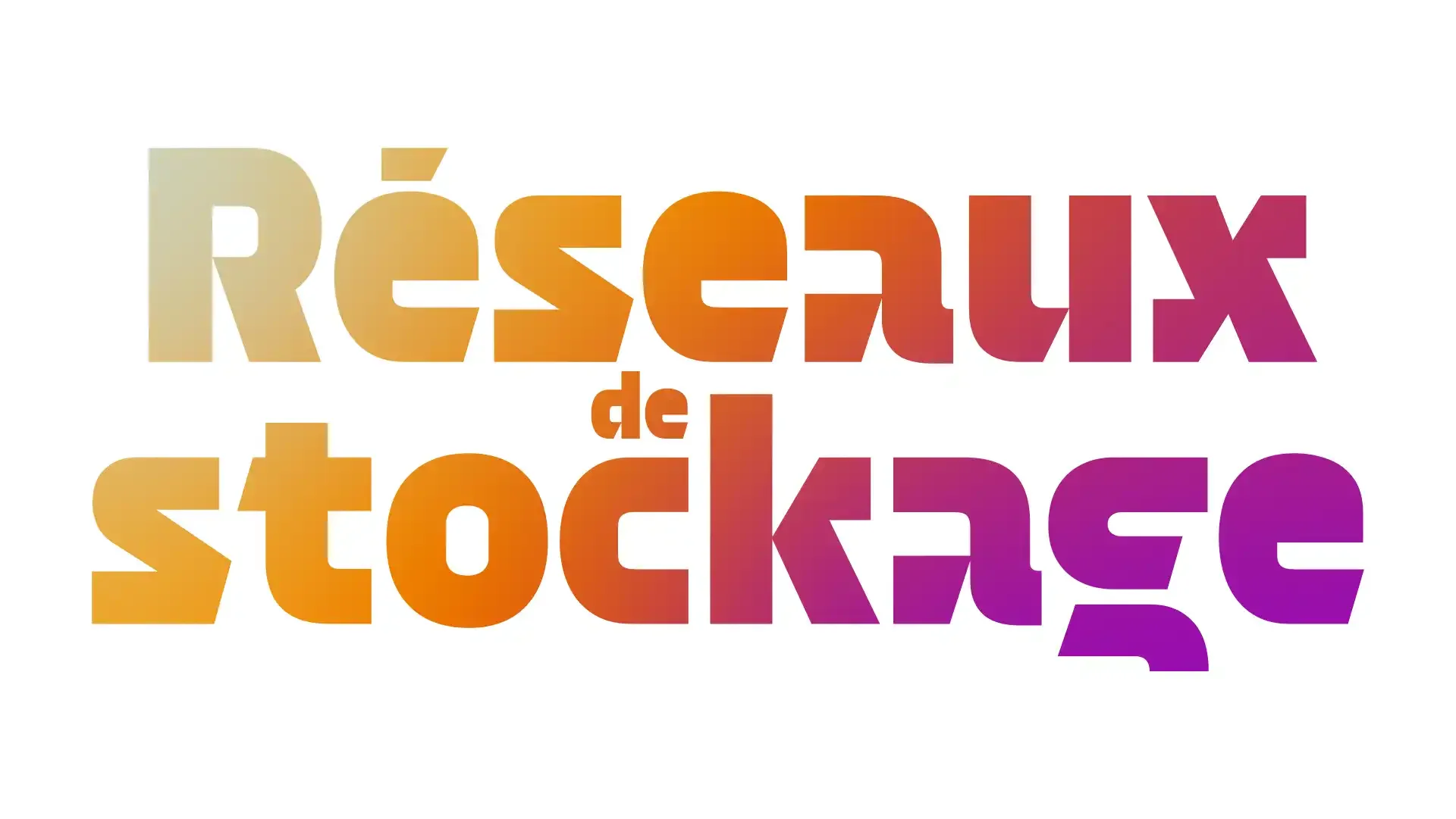
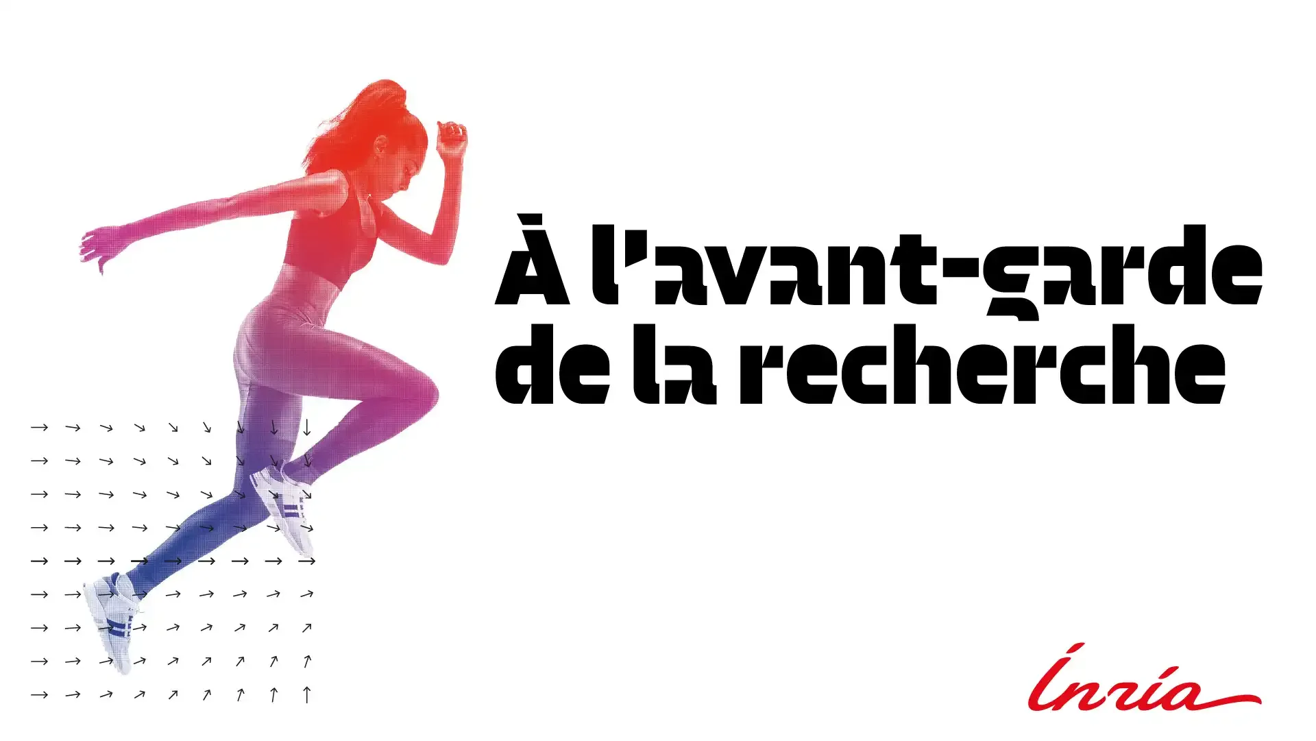
Inria is a digital research institute. We therefore decided to explore this direction by conducting a digital typographic experiment. A typeface is designed in vector format but then goes through a rasterization stage, which involves converting the drawing information into pixels. This process serves as the interface between the digital and the human. The rasterization stage can distort the letters depending on the size used; the smaller the size, the more the letters' design is modified, to the point where their shape can become abstracted. We thus went into very small sizes with the Inria Sans ExtraBold to maintain a familiar look, and we were able to extract a new graphical form language that is creative and innovative, giving life to the Inria Poster.