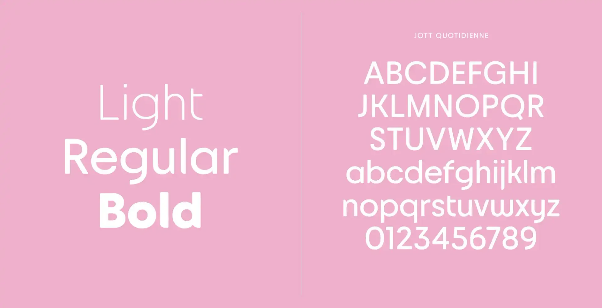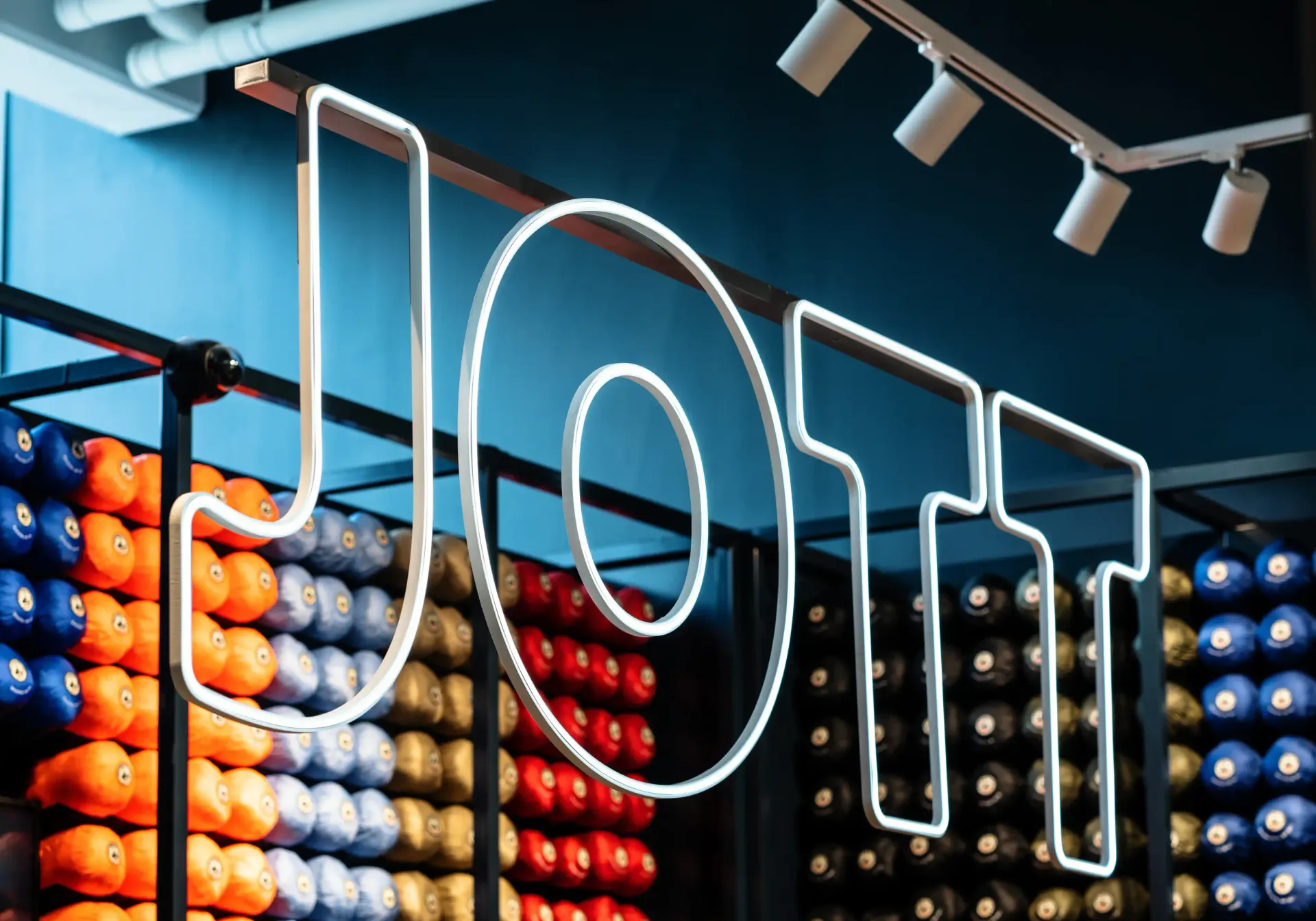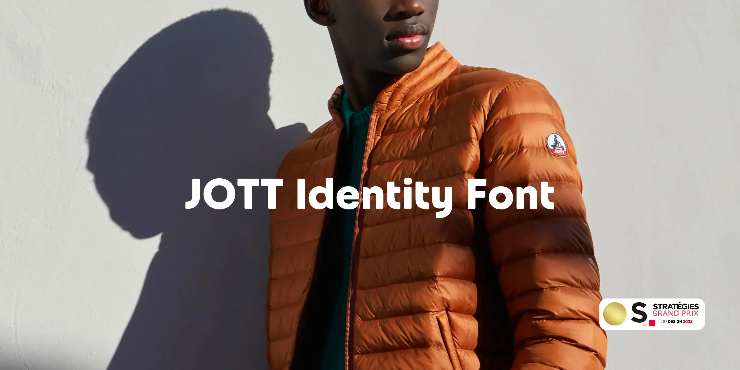
Jott identity font
Quotidienne, Inline, and Dot Fonts for everyday style.
Challenge
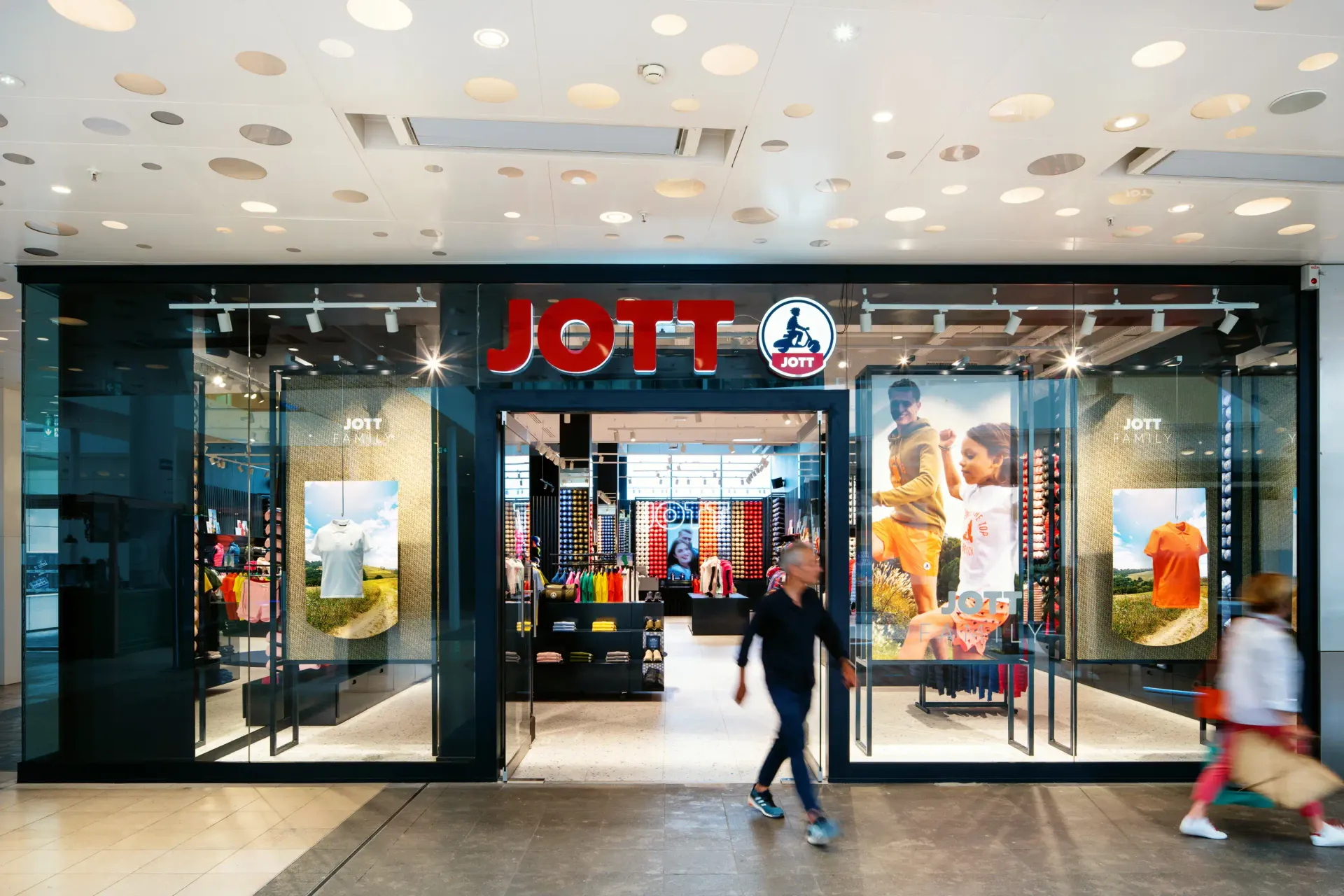
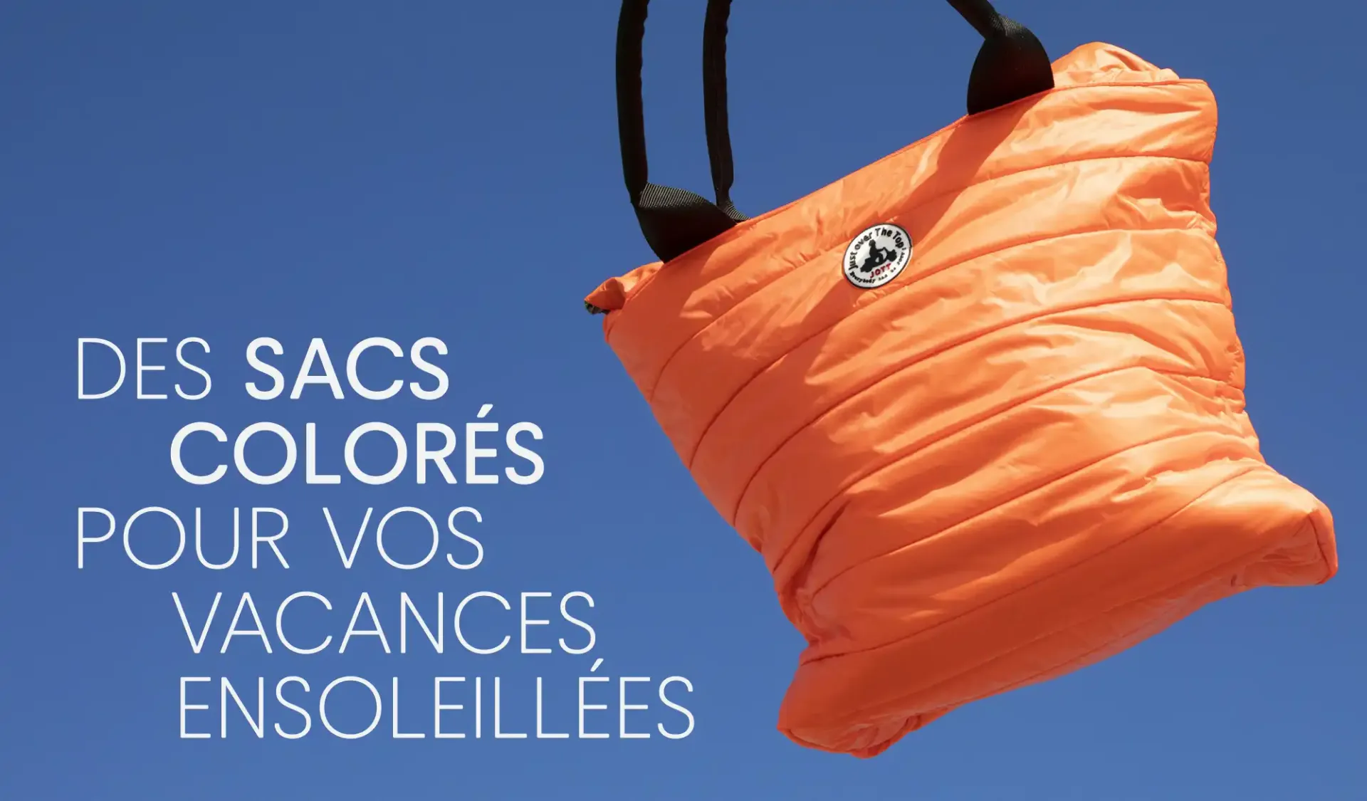
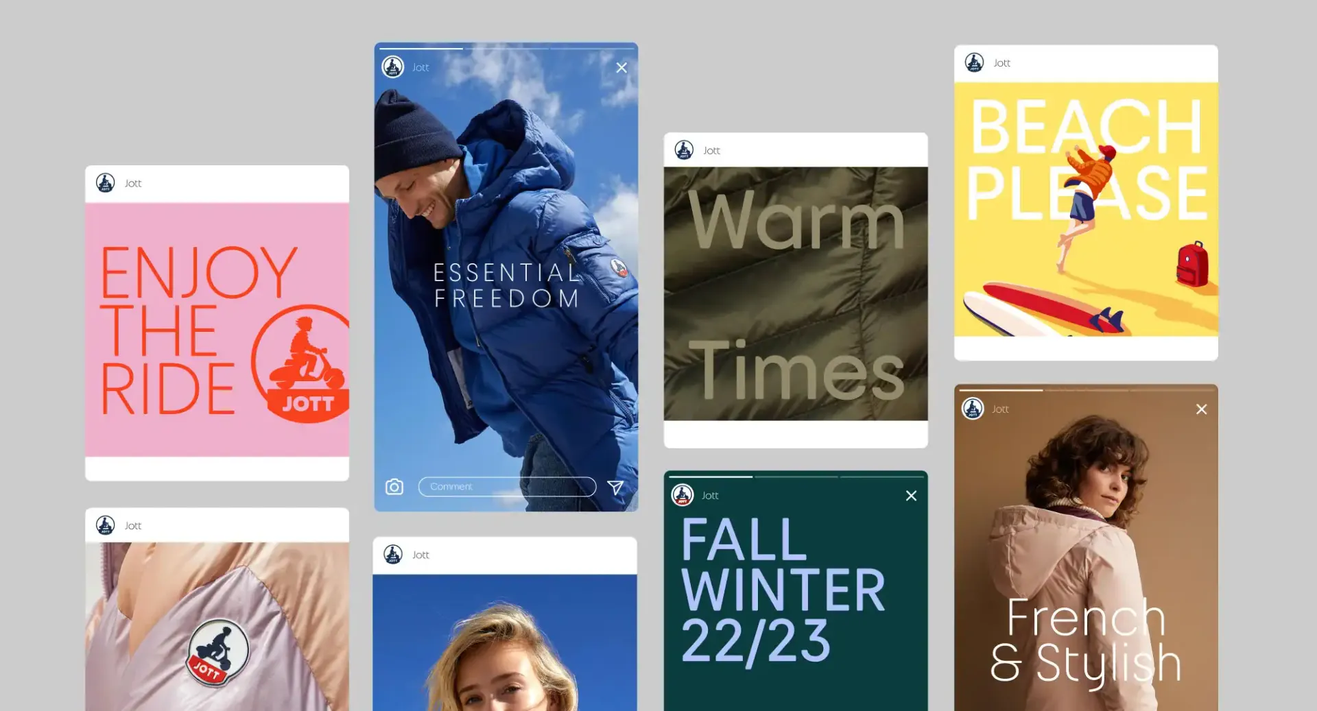
The Pixelis agency was finalising the rebranding of JOTT, the outfit brand born in Marseille, when they asked us to create a custom font to feed the singularity of the brand and to reflect South of France shining creativity. The initial brief was to combine functionality and creativity to render an everyday life style. Among the Pixellis creation were a new logo, shops and Point of Sales designs, signage, communication… Pixelis created an energetic cross-generational style, versatile, colourful, comfortable and "free to feel good". Black[Foundry]'s contribution was to create a custom typefaces perfectly integrated with the rebranding of Pixelis, on all media and speaking to everyone, joyful, versatile, life-style.
Solution
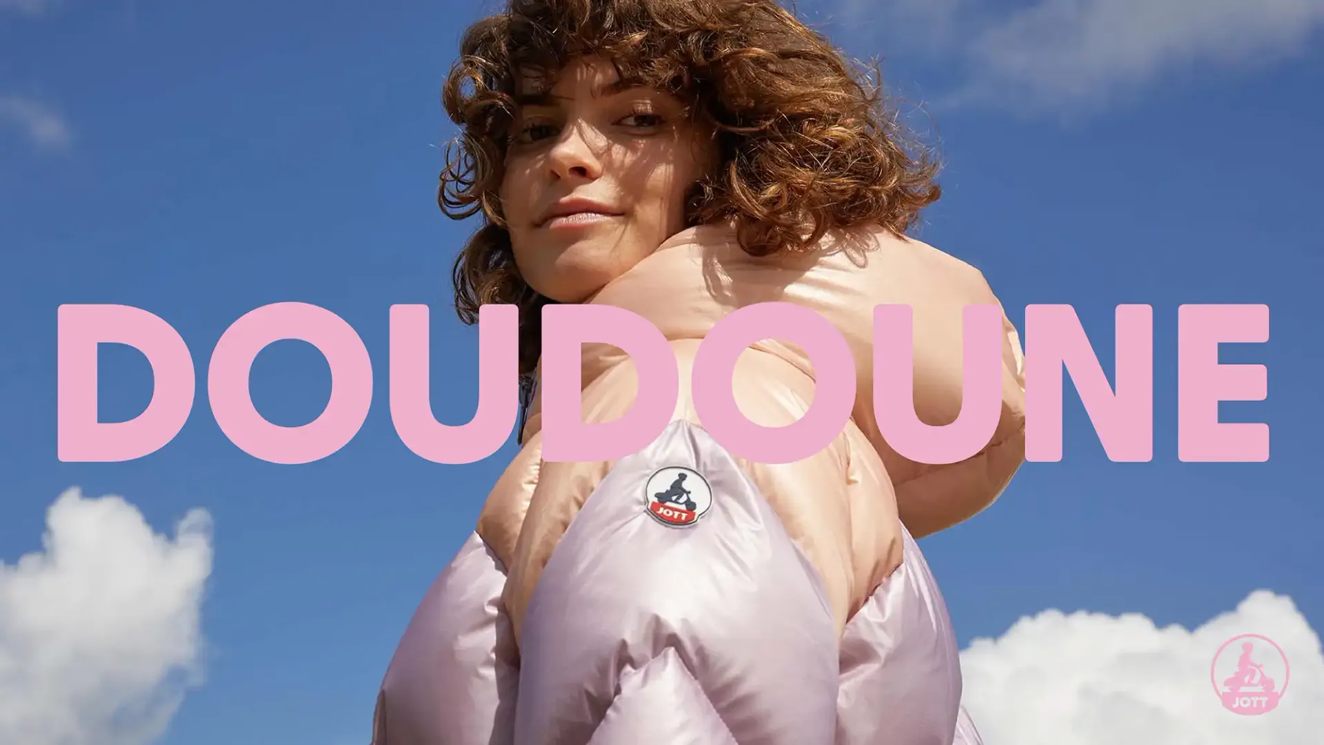
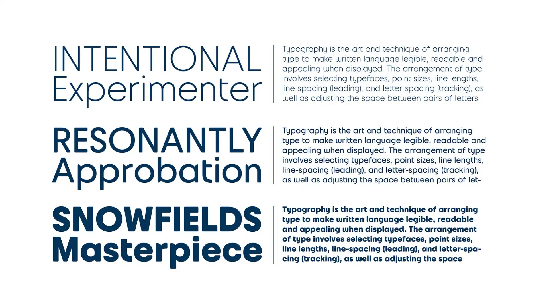
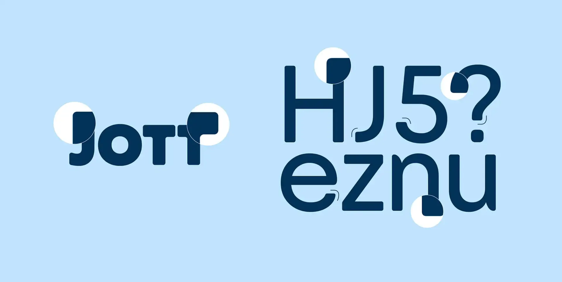
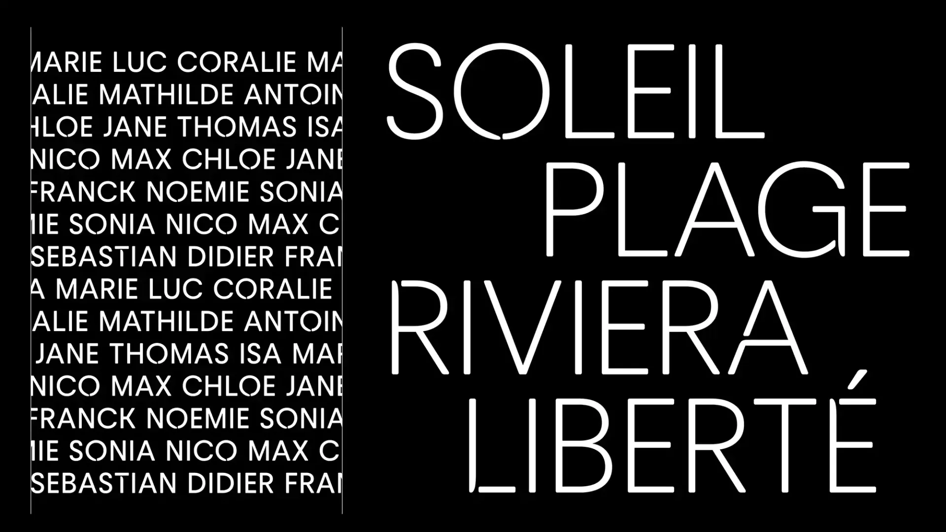
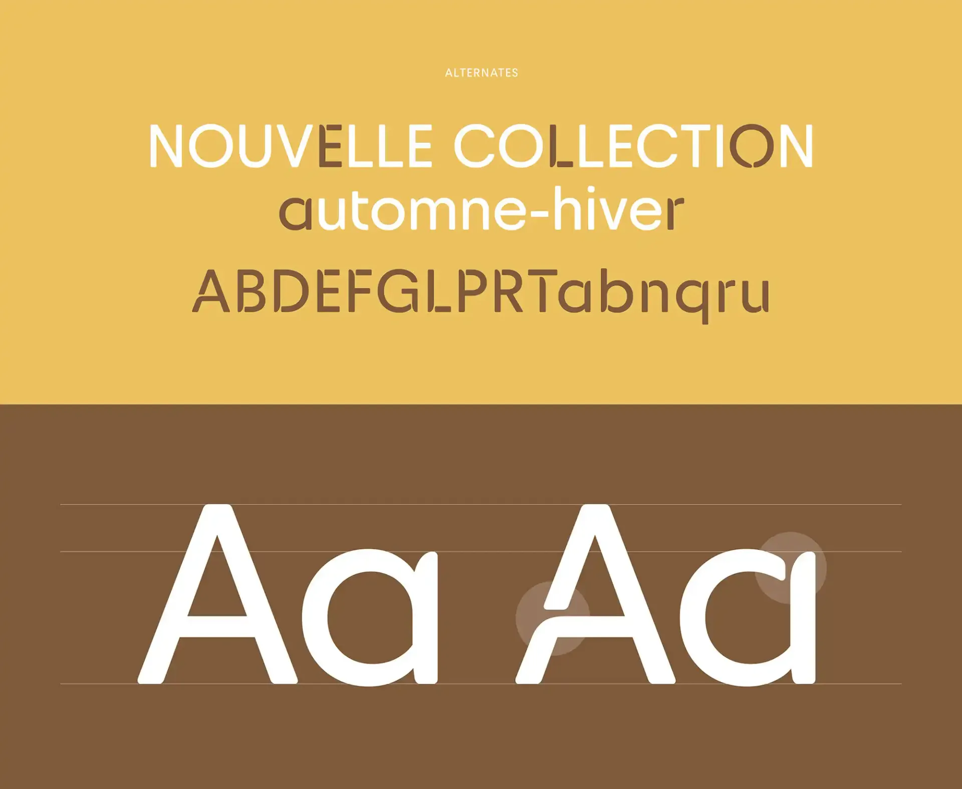
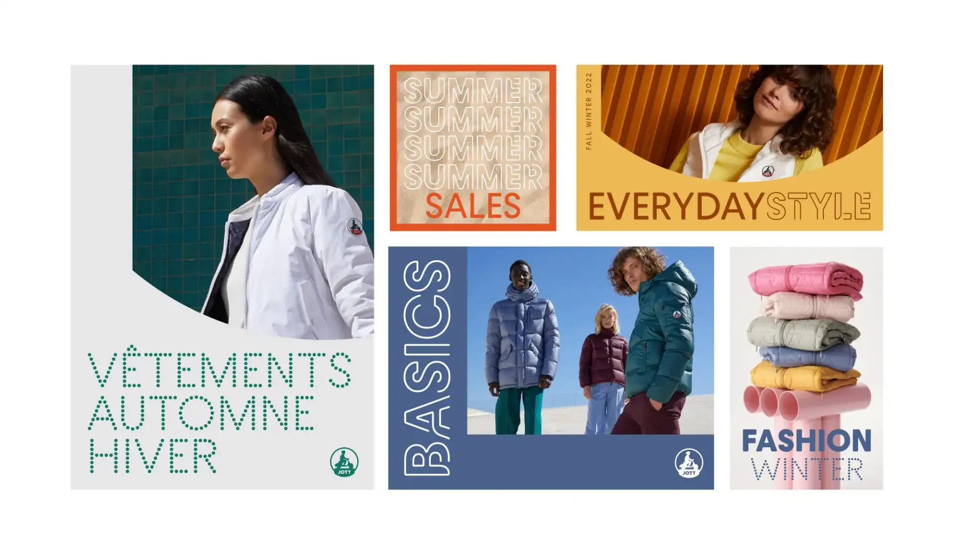
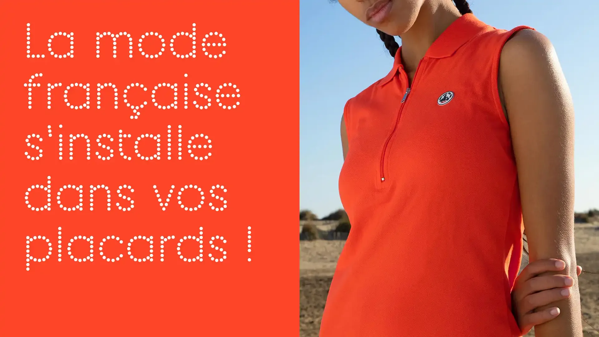
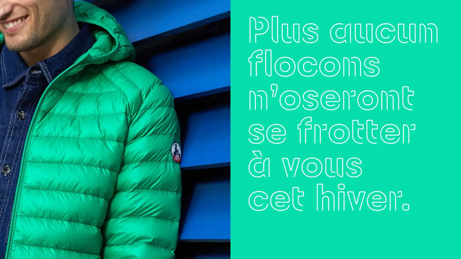
Joyful, versatile, life-style, instead of one typeface we created 3: the "Quotidienne" (for everyday usage), the "Inline", and the "Dot". That typographic palette helps maintaining consistency while providing variety and support for creativity. The main typeface is the "Quotidienne" that has 3 weights (Light, Regular, Bold) and can be used daily in the various communication and merchandising supports. The design of the logo created by Pixellis inspired the first draft of the typeface design, we used features like the notches of the character's jacket in the glyph design too.
The letterforms are slightly rounded in harmony with the curves of the logotype to bring the softness of everyday life with JOTT clothes, speaking to all generations. The letters' proportions combine wide and circular glyphs (like "D", "C" and "O") with narrow ones (such as "L", "E", "S") hinting at the original Trajan capitals model proportions, that we also injected to the lowercases.
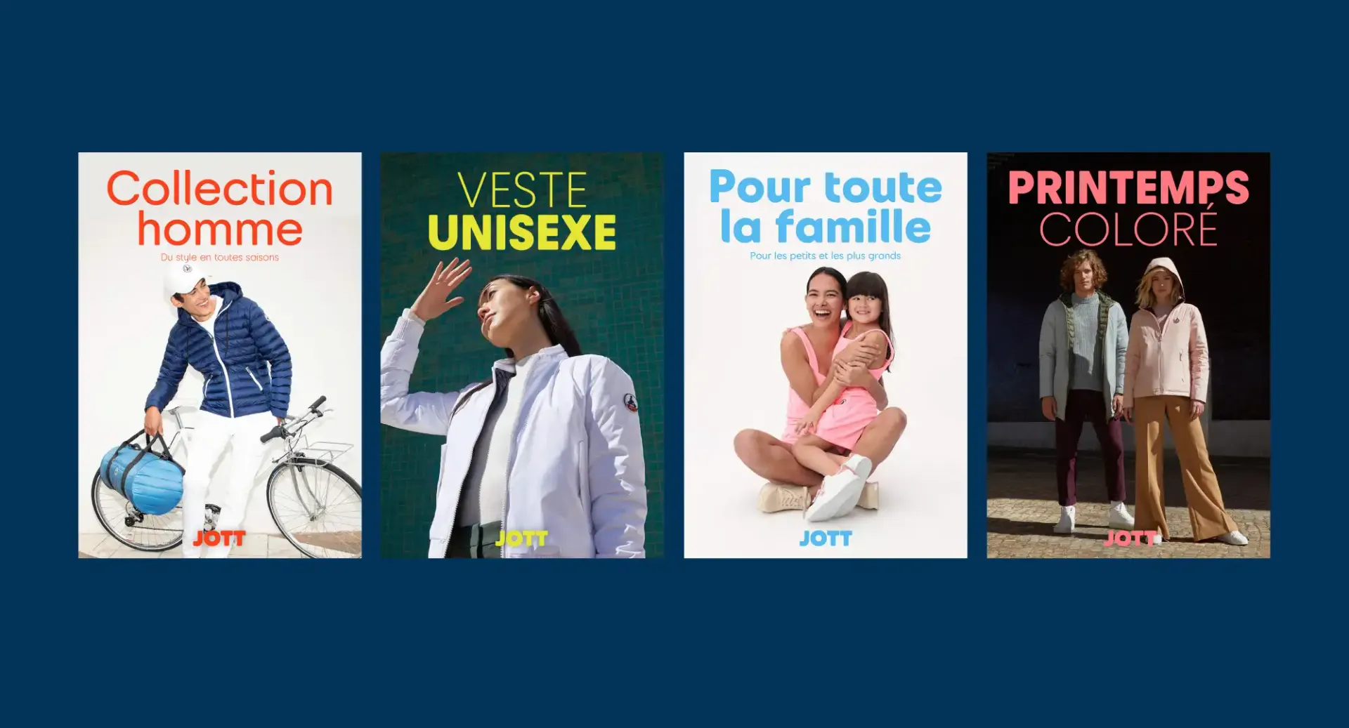
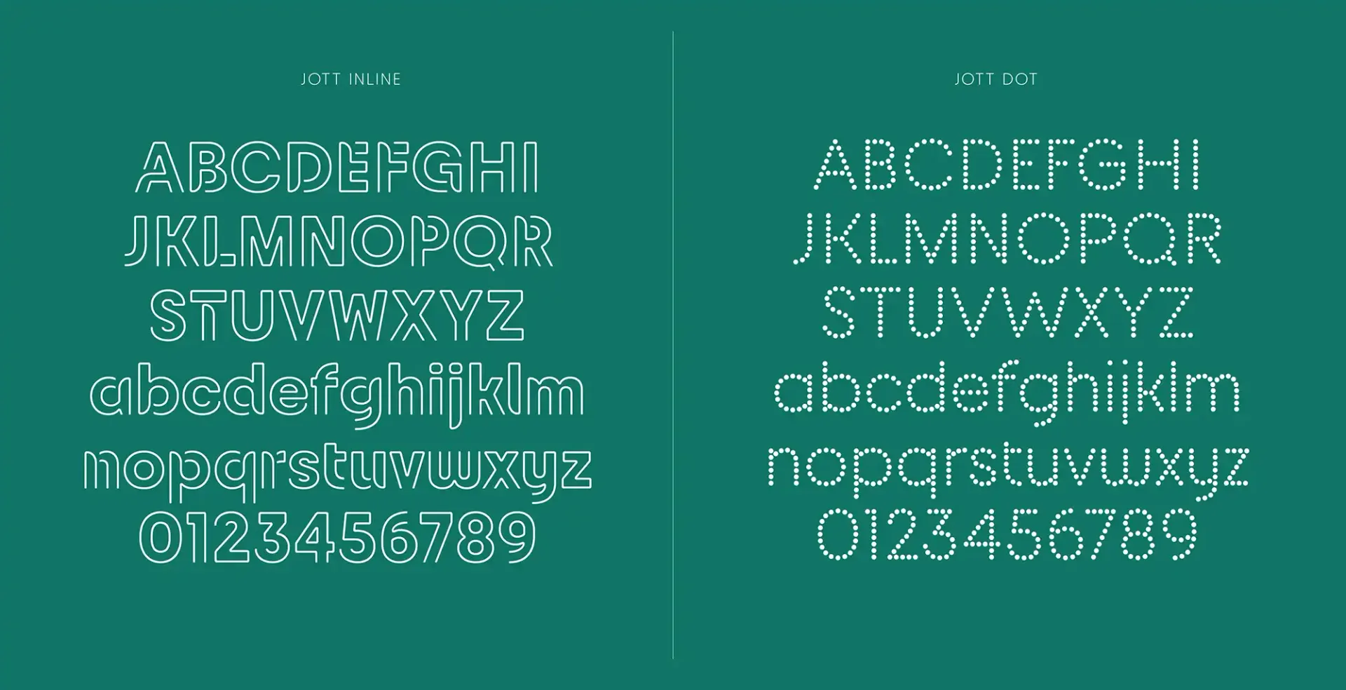
The two complementary typeface, "Inline" and "Dot" provide versatility and can respond to specific communication challenges. In harmony with main "Quotidienne" in terms of design, they enhance the energy of the brand, widening the creative possibilities.