Mobilize
Capturing Mobilize’s vision for bold, sustainable urban mobility.
Challenge
Mobilize, a new brand from the Renault group, is dedicated to urban micro-mobility, positioning itself as an iconic reference in sustainable mobility. Blending urban lifestyle with cutting-edge technology, it targets a wide audience, particularly young people, with zero-emission solutions. To establish its identity, Mobilize aims to create a unique visual symbol, paired with typography inspired by urban rhythms and tech innovation. This distinctive visual language should reflect its futuristic DNA and connection to Renault's expertise, while embodying the brand's simplicity and accessibility for the city of tomorrow.
Solution
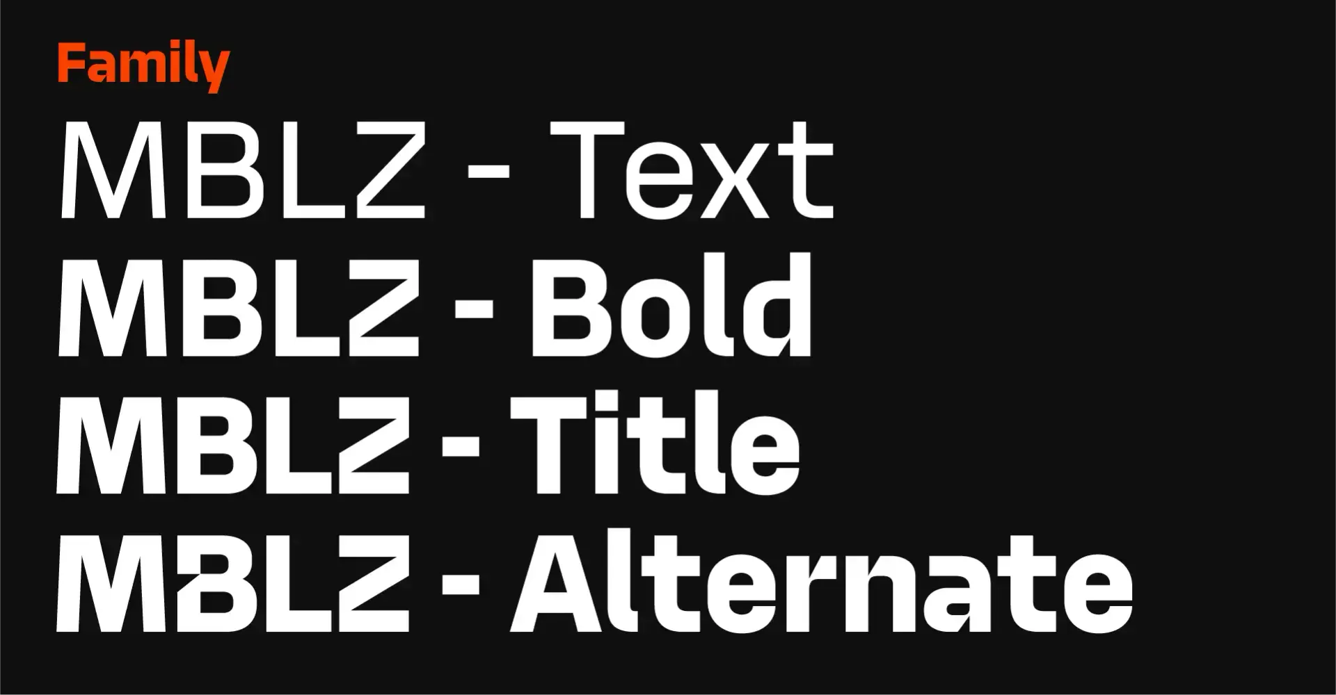
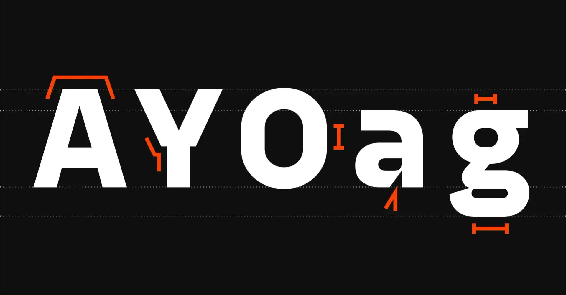
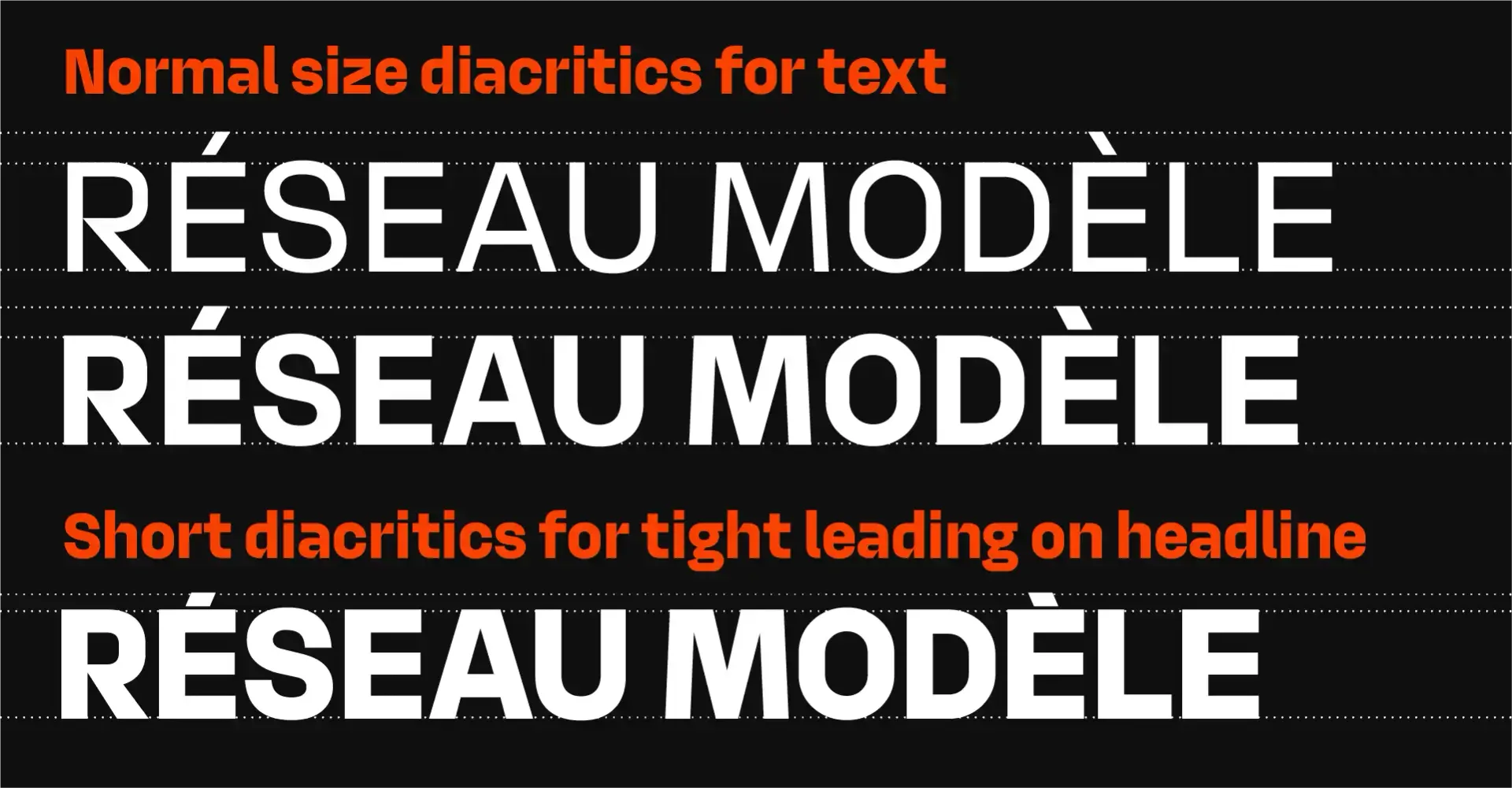
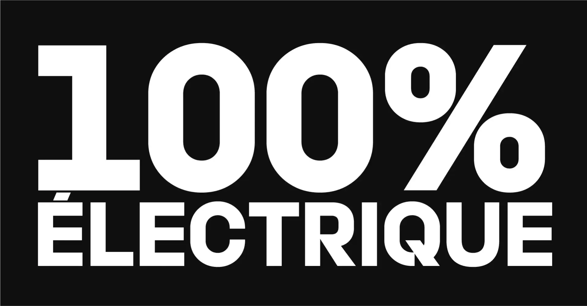
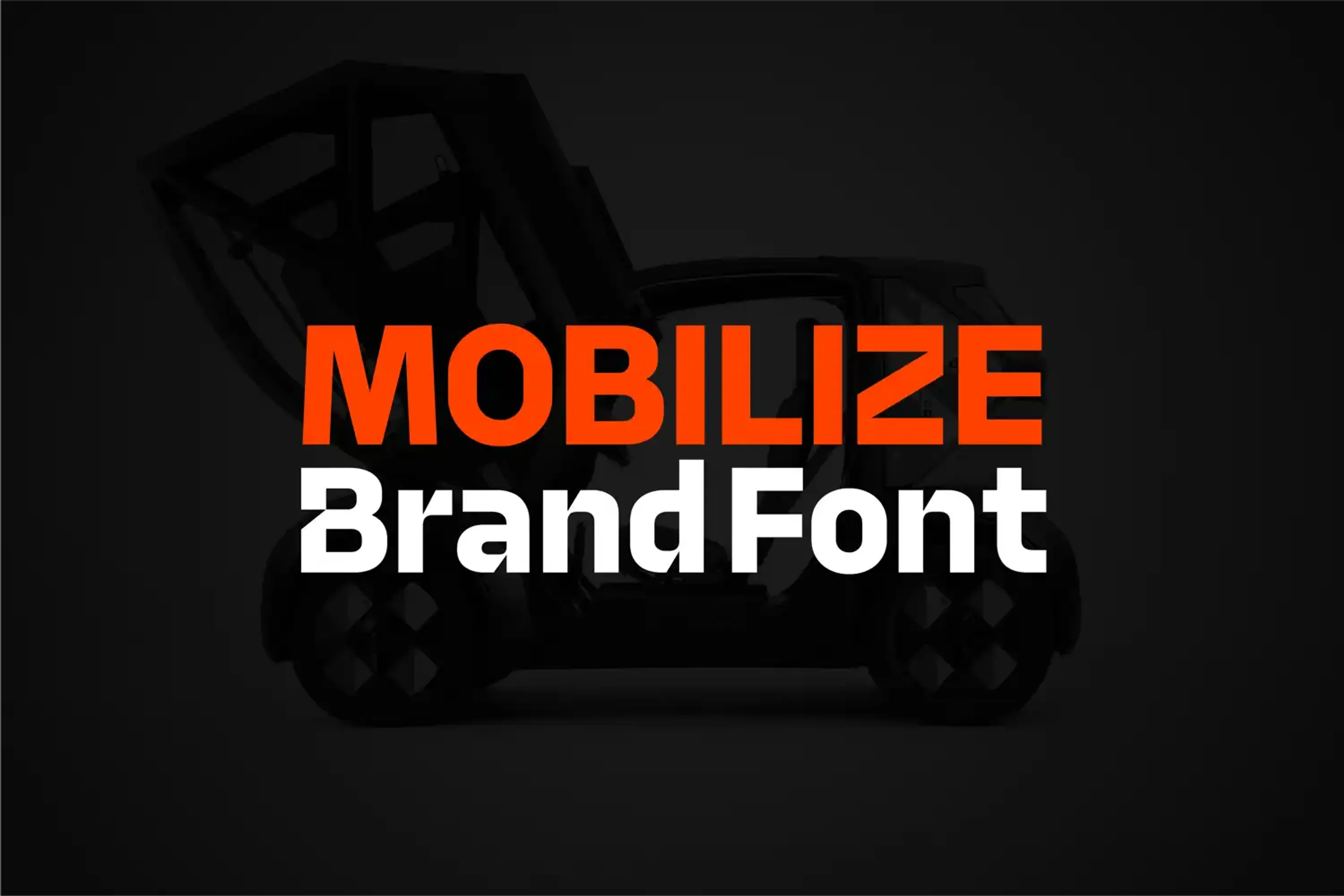
The Mobilize brand font was crafted to embody its vision of urban mobility with a modern, impactful style. Designed with bold rhythm and mechanical forms, it mirrors the energetic, tech-driven spirit of Mobilize, delivering powerful headline impact. It comes in three weights: two for text and one exclusively for headlines, allowing for maximum clarity and presence across diverse applications. It also includes alternate capital letters to distinguish car names. The headline version is designed for very tight line spacing, creating impactful title blocks. To ensure cohesion within the Renault Group, Mobilize's font integrates seamlessly through matched vertical metrics.
Additionally, a custom icon system extends the brand's visual language, harmonizing with the MBLZ font to communicate Mobilize's unique style. This integrated typographic and iconographic system strengthens the brand's identity and supports its message of dynamic, urban innovation.