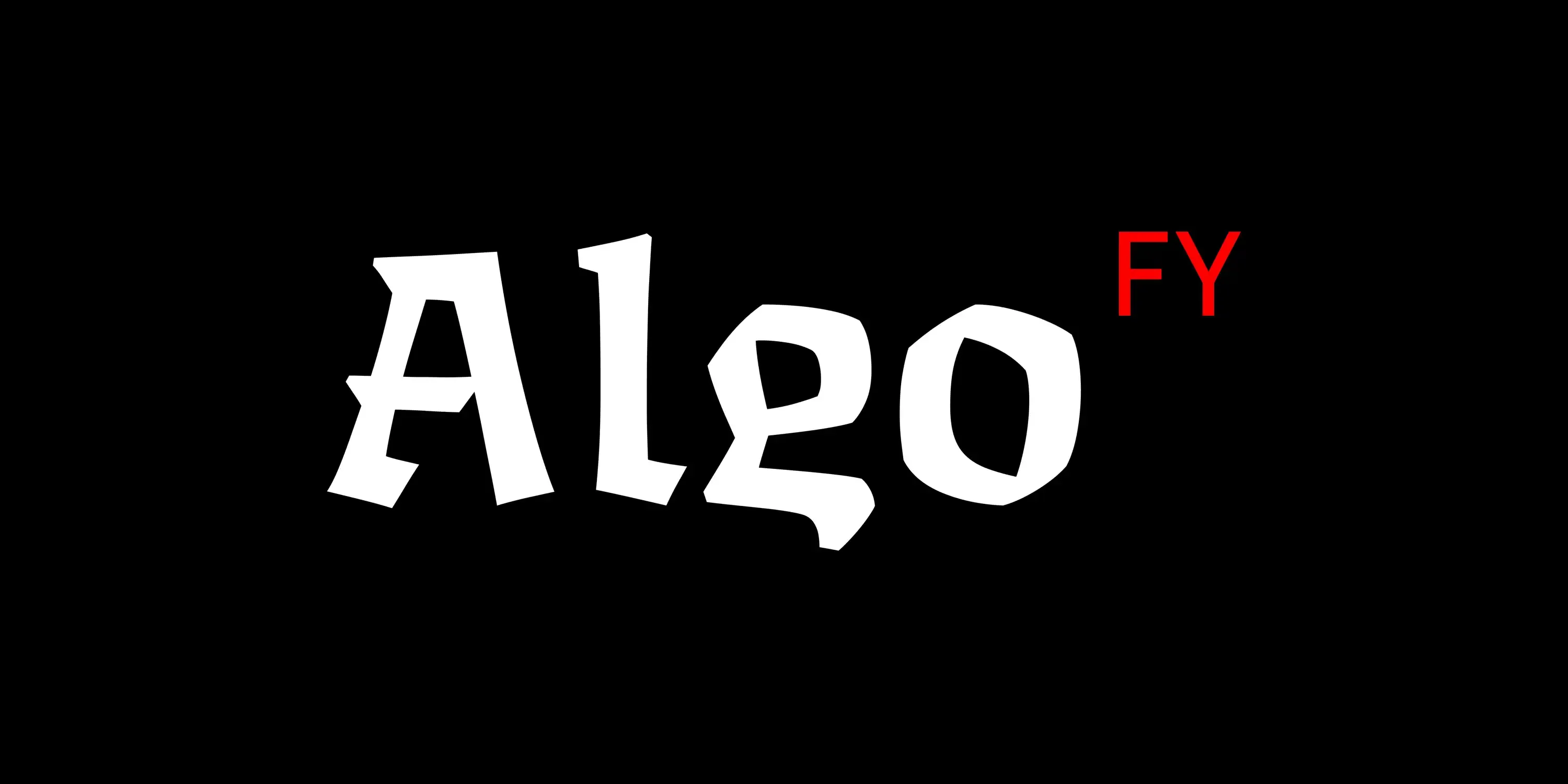
Algo FY is a blackletter-inspired display serif blending broken ductus with calligraphic forms for a bold, sculptural presence. Available in three distinct weights: sculptural, rustic, and dynamic, it features differentiated in- and out-strokes along with alternating concave and convex curves, giving it a spontaneous, unpredictable rhythm. With an antique, mystical aura, it’s perfect for fantasy or medieval themes. Seen in use for Fantasy Zombicide games titles, cards, manuals, and logo.
?704a)
?a34f)
?3b8e)
?9e56)
With a simple tool, ancient hands carved the beginning of all written language.
In Gothic calligraphy, ductus is the set of rules governing the angular, broken strokes characteristic of the script. The ductus of Gothic scripts emphasizes sharp transitions and consistent stroke weight, creating the distinct, dense texture associated with medieval manuscripts.
We notice type most when it's wrong. When something feels off. The spacing's tight, the voice is too loud, or it just doesn't match what's being said. But when the type is right, it gets out of the way — and helps the words do their job. It can give structure to ideas. It makes space for meaning. Typography isn't just about style. It's about the way we take in information. It adds rhythm to the reading experience. It tells us where to look first and what matters most. It makes content easier to follow, and in some cases, easier to trust. The tone comes through in the details — the shape of the letters, how they're spaced, the way one form leads to the next. Some typefaces feel quiet and careful. Others have energy. Some pull you in. Some stay out of the way. Choosing the right one is less about picking a look and more about finding a voice that fits what you want to say.That's why trying type in context matters. It's one thing to see a beautiful letter or a well-set specimen — but it's another thing to see how it handles your content. How it behaves when it's small. How it reads when it's big. How it feels with your own words.That's what this space is for. Try a headline. Paste a paragraph. Adjust the size, change the weight, type something unexpected. Some typefaces are built to be expressive. Others are made to stay flexible. The best ones hold up in all kinds of situations. They do the job without losing their character. Take a minute to experiment. You'll know when it feels right.
AaBbCcDdEeFfGgHhIiJjKkLlMmNnOoPpQqRrSsTtUuVvWwXxYyZz
Buy Algo
1. Select Style
| Algo Superfamily 3 styles, 1 variable font included for FREE! $95.99
Save 23% |
|---|
| Algo Family Styles included • Light • Regular • Black $77.99 |
|---|
2. Select License
Your selection
Subtotal
$0.00
State and local taxes may apply.
Please select fonts and licenses.
Please select at least one license.
Please select some fonts.
Name
Description
$0.00
latin capital letter a U+0041
A
Uppercase Letter Latin
Uppercase Letter Greek
Lowercase Letter Latin
Lowercase Letter
Modifier Letter
Other Letter Latin
Nonspacing Mark Inherited
Decimal Number
Other Number
Connector Punctuation
Dash Punctuation
Close Punctuation
Final Punctuation
Initial Punctuation
Other Punctuation
Open Punctuation
Currency Symbol
Modifier Symbol
Math Symbol
Other Symbol
Ligatures
Stylistic Set 1
Stylistic Set 2
Stylistic Set 3
Stylistic Set 4
Stylistic Set 5
Fractions
Lining Figures
Oldstyle Figures
Tabular Figures
Proportional Figures
Slashed Zero
Ordinals
Scientific Inferiors
Superscript
Subscript
Numerators
Denominators
Case-Sensitive Forms
Credits & Details
Designed by
Black Foundry Designers
Language Support
Language Support
- Catalan
- Croatian
- Czech
- Danish
- Dutch
- English
- Filipino
- Finnish
- French
- Fula
- German
- Hungarian
- Indonesian
- Italian
- Latvian
- Malay
- Maltese
- Norwegian
- Polish
- Portuguese
- Romanian
- Slovak
- Slovenian
- Spanish
- Swedish
- Turkish
Features
OpenType Features
- Common Ligatures
- Fractions
- Lining Numerals
- Old Style Numerals
- Ordinal Numerals
- Proportional Numerals
- Slashed Zero
- Stylistic Sets
- Subscript
- Superscript
- Tabular Numerals