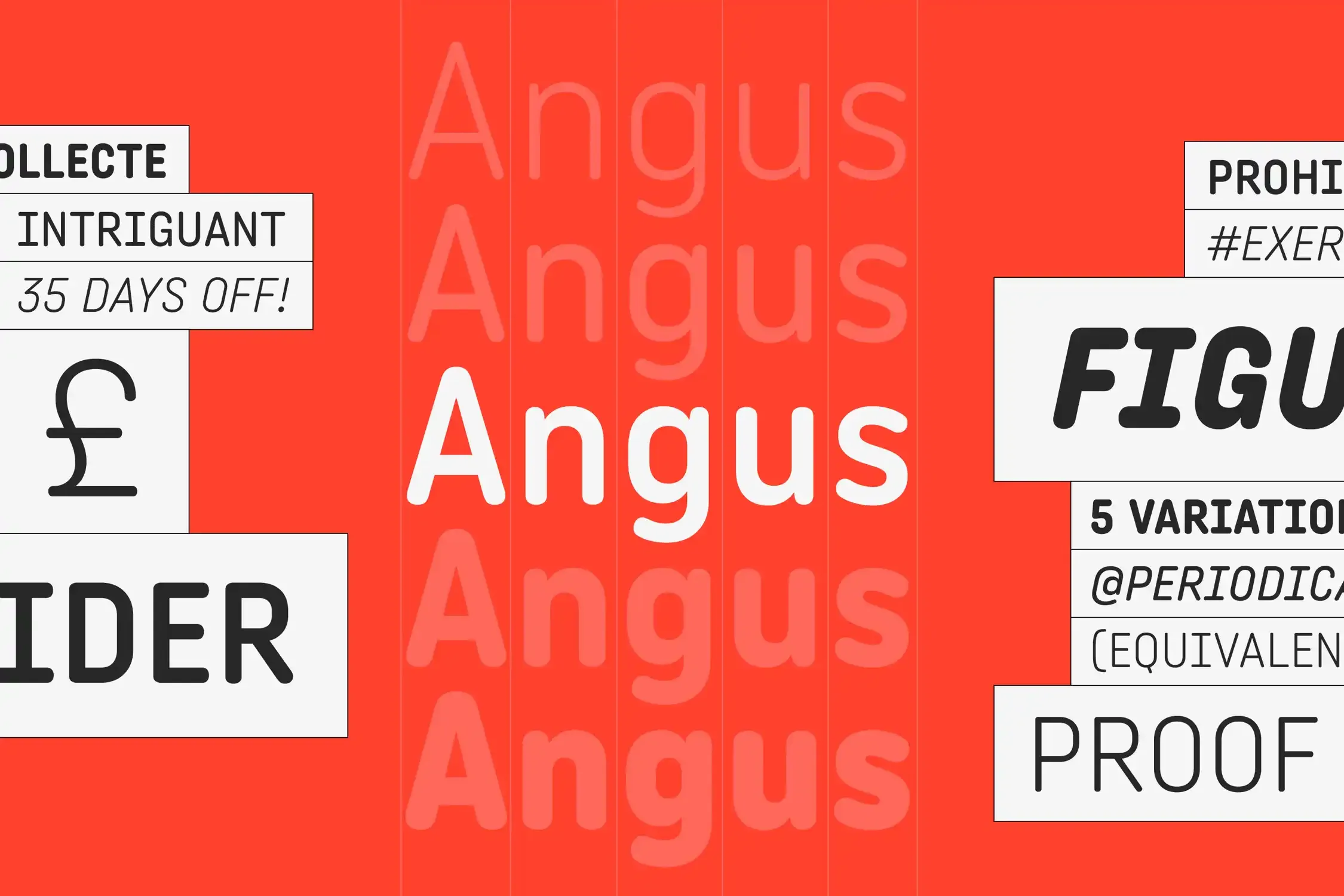
Angus is a rounded sans serif font family balancing softness and straightness with condensed proportions and a monospaced look. Multiplexed widths remain the same across styles, enabling typographic shifts without text reflow and giving each weight a distinct voice. With a cheerful look making it joyfully approachable, it suits entertainment, packaging, websites, and information graphics. Available in five weights from Light to Extra Bold and matching italics.
?0c92)
?f569)
?6dd3)
?b9ed)
?ad14)
?28be)
The jellybeans were multiplexed into a kaleidoscope of flavors.
Roundness is a curious thing, an echo of perfection in a world filled with angles and edges. It's the shape that invites touch, the curve that promises comfort. Imagine the soft embrace of a round pillow, perfectly shaped to cradle your weary head, or the warm, inviting glow of a round lantern casting its gentle light across a darkened room.
We notice type most when it's wrong. When something feels off. The spacing's tight, the voice is too loud, or it just doesn't match what's being said. But when the type is right, it gets out of the way — and helps the words do their job. It can give structure to ideas. It makes space for meaning. Typography isn't just about style. It's about the way we take in information. It adds rhythm to the reading experience. It tells us where to look first and what matters most. It makes content easier to follow, and in some cases, easier to trust. The tone comes through in the details — the shape of the letters, how they're spaced, the way one form leads to the next. Some typefaces feel quiet and careful. Others have energy. Some pull you in. Some stay out of the way. Choosing the right one is less about picking a look and more about finding a voice that fits what you want to say.That's why trying type in context matters. It's one thing to see a beautiful letter or a well-set specimen — but it's another thing to see how it handles your content. How it behaves when it's small. How it reads when it's big. How it feels with your own words.That's what this space is for. Try a headline. Paste a paragraph. Adjust the size, change the weight, type something unexpected. Some typefaces are built to be expressive. Others are made to stay flexible. The best ones hold up in all kinds of situations. They do the job without losing their character. Take a minute to experiment. You'll know when it feels right.
AaBbCcDdEeFfGgHhIiJjKkLlMmNnOoPpQqRrSsTtUuVvWwXxYyZz
ABCDEFGHIJKLMNOPQRSTUVWXYZ
abcdefghijklmnopqrstuvwxyz
0123456789
.,;:!?"'()[]{}<>
&¶†‡§*™®©@ªº#№€$¥£¢₡₮₴₺₹₫₩₪₭₱₵₸₼₽¤+−×÷=¬~<>±^≠≈≤≥∞◊√∫∂∏∑∆ℓ
The jellybeans were multiplexed into a kaleidoscope of flavors.
Roundness is a curious thing, an echo of perfection in a world filled with angles and edges. It's the shape that invites touch, the curve that promises comfort. Imagine the soft embrace of a round pillow, perfectly shaped to cradle your weary head, or the warm, inviting glow of a round lantern casting its gentle light across a darkened room.
We notice type most when it's wrong. When something feels off. The spacing's tight, the voice is too loud, or it just doesn't match what's being said. But when the type is right, it gets out of the way — and helps the words do their job. It can give structure to ideas. It makes space for meaning. Typography isn't just about style. It's about the way we take in information. It adds rhythm to the reading experience. It tells us where to look first and what matters most. It makes content easier to follow, and in some cases, easier to trust. The tone comes through in the details — the shape of the letters, how they're spaced, the way one form leads to the next. Some typefaces feel quiet and careful. Others have energy. Some pull you in. Some stay out of the way. Choosing the right one is less about picking a look and more about finding a voice that fits what you want to say.That's why trying type in context matters. It's one thing to see a beautiful letter or a well-set specimen — but it's another thing to see how it handles your content. How it behaves when it's small. How it reads when it's big. How it feels with your own words.That's what this space is for. Try a headline. Paste a paragraph. Adjust the size, change the weight, type something unexpected. Some typefaces are built to be expressive. Others are made to stay flexible. The best ones hold up in all kinds of situations. They do the job without losing their character. Take a minute to experiment. You'll know when it feels right.
Name
Description
$0.00
latin capital letter a U+0041
A
Uppercase Letter Latin
Uppercase Letter Greek
Lowercase Letter Latin
Lowercase Letter
Modifier Letter
Other Letter Latin
Decimal Number
Other Number
Connector Punctuation
Dash Punctuation
Close Punctuation
Final Punctuation
Initial Punctuation
Other Punctuation
Open Punctuation
Currency Symbol
Modifier Symbol
Math Symbol
Other Symbol
Ligatures
Stylistic Set 1
Stylistic Set 2
Fractions
Oldstyle Figures
Tabular Figures
Ordinals
Scientific Inferiors
Superscript
Subscript
Numerators
Denominators
Case-Sensitive Forms
Credits & Details
Designed by
Black Foundry Designers
Language Support
Language Support
- Catalan
- Croatian
- Czech
- Danish
- Dutch
- English
- Filipino
- Finnish
- French
- Fula
- German
- Hungarian
- Indonesian
- Italian
- Latvian
- Malay
- Maltese
- Norwegian
- Polish
- Portuguese
- Romanian
- Slovak
- Slovenian
- Spanish
- Swedish
- Turkish
Features
OpenType Features
- Common Ligatures
- Fractions
- Lining Numerals
- Old Style Numerals
- Ordinal Numerals
- Proportional Numerals
- Stylistic Sets
- Subscript
- Superscript
- Tabular Numerals