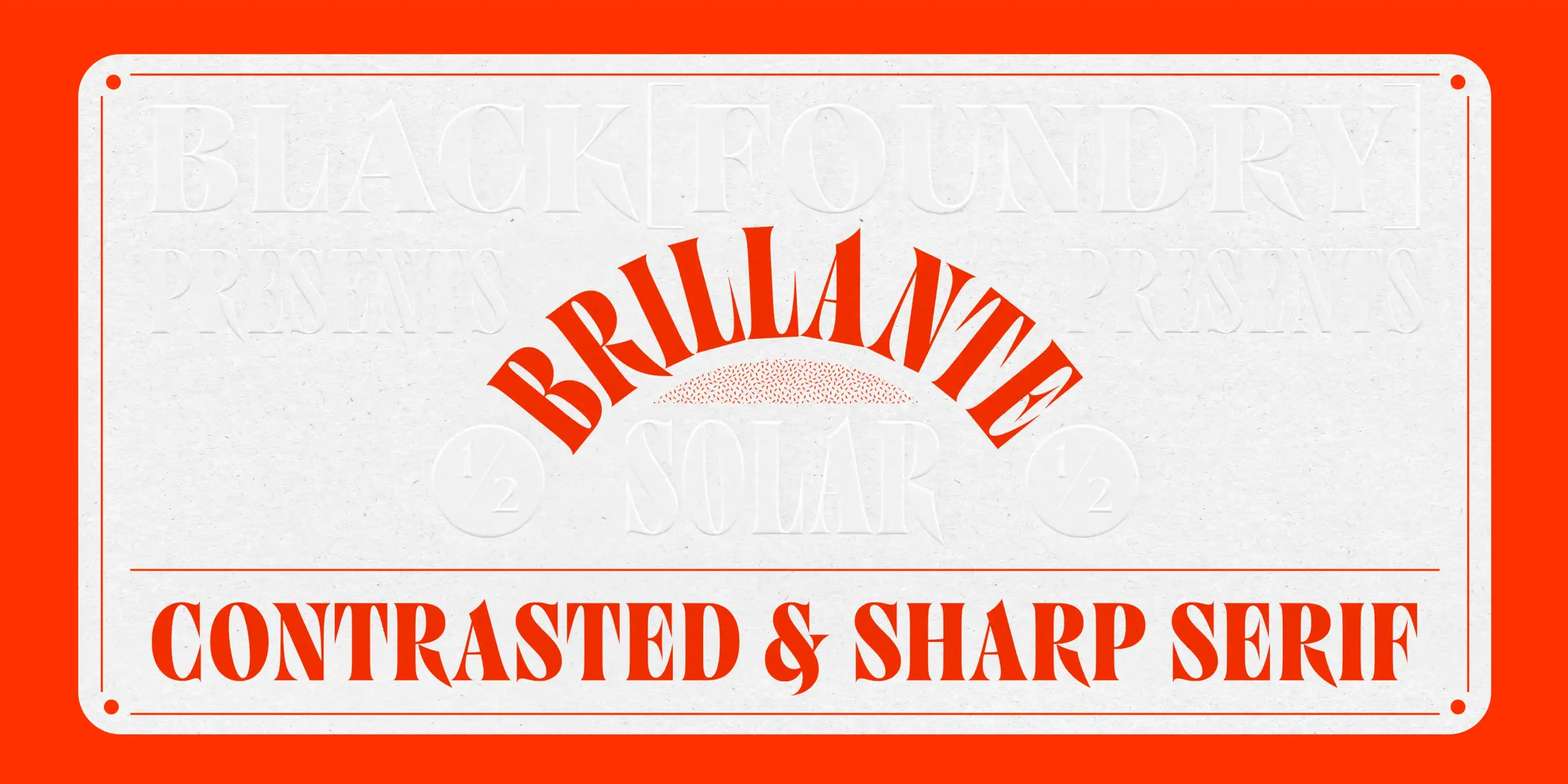
Brillante is a meticulously crafted high-contrast serif designed to shine in fashion, luxury, and jewelry. Distinctive details such as spiked V and W, thorn-like K and R, sharpened accents, and short serifs give it smart elegance. Tailor-made for titles, branding, editorial, and packaging, Brillante captures sparkle with sophistication. With 15 fonts spanning Thin to Black in Condensed, Normal, and Wide widths, plus a two-axis variable format, it offers exceptional versatility.
?e72a)
?2725)
?fdf0)
?476b)
?a520)
?2d40)
?0808)
?b574)
?b393)
?e575)
Sparkling with unparalleled luxury
The luxurious penthouse showcased its opulence through a stunning chandelier adorned with intricate crystal spikes. Each spike was expertly crafted to catch and refract light, creating a dazzling display of colors that danced across the room. The chandelier's radiant brilliance added a layer of grandeur to the space, complementing the elegant furnishings and rich textures. This striking centerpiece not only illuminated the room but also embodied the epitome of refined luxury, transforming the penthouse into a haven of sophistication and style.
We notice type most when it's wrong. When something feels off. The spacing's tight, the voice is too loud, or it just doesn't match what's being said. But when the type is right, it gets out of the way — and helps the words do their job. It can give structure to ideas. It makes space for meaning. Typography isn't just about style. It's about the way we take in information. It adds rhythm to the reading experience. It tells us where to look first and what matters most. It makes content easier to follow, and in some cases, easier to trust. The tone comes through in the details — the shape of the letters, how they're spaced, the way one form leads to the next. Some typefaces feel quiet and careful. Others have energy. Some pull you in. Some stay out of the way. Choosing the right one is less about picking a look and more about finding a voice that fits what you want to say.That's why trying type in context matters. It's one thing to see a beautiful letter or a well-set specimen — but it's another thing to see how it handles your content. How it behaves when it's small. How it reads when it's big. How it feels with your own words.That's what this space is for. Try a headline. Paste a paragraph. Adjust the size, change the weight, type something unexpected. Some typefaces are built to be expressive. Others are made to stay flexible. The best ones hold up in all kinds of situations. They do the job without losing their character. Take a minute to experiment. You'll know when it feels right.
AaBbCcDdEeFfGgHhIiJjKkLlMmNnOoPpQqRrSsTtUuVvWwXxYyZz
ABCDEFGHIJKLMNOPQRSTUVWXYZ
abcdefghijklmnopqrstuvwxyz
0123456789
.,;:!?"'()[]{}<>
&¶†‡§*™®©@ªº#№€$¥£¢₡₮₴₺₹₫₩₪₭₱₵₸₼₽¤+−×÷=¬~<>±^≠≈≤≥∞◊√∫∂∏∑∆ℓ
Sparkling with unparalleled luxury
The luxurious penthouse showcased its opulence through a stunning chandelier adorned with intricate crystal spikes. Each spike was expertly crafted to catch and refract light, creating a dazzling display of colors that danced across the room. The chandelier's radiant brilliance added a layer of grandeur to the space, complementing the elegant furnishings and rich textures. This striking centerpiece not only illuminated the room but also embodied the epitome of refined luxury, transforming the penthouse into a haven of sophistication and style.
We notice type most when it's wrong. When something feels off. The spacing's tight, the voice is too loud, or it just doesn't match what's being said. But when the type is right, it gets out of the way — and helps the words do their job. It can give structure to ideas. It makes space for meaning. Typography isn't just about style. It's about the way we take in information. It adds rhythm to the reading experience. It tells us where to look first and what matters most. It makes content easier to follow, and in some cases, easier to trust. The tone comes through in the details — the shape of the letters, how they're spaced, the way one form leads to the next. Some typefaces feel quiet and careful. Others have energy. Some pull you in. Some stay out of the way. Choosing the right one is less about picking a look and more about finding a voice that fits what you want to say.That's why trying type in context matters. It's one thing to see a beautiful letter or a well-set specimen — but it's another thing to see how it handles your content. How it behaves when it's small. How it reads when it's big. How it feels with your own words.That's what this space is for. Try a headline. Paste a paragraph. Adjust the size, change the weight, type something unexpected. Some typefaces are built to be expressive. Others are made to stay flexible. The best ones hold up in all kinds of situations. They do the job without losing their character. Take a minute to experiment. You'll know when it feels right.
AaBbCcDdEeFfGgHhIiJjKkLlMmNnOoPpQqRrSsTtUuVvWwXxYyZz
ABCDEFGHIJKLMNOPQRSTUVWXYZ
abcdefghijklmnopqrstuvwxyz
0123456789
Name
Description
$0.00
latin capital letter a U+0041
A
Uppercase Letter Latin
Uppercase Letter Greek
Lowercase Letter Latin
Lowercase Letter
Modifier Letter
Other Letter Latin
Nonspacing Mark Inherited
Decimal Number
Other Number
Connector Punctuation
Dash Punctuation
Close Punctuation
Final Punctuation
Initial Punctuation
Other Punctuation
Open Punctuation
Currency Symbol
Modifier Symbol
Math Symbol
Other Symbol
Stylistic Set 1
Fractions
Oldstyle Figures
Tabular Figures
Ordinals
Scientific Inferiors
Superscript
Subscript
Numerators
Denominators
Case-Sensitive Forms
Credits & Details
Designed by
Black Foundry Designers
Language Support
Language Support
- Catalan
- Croatian
- Czech
- Danish
- Dutch
- English
- Filipino
- Finnish
- French
- Fula
- German
- Hungarian
- Indonesian
- Italian
- Latvian
- Malay
- Maltese
- Norwegian
- Polish
- Portuguese
- Romanian
- Slovak
- Slovenian
- Spanish
- Swedish
- Turkish
- Vietnamese
Features
OpenType Features
- Common Ligatures
- Fractions
- Lining Numerals
- Old Style Numerals
- Ordinal Numerals
- Proportional Numerals
- Stylistic Sets
- Subscript
- Superscript
- Tabular Numerals