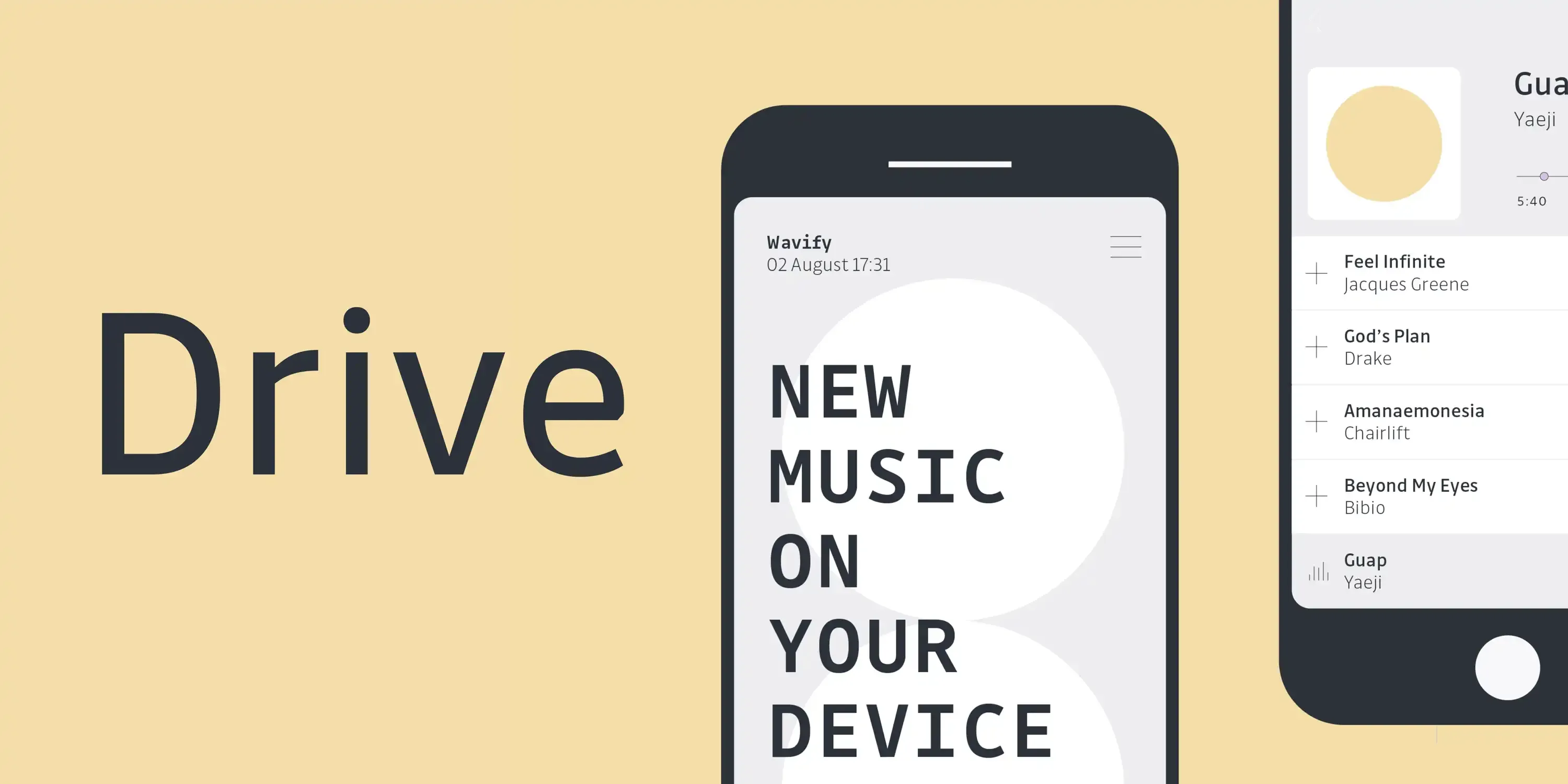
Drive is a humanist sans serif superfamily built for business communication where clarity and speed are vital. Its three coordinated styles — Drive, Drive Mono, and Drive Prop — keep text clear and efficient, allowing more content per line without loss of readability. With open counterforms and nearly monolinear strokes, it stays legible even under adverse conditions. Nine weights from Hairline to Extrabold, with italics or variable fonts, make it adaptable for both text and display in print and digital design.
?ae04)
?8cec)
?9038)
?c64d)
?cebd)
?0bd3)
?eca1)
?c150)
?41e9)
?a8c6)
Type design is wonderful!
The art of cross-cultural type design is a fascinating field that explores the intersection of typography and multilingualism. It involves designing typefaces that can be used across different languages and writing systems, while still maintaining their aesthetic and functional qualities. This requires a deep understanding of the unique features of each writing system, as well as the cultural context in which they are used. Cross-cultural type design is essential in today's globalized world, as it allows people from different linguistic and cultural backgrounds to communicate effectively.
We notice type most when it's wrong. When something feels off. The spacing's tight, the voice is too loud, or it just doesn't match what's being said. But when the type is right, it gets out of the way — and helps the words do their job. It can give structure to ideas. It makes space for meaning. Typography isn't just about style. It's about the way we take in information. It adds rhythm to the reading experience. It tells us where to look first and what matters most. It makes content easier to follow, and in some cases, easier to trust. The tone comes through in the details — the shape of the letters, how they're spaced, the way one form leads to the next. Some typefaces feel quiet and careful. Others have energy. Some pull you in. Some stay out of the way. Choosing the right one is less about picking a look and more about finding a voice that fits what you want to say.That's why trying type in context matters. It's one thing to see a beautiful letter or a well-set specimen — but it's another thing to see how it handles your content. How it behaves when it's small. How it reads when it's big. How it feels with your own words.That's what this space is for. Try a headline. Paste a paragraph. Adjust the size, change the weight, type something unexpected. Some typefaces are built to be expressive. Others are made to stay flexible. The best ones hold up in all kinds of situations. They do the job without losing their character. Take a minute to experiment. You'll know when it feels right.
AaBbCcDdEeFfGgHhIiJjKkLlMmNnOoPpQqRrSsTtUuVvWwXxYyZz
ABCDEFGHIJKLMNOPQRSTUVWXYZ
abcdefghijklmnopqrstuvwxyz
0123456789
.,;:!?"'()[]{}<>
&¶†‡§*™®©@ªº#№€$¥£¢₡₮₴₺₹₫₩₪₭₱₵₸₼₽¤+−×÷=¬~<>±^≠≈≤≥∞◊√∫∂∏∑∆ℓ
Type design is wonderful!
The art of cross-cultural type design is a fascinating field that explores the intersection of typography and multilingualism. It involves designing typefaces that can be used across different languages and writing systems, while still maintaining their aesthetic and functional qualities. This requires a deep understanding of the unique features of each writing system, as well as the cultural context in which they are used. Cross-cultural type design is essential in today's globalized world, as it allows people from different linguistic and cultural backgrounds to communicate effectively.
Name
Description
$0.00
latin capital letter a U+0041
A
Uppercase Letter Latin
Uppercase Letter Greek
Lowercase Letter Latin
Lowercase Letter
Modifier Letter
Other Letter Latin
Nonspacing Mark Inherited
Decimal Number
Other Number
Connector Punctuation
Dash Punctuation
Close Punctuation
Final Punctuation
Initial Punctuation
Other Punctuation
Open Punctuation
Currency Symbol
Modifier Symbol
Math Symbol
Other Symbol
Ligatures
Stylistic Set 1
Fractions
Oldstyle Figures
Tabular Figures
Ordinals
Scientific Inferiors
Superscript
Subscript
Numerators
Denominators
Case-Sensitive Forms
Credits & Details
Designed by
Black Foundry Designers
Language Support
Language Support
- Catalan
- Croatian
- Czech
- Danish
- Dutch
- English
- Filipino
- Finnish
- French
- Fula
- German
- Hungarian
- Indonesian
- Italian
- Latvian
- Malay
- Maltese
- Norwegian
- Polish
- Portuguese
- Romanian
- Slovak
- Slovenian
- Spanish
- Swedish
- Turkish
Features
OpenType Features
- Common Ligatures
- Fractions
- Lining Numerals
- Old Style Numerals
- Ordinal Numerals
- Proportional Numerals
- Stylistic Sets
- Subscript
- Superscript
- Tabular Numerals