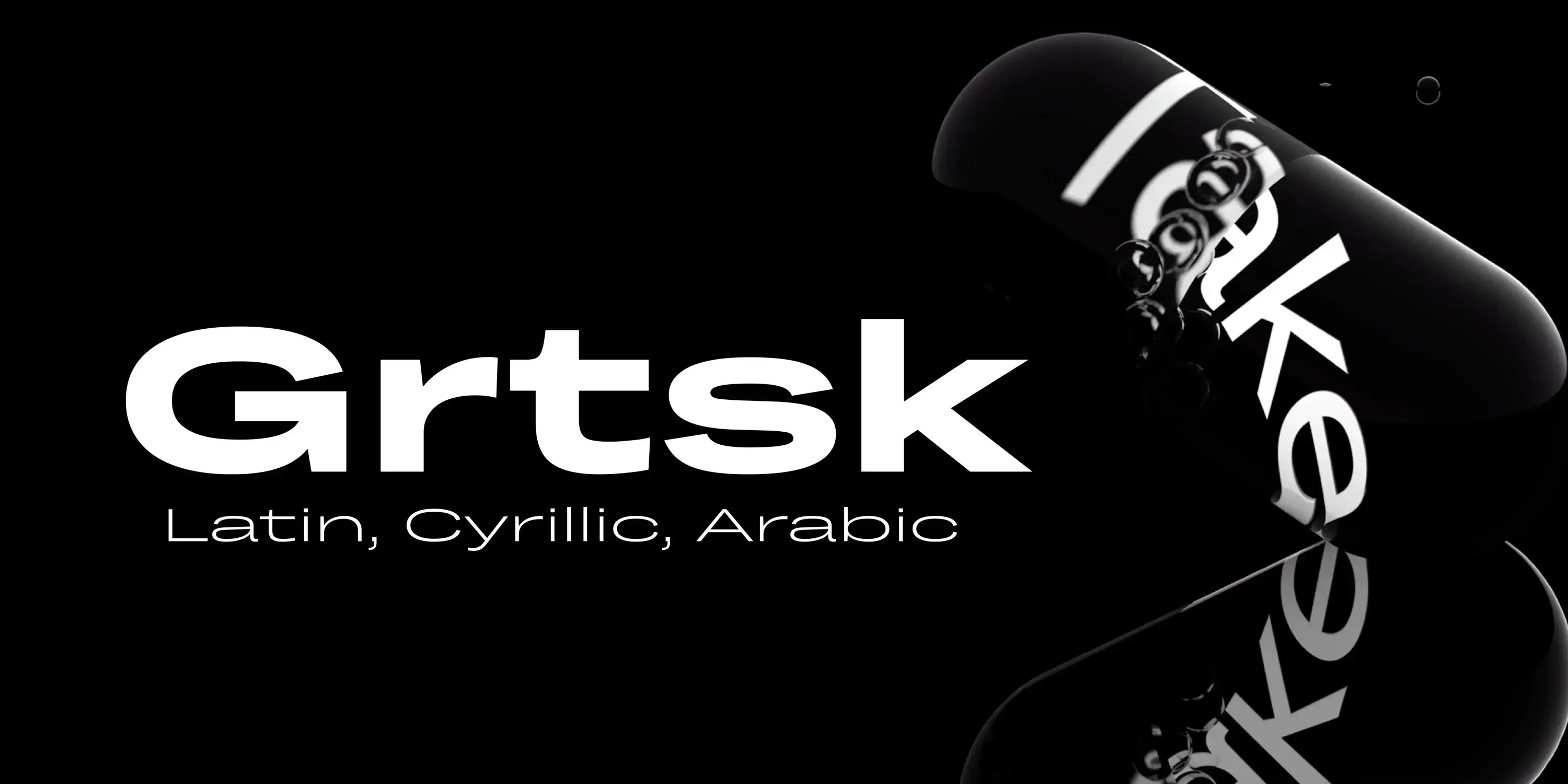
Grtsk is a sans serif superfamily of 126 sans fonts and one variable font combining weight, width, and slant into an infinitely versatile system. With styles from thin to bold, widths from narrow to extra wide, and 15-degree slants and back-slants, it adapts to contexts from expressive to formal. Seven widths are named after metric prefixes, from Zetta 10²¹ narrow to Mega 10⁶ wide. Inspired by grotesques of the 19th and 20th centuries, Grtsk blends humanist and rational forms for contemporary print and digital use.
?483b)
?d82e)
?e32a)
?1b41)
?b07d)
?4712)
?8ebe)
?2102)
?f723)
?1c49)
?8897)
From Mega-bytes to Zetta-bytes, our data spans the galaxy.
Imagine a cosmic library where Mega-bytes are used to catalog the snacks enjoyed by intergalactic travelers, while Giga-bytes keep track of their cosmic selfie collections. Tera-bytes hold the classified recipes for every dish ever prepared at space diners, and Peta-bytes are dedicated to documenting the ongoing debates over which galaxy has the best pizza. Exa-bytes are employed to archive the complete history of time-traveling fashion trends, and Zetta-bytes? They're reserved for the ultimate prank: a never-ending loop of cosmic cat videos that even the most advanced alien civilizations can't escape.
We notice type most when it's wrong. When something feels off. The spacing's tight, the voice is too loud, or it just doesn't match what's being said. But when the type is right, it gets out of the way — and helps the words do their job. It can give structure to ideas. It makes space for meaning. Typography isn't just about style. It's about the way we take in information. It adds rhythm to the reading experience. It tells us where to look first and what matters most. It makes content easier to follow, and in some cases, easier to trust. The tone comes through in the details — the shape of the letters, how they're spaced, the way one form leads to the next. Some typefaces feel quiet and careful. Others have energy. Some pull you in. Some stay out of the way. Choosing the right one is less about picking a look and more about finding a voice that fits what you want to say.That's why trying type in context matters. It's one thing to see a beautiful letter or a well-set specimen — but it's another thing to see how it handles your content. How it behaves when it's small. How it reads when it's big. How it feels with your own words.That's what this space is for. Try a headline. Paste a paragraph. Adjust the size, change the weight, type something unexpected. Some typefaces are built to be expressive. Others are made to stay flexible. The best ones hold up in all kinds of situations. They do the job without losing their character. Take a minute to experiment. You'll know when it feels right.
AaBbCcDdEeFfGgHhIiJjKkLlMmNnOoPpQqRrSsTtUuVvWwXxYyZz
ABCDEFGHIJKLMNOPQRSTUVWXYZ
abcdefghijklmnopqrstuvwxyz
0123456789
.,;:!?"'()[]{}<>
&¶†‡§*™®©@ªº#№€$¥£¢₡₮₴₺₹₫₩₪₭₱₵₸₼₽¤+−×÷=¬~<>±^≠≈≤≥∞◊√∫∂∏∑∆ℓ
From Mega-bytes to Zetta-bytes, our data spans the galaxy.
Name
Description
$0.00
latin capital letter a U+0041
A
Uppercase Letter Latin
Uppercase Letter Cyrillic
Uppercase Letter Greek
Lowercase Letter Latin
Lowercase Letter
Lowercase Letter Greek
Lowercase Letter Cyrillic
Modifier Letter
Other Letter Latin
Letter Arabic
Nonspacing Mark Inherited
Nonspacing Mark Arabic
Decimal Number
Decimal Number Arabic
Other Number
Connector Punctuation
Dash Punctuation
Close Punctuation
Final Punctuation
Initial Punctuation
Other Punctuation
Punctuation Arabic
Open Punctuation
Currency Symbol
Modifier Symbol
Math Symbol
Other Symbol
Discretionary Ligatures
Contextual Alternates
Stylistic Set 1
Fractions
Oldstyle Figures
Tabular Figures
Ordinals
Scientific Inferiors
Superscript
Subscript
Numerators
Denominators
Case-Sensitive Forms
Glyph Composition
Initial Forms
Medial Forms
Final Forms
Credits & Details
Designed by
Black Foundry Designers
Language Support
Language Support
- Arabic
- Belarusian
- Bulgarian
- Catalan
- Croatian
- Czech
- Danish
- Dutch
- English
- Filipino
- Finnish
- French
- Fula
- German
- Hungarian
- Indonesian
- Italian
- Kazakh
- Latvian
- Macedonian
- Malay
- Maltese
- Norwegian
- Persian
- Polish
- Portuguese
- Romanian
- Russian
- Serbian
- Slovak
- Slovenian
- Spanish
- Swedish
- Turkish
- Ukrainian
- Uzbek
Features
OpenType Features
- Discretionary Ligatures
- Fractions
- Lining Numerals
- Old Style Numerals
- Ordinal Numerals
- Proportional Numerals
- Stylistic Sets
- Subscript
- Superscript
- Tabular Numerals