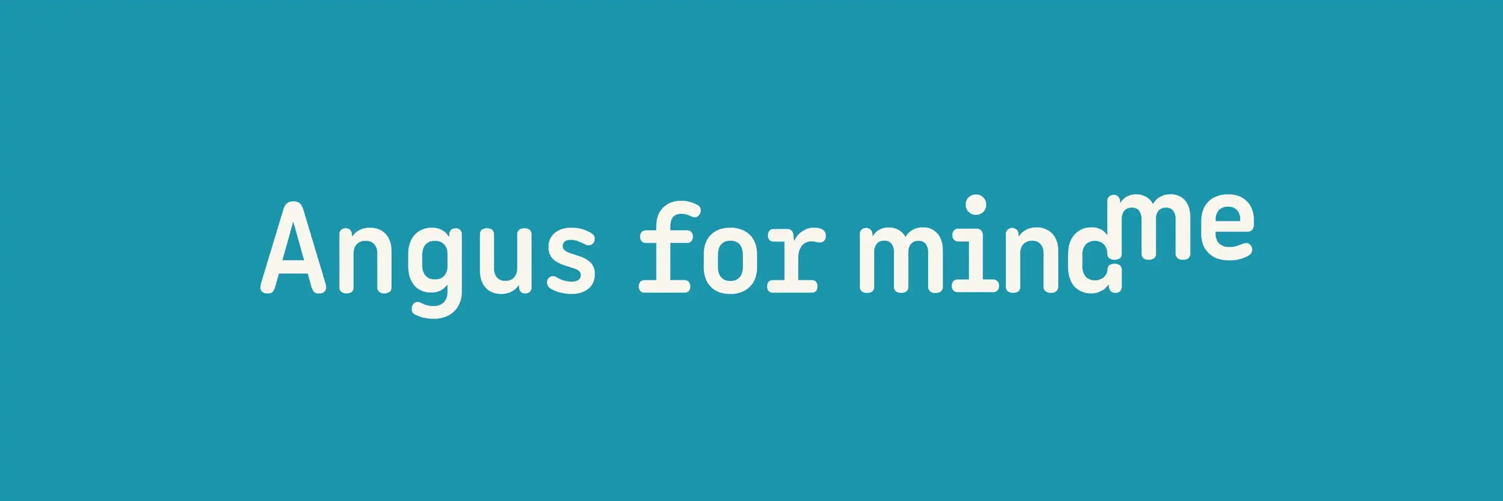
Angus for MindMe
Showcasing Angus in Mind Me's brand
Mind Me’s brand prominently features the Angus font, a choice that enhances the brand’s visual identity and user experience. Here’s a closer look at why Angus was selected and how it’s being utilized effectively.
Why Angus?
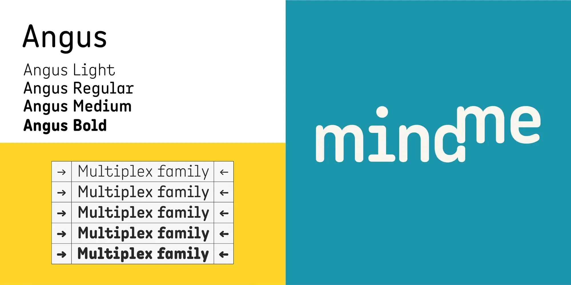
The Angus font stands out for its modern, geometric design with clean lines and refined curves. This versatility makes it suitable for a variety of applications, from bold headlines to readable body text. Angus has a digital feel while being very human and approachable, perfectly matching Mind Me’s need to convey professionalism, innovation, and approachability—key attributes for a digital fundraising company.
Angus in Action
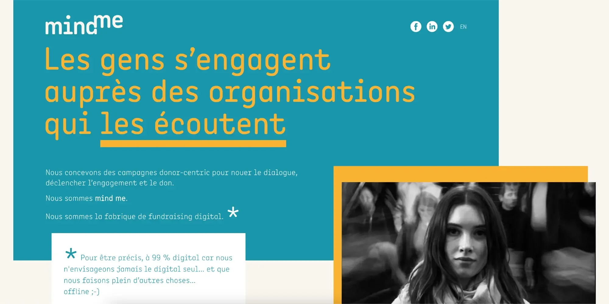
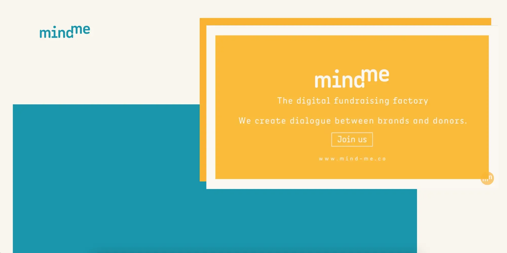
Mind Me’s website integrates Angus across all textual elements, including titles, body copy, and small captions. The font’s clear readability ensures that information is easily accessible, while its stylish design aligns with the brand’s goal of engaging and retaining visitors. The consistent use of Angus creates a cohesive visual experience, enhancing the overall aesthetic appeal and usability of the site.
Conclusion
The Angus font significantly contributes to Mind Me’s rebranding success, showcasing how thoughtful typography can elevate a brand’s digital presence. By combining readability with modern design, Angus helps Mind Me effectively communicate its mission and values, making it an integral part of their branding strategy.