
Bluu Suuperstar for Metal Exhibition
Bluu Suuperstar: Amplifying the Metal Music Experience at the Philharmonie de Paris
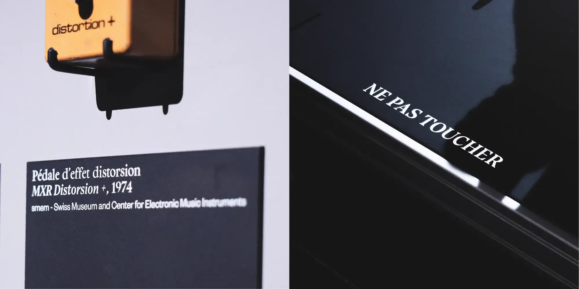
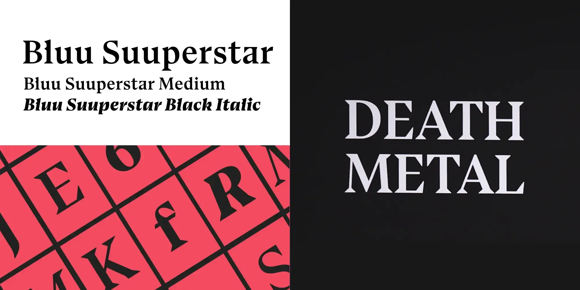
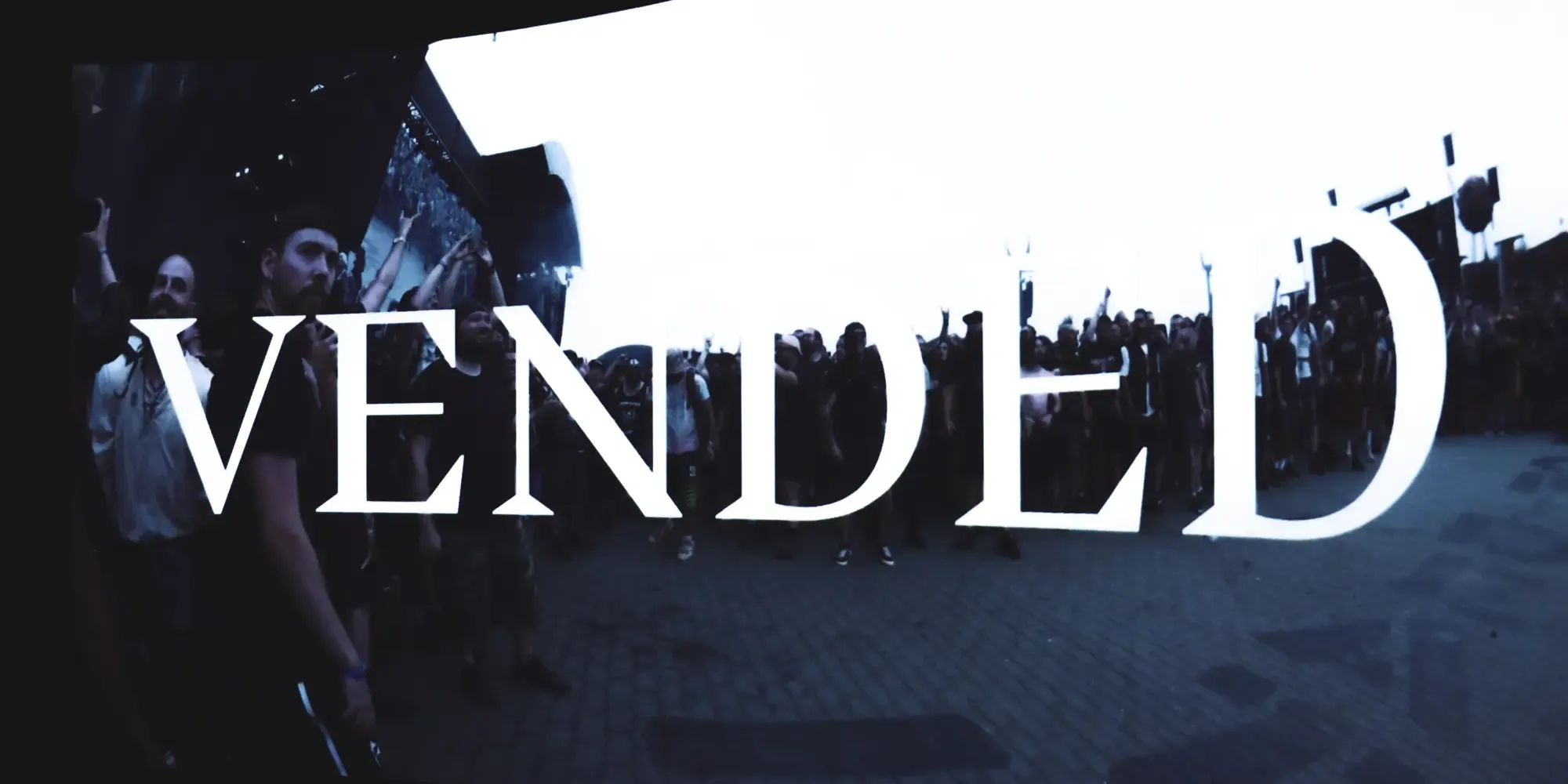
The Philharmonie de Paris, in its exhibition dedicated to Metal Music, has chosen the typeface Bluu Suuperstar for the venue’s signage and most of the captions and explanation texts. The selection of Bluu Suuperstar, particularly in its Medium and Black weights, perfectly complements the intense and dynamic nature of the Metal genre.
Why Bluu Suuperstar?
-
Bold and Intense: Bluu Suuperstar’s Medium and Black weights are designed to make a strong impact. The boldness of the font reflects the powerful and aggressive energy of Metal music, ensuring that the exhibition’s signage captures the attention of visitors and sets the tone for the experience.
-
Unique Character: The distinctive letterforms of Bluu Suuperstar add a unique character to the exhibition’s visual elements. The font’s edgy and unconventional design mirrors the rebellious and non-conformist spirit of Metal music, creating a cohesive and immersive environment for the exhibition.
-
Readability and Style: Despite its bold appearance, Bluu Suuperstar maintains excellent readability. This balance is crucial for the captions and explanatory texts, allowing visitors to engage with the information effortlessly while enjoying the stylistic elements that enhance the exhibition’s theme.
-
Versatility: Bluu Suuperstar provides versatility in design, making it suitable for various applications within the exhibition. From large-scale signage to detailed captions, the font ensures a consistent and striking visual identity throughout the venue.
Bluu Suuperstar in Action
The Philharmonie de Paris has effectively utilized Bluu Suuperstar to enhance the Metal Music exhibition. Here’s how the font contributes to the overall experience:
-
Venue Signage: The bold and impactful nature of Bluu Suuperstar is prominently displayed in the venue’s signage. This creates a dramatic and engaging entrance, drawing visitors into the world of Metal music.
-
Captions and Explanatory Texts: For the exhibition’s captions and explanatory texts, Bluu Suuperstar provides clarity and style. The font’s unique character enhances the visual appeal of the information panels, making the educational content both accessible and visually engaging.
-
Thematic Consistency: Throughout the exhibition, Bluu Suuperstar ensures thematic consistency. The font’s strong presence reinforces the exhibition’s focus on the power and intensity of Metal music, helping to create a unified and immersive visitor experience.
Conclusion
The use of Bluu Suuperstar by the Philharmonie de Paris for the Metal Music exhibition demonstrates the importance of selecting a typeface that aligns with the thematic essence of the project. With its bold intensity, unique character, and excellent readability, Bluu Suuperstar is the perfect match for conveying the dynamic and rebellious spirit of Metal music. The font’s ability to enhance both the visual and informational aspects of the exhibition has made it an essential part of creating a memorable and impactful exhibition.
We are so happy with their choice and implementation of the Bluu Suuperstar typeface.