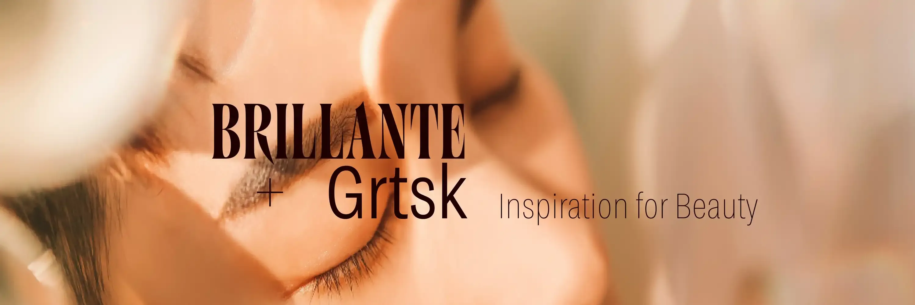
Brillante & Grtsk: Inspiration for Beauty
In the cutthroat world of cosmetics, beauty isn’t just skin deep—it’s ink deep, etched into every letter of your branding. Fonts are the unsung heroes of packaging design, telling your customers, “Yes, this lipstick will change your life,” before they even open the cap. Enter Brillante and Grtsk, a duo so iconic they could headline Paris Fashion Week.
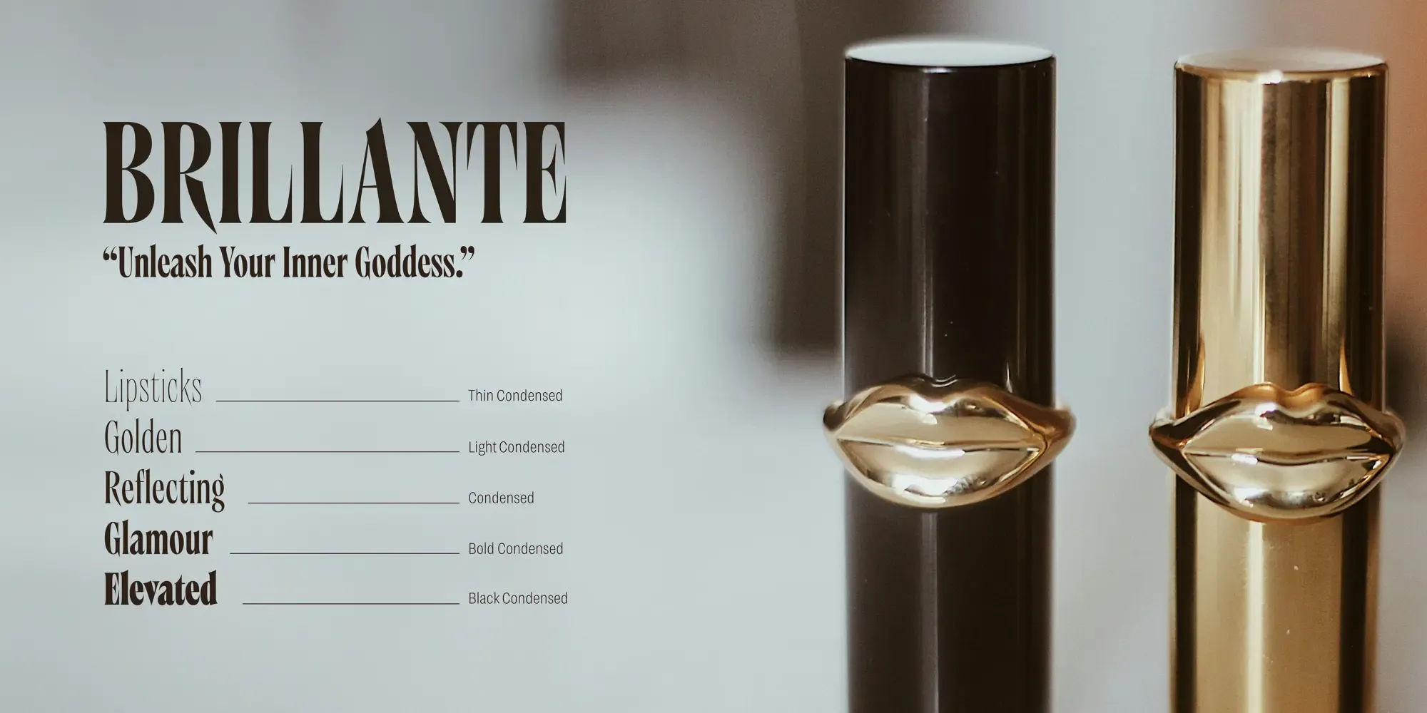
Brillante: The Showstopper
Picture this: a bold, high-contrast typeface strutting down the page like it’s wearing Louboutins. That’s Brillante. With its razor-sharp serifs and unapologetic flair, it doesn’t just grab attention—it demands it. This is the font that whispers, “Luxury,” but in a way that makes everyone turn and look.
Brillante isn’t afraid to make a scene, and frankly, we love that about it.
- For the Spotlight: It’s perfect for logos, product names, and dramatic taglines like “Unleash Your Inner Goddess.” (Yes, it can handle the weight of that statement.)
- Timelessly Modern: Brillante is the Chanel of typefaces—classic yet contemporary, bold yet refined. It looks just as good on a shimmering eyeshadow palette as it does on a glossy magazine ad.
- Power & Poise: It’s the typography equivalent of a red carpet dress—every curve and edge screams elegance.
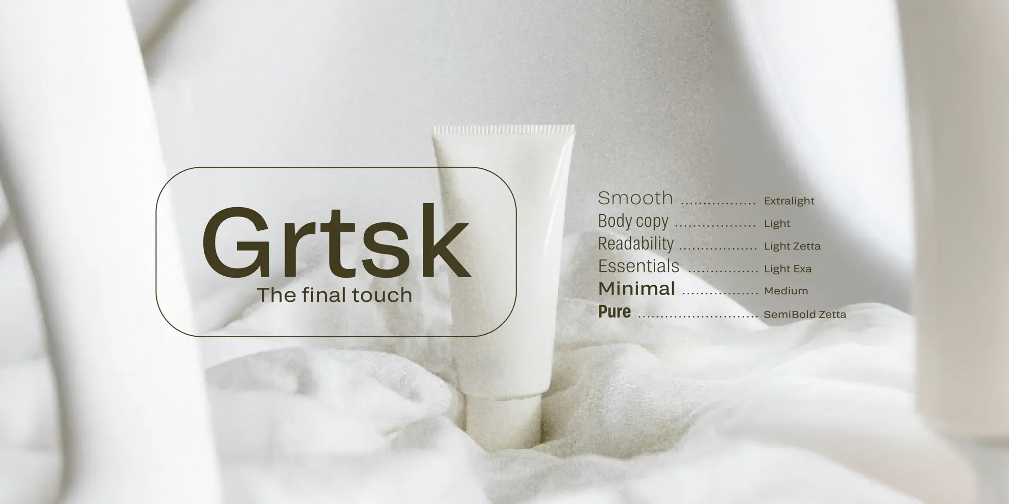
Grtsk: The Quiet Genius
While Brillante basks in the limelight, Grtsk works diligently in the background, making sure every detail is impeccable. It’s clean, modern, and versatile—a font that says, “I may not be glamorous, but I get the job done beautifully.”
Here’s why Grtsk is the Robin to Brillante’s Batman:
- Condensed Brilliance: When you’ve got 47 ingredients to list on a lipstick tube the size of a thumb, Grtsk’s condensed axis steps in like a pro. Small print? No problem.
- Wide Appeal: Need a wider axis for a standout product description? Grtsk’s got you. It’s flexible like yoga, but for letters.
- Legibility Meets Chic: Whether it’s on your product’s legal disclaimers or Instagram captions, Grtsk ensures your brand always looks polished, never plain.
A Match Made in Font Heaven
Together, Brillante and Grtsk are the ultimate power couple. Think Beyoncé and Jay-Z, but for cosmetics branding.
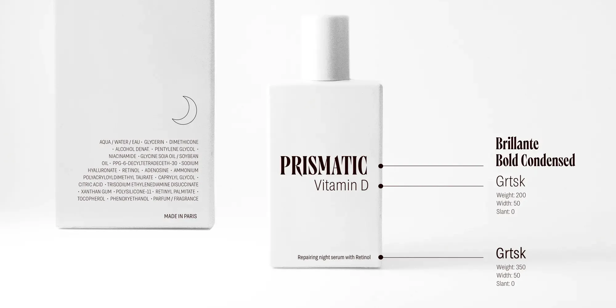
- Balance & Contrast: Brillante turns heads with its dramatic flair, while Grtsk provides stability and clarity. It’s the perfect yin and yang for your brand.
- Luxury Meets Functionality: These two fonts work together to create an aesthetic that’s equal parts glam and grounded. Your packaging will scream “exclusive” without sacrificing practicality.
- Visual Storytelling: Whether it’s a glossy lipstick ad or the fine print on a skincare bottle, this duo creates a seamless narrative that feels as luxurious as it looks.
The Packaging Glow-Up You Deserve
Brillante and Grtsk aren’t just fonts; they’re your brand’s new best friends. They’ll elevate your packaging, make your ads unmissable, and ensure your customers never forget your name. With Brillante’s dazzling confidence and Grtsk’s understated charm, your cosmetics line will be the epitome of style and substance.
Because in beauty branding, it’s not just about looking good—it’s about looking unforgettable. So go ahead, make your packaging sparkle, and let Brillante and Grtsk do the talking.