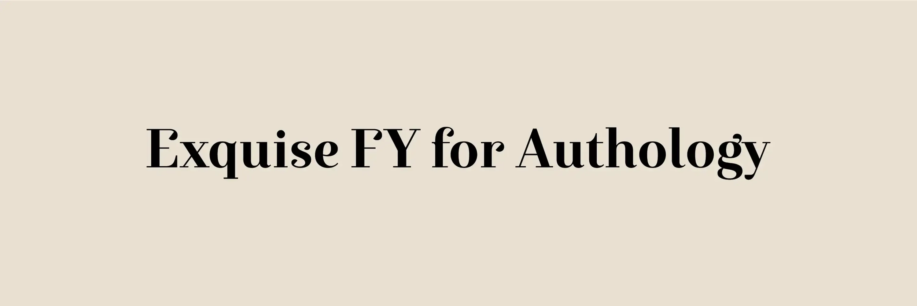
Exquise FY for Authology
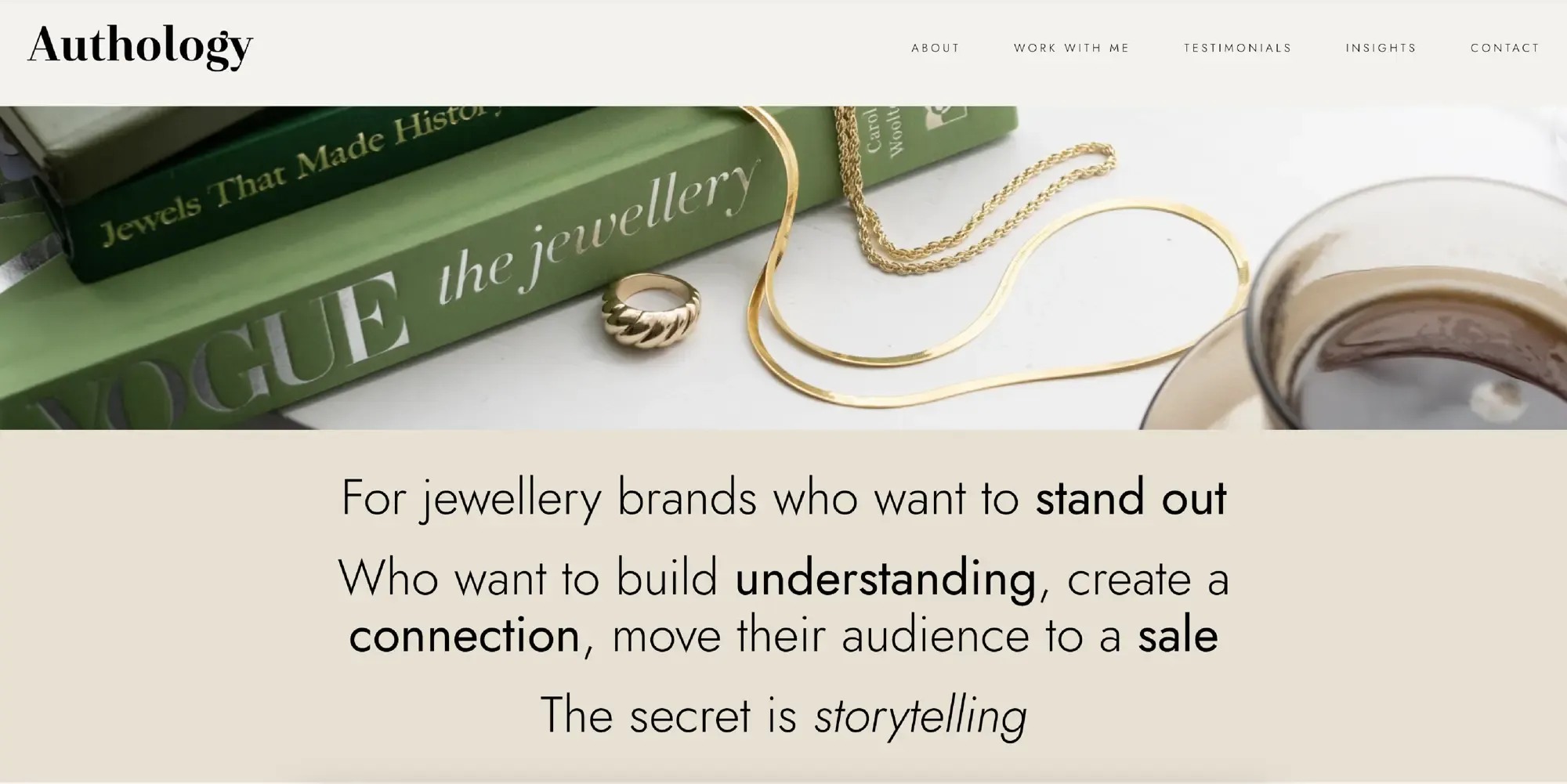
Authology has embraced the elegance of the Exquise FY font for their brand redesign, utilizing it in their logo and across their social media platforms. This choice highlights the perfect synergy between Authology’s brand values and the refined aesthetic of Exquise FY.
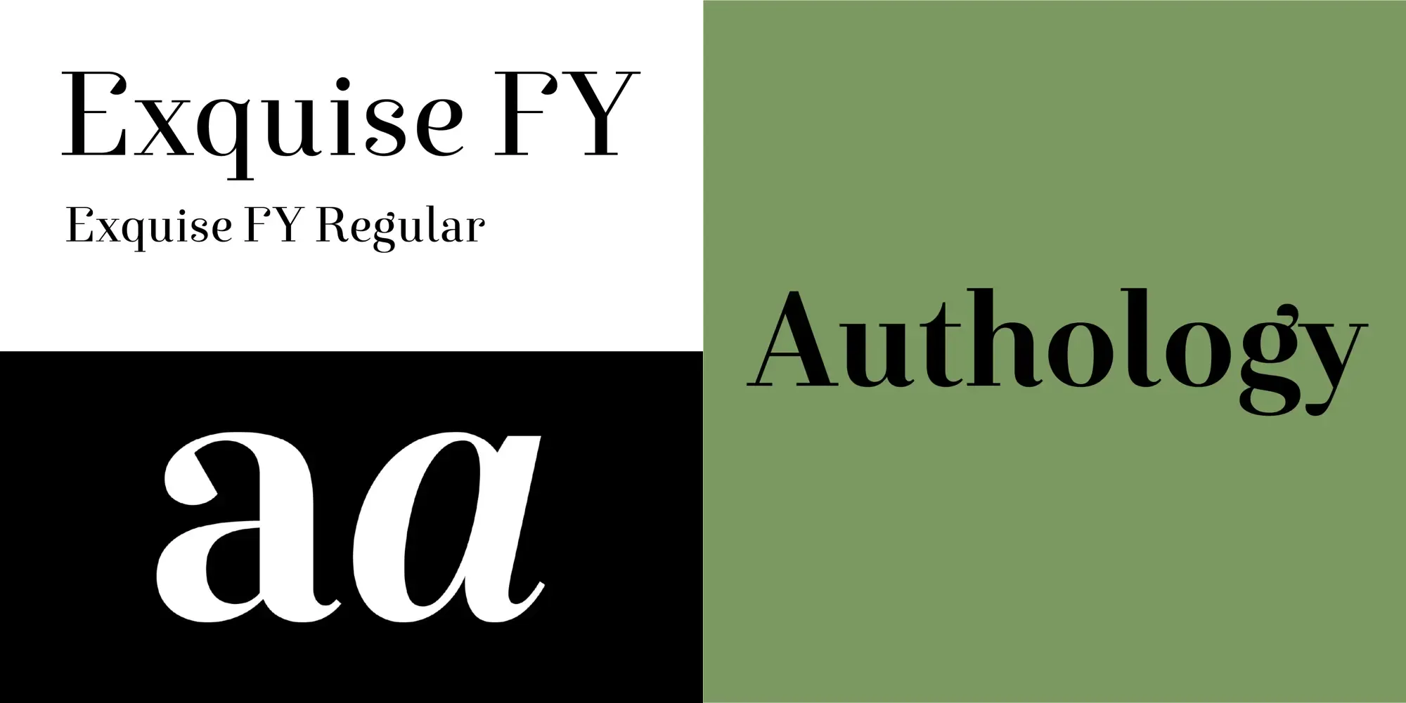
Why Exquise FY?
-
Elegance and Sophistication: Exquise FY exudes a timeless elegance, making it ideal for brands seeking to convey sophistication.
-
Versatility: The font’s versatility allows it to adapt to various design contexts while maintaining its distinctive charm.
-
Readability: Its clean lines and well-balanced proportions ensure excellent readability across different mediums.
Exquise FY in Action
Authology showcases the Exquise FY font prominently in their logo, which appears on their website and social media platforms. The font’s refined curves and contemporary feel align seamlessly with Authology’s identity, enhancing their storytelling approach to jewelry design. On social media, Exquise FY provides a cohesive and visually appealing experience, reinforcing the brand’s message and aesthetics.
Conclusion
Exquise FY is an exceptional choice for Authology, aligning perfectly with their ethos. Its elegance, versatility, and readability make it a fitting match, enhancing their visual identity both online and offline. Although Exquise FY is used sparingly in the overall identity the font still plays a huge part in forming the visual identity of the brand.
We are so happy with their choice and implementation of the Exquise FY typeface.