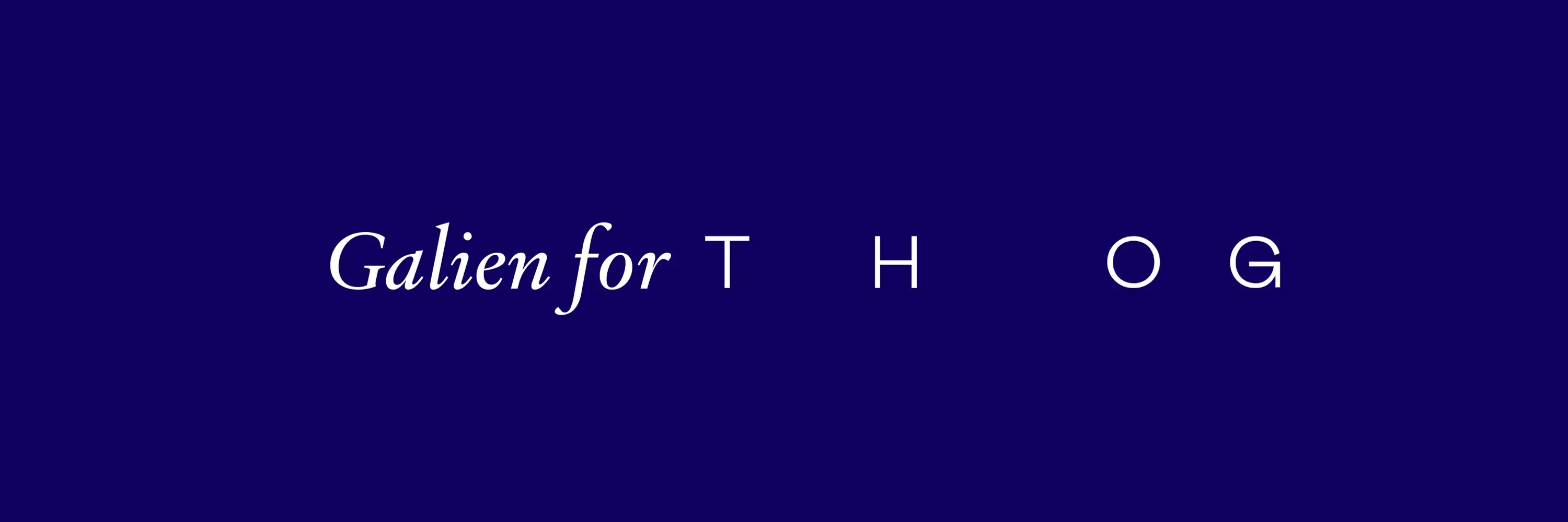
Galien for The Hand of God
Showcasing the Galien Font in The Hand of God’s Website Redesign
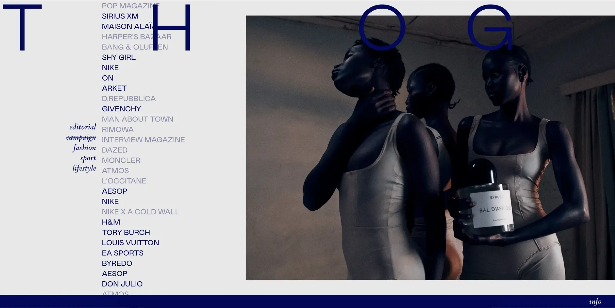
The Hand of God, an independent post-production studio, has undergone a stunning website redesign that incorporates the elegant Galien font. The Hand of God collaborates with top photographers, agencies, and renowned brands. They specialize in fulfilling precise visual requirements for their clients, ensuring high-quality results in various projects including editorial, campaign, fashion, sport, and lifestyle sectors. Their redesign, crafted by Bianca Pina in collaboration with Tastefully Made, leverages the distinctive characteristics of Galien to enhance the site’s visual appeal and functionality.
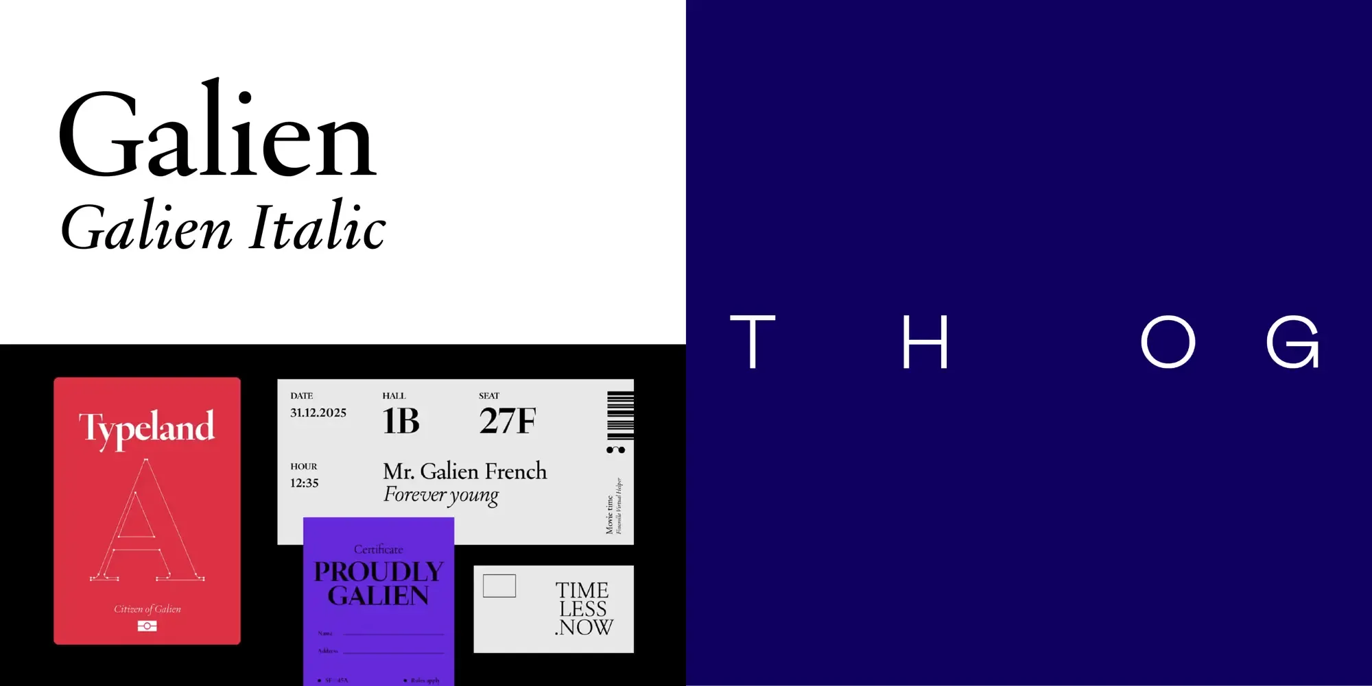
Why Galien?
- Quaintly Modern: Galien’s refined serifs, small x-height and long extenders offer a sense of old-style sophistication in a modern typeface, making it ideal for brands looking to make a strong visual impact.
- Refinement: The serif typeface complements their high-end projects, adding a touch of classic refinement to their modern and innovative designs.
Galien in Action!
- Headers and Titles: The Hand of God uses Galien Italic to create a striking and memorable impression. The font is used lowercase only for the headers which in combination with the sans-serif font chosen creates a reverse hierarchy. This reverse hierarchy gives more focus to the beautiful images displayed on their website. This limitation of style (pure italic lowercase) creates a simplicity that accentuates the luxury aspects of the brand. Galien is a big part of creating this luxury feeling.
- Highlighting Key Information: By employing Galien for text that needs to stand out, The Hand of God ensures important information is easily accessible and visually distinct, enhancing the overall navigation.
- Aesthetic Consistency: The consistent use of Galien throughout the site maintains a cohesive visual identity, aligning with the studio’s brand values of quality and precision.
Conclusion
The Hand of God’s website redesign exemplifies how the Galien font can transform digital spaces, even by the mean of discreet and sparse touches. Its distinctive elegance, versatility, and readability make it a perfect fit for the studio’s needs, creating a sophisticated and user-friendly online presence. Their choice of the Galien font, made their categories and headings stand out in a very fitting manner. This collaboration highlights the power of thoughtful font choice in crafting compelling digital experiences.
We are very pleased with their choice and implementation of the Galien font.