
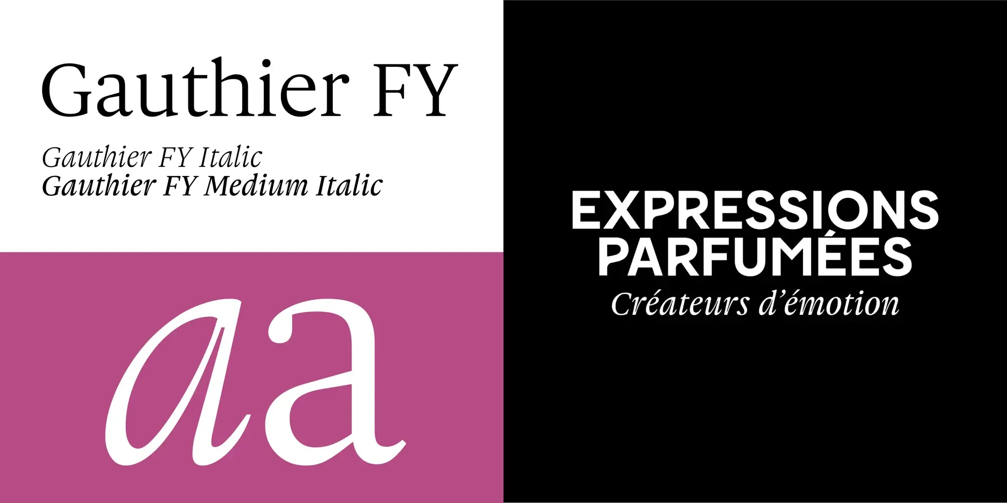
Gauthier for Expressions Parfumées
Gauthier Italic: Enhancing the Elegance of Expressions Parfumées
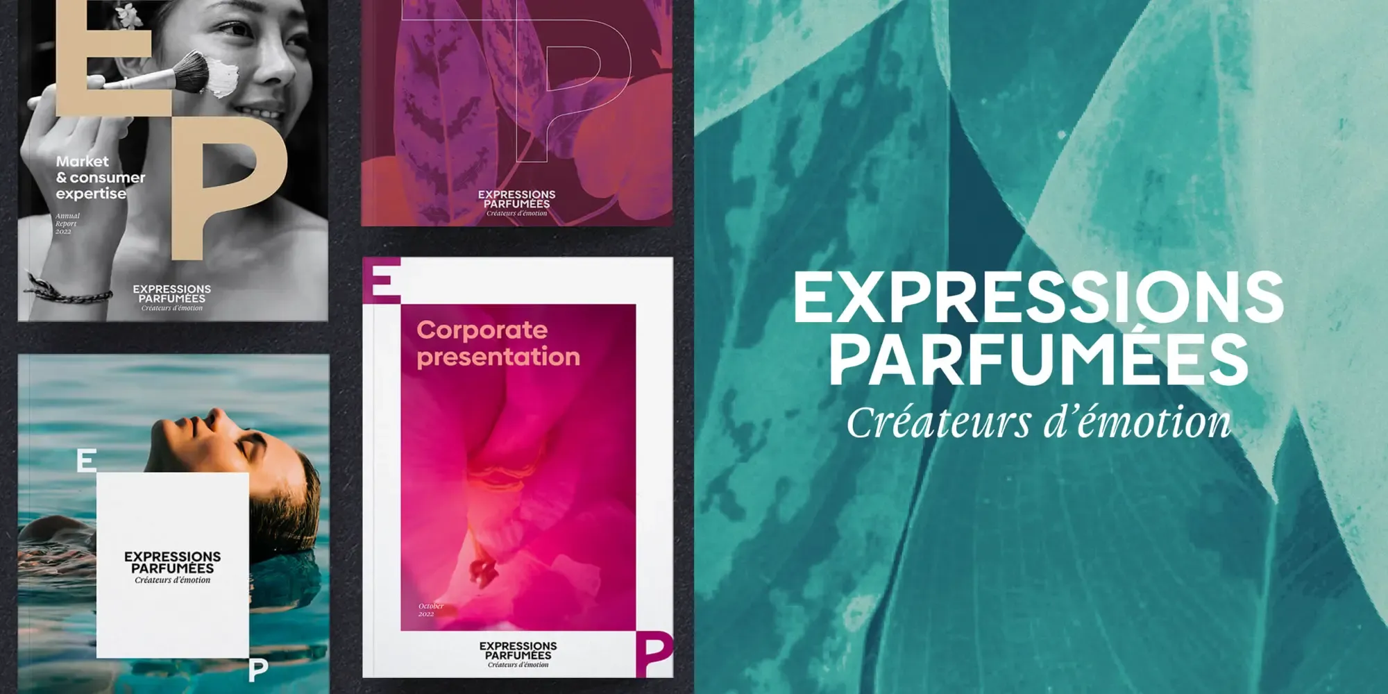
Expressions Parfumées, a renowned name in the world of perfumery, has chosen the Gauthier Italic font for their brand logo identity, logo baseline, and text titling. This choice underscores the brand’s commitment to elegance, sophistication, and a sensory-rich experience.
Why Gauthier Italic?
-
Delicate Design: Gauthier Italic is characterized by its delicate and refined letterforms. The font’s graceful curves and subtle flourishes perfectly complement the luxurious and intricate nature of perfumery, making it an ideal choice for Expressions Parfumées’ brand identity.
-
Sensual Appeal: The sensuality inherent in Gauthier Italic’s design resonates with the essence of fragrance creation. The fluidity and elegance of the italic style evoke a sense of movement and aroma, aligning beautifully with the sensory experience that Expressions Parfumées aims to deliver.
-
Flavorful Aspect: Gauthier Italic’s distinctive style adds a flavorful and artistic touch to the brand’s visual elements. This font’s unique character enhances the storytelling aspect of Expressions Parfumées, conveying the richness and depth of their perfume creations.
-
Timeless Elegance: The timeless elegance of Gauthier Italic ensures that the brand identity of Expressions Parfumées remains sophisticated and appealing across different mediums and over time. Its classic yet contemporary design contributes to a lasting and memorable brand presence.
Gauthier Italic in Action
Expressions Parfumées has skillfully utilized the Gauthier Italic font to create a cohesive and visually appealing brand identity. Here’s how the font enhances their branding:
-
Logo Baseline: The italic style of Gauthier adds a touch of fluidity and grace to the logo baseline, enhancing the overall aesthetic appeal. This subtle yet impactful use of typography reinforces the brand’s luxurious and artistic image.
-
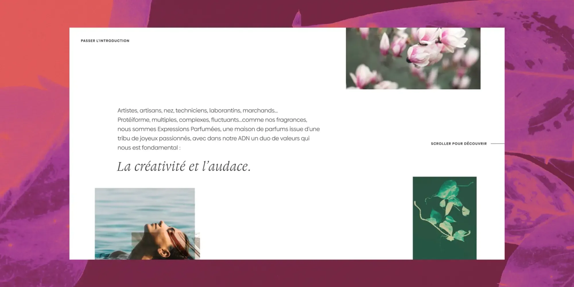
Text Titling: For text titling, Gauthier Italic provides a distinct and stylish appearance. Whether used in marketing materials, packaging, or digital content, the font ensures that titles are both eye-catching and harmonious with the brand’s visual language.
Conclusion
The selection of Gauthier FY Italic by Expressions Parfumées highlights the importance of choosing the right type combinations. With its delicate design, sensual appeal, and timeless elegance, Gauthier FY Italic is the perfect match for the sophisticated and sensory-rich world of perfumery. The font’s ability to enhance the visual identity of Expressions Parfumées and work together with their existing logo has made it a key element in representing the brand’s commitment to luxury, artistry, and quality.
We are so pleased with their choice and implementation of the Gauthier FY Italic font.