Grtsk for France Galop
France Galop's New Logo and Identity: A Perfect Match with the Grtsk Font
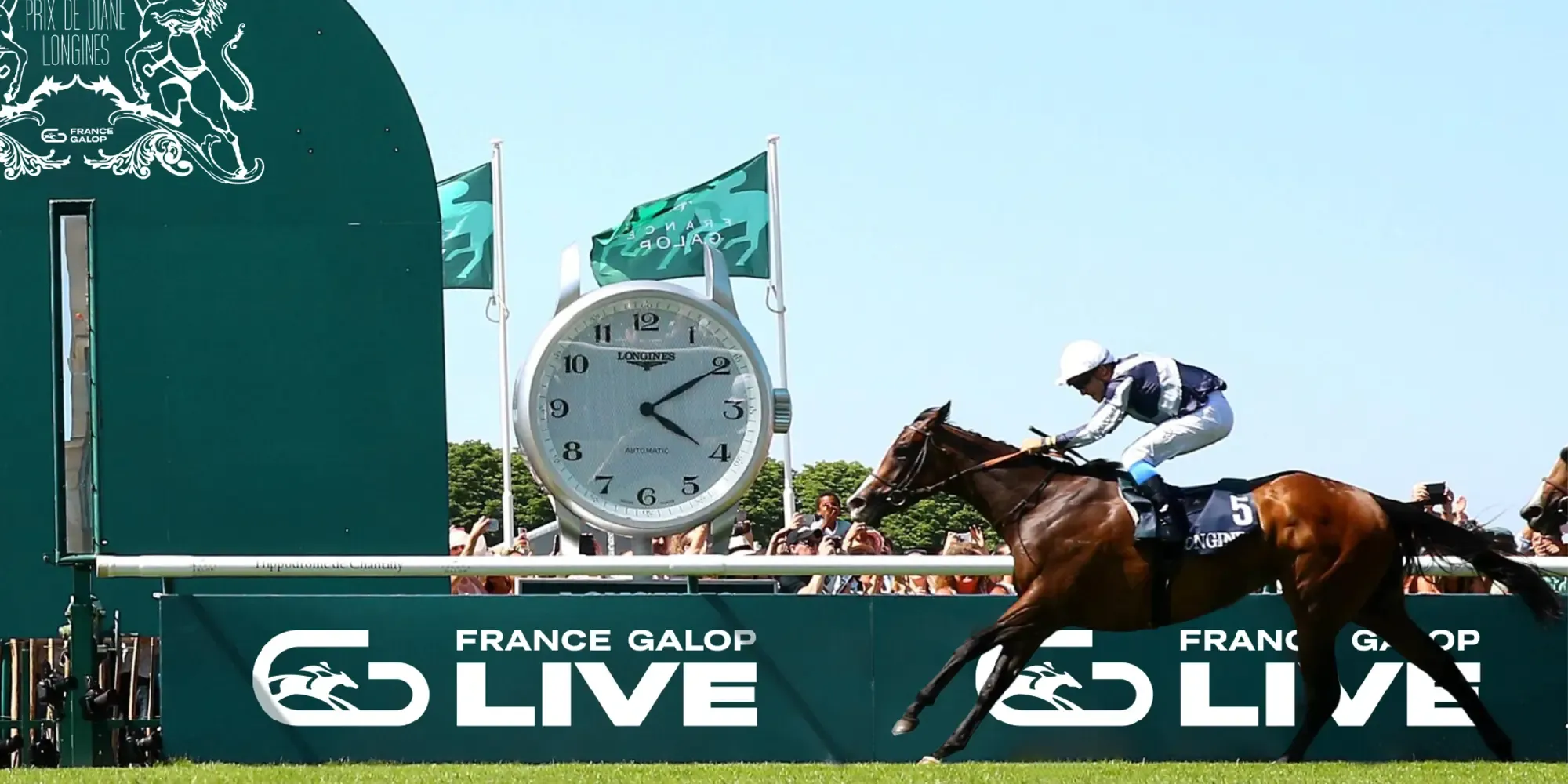
France Galop has recently unveiled a new logo and visual identity that perfectly encapsulates the elegance and dynamism of the horse racing world. Central to this fresh branding is the versatile Grtsk Typeface, which has been employed in various weights and styles to create a cohesive and impactful visual presence.
The Choice of Grtsk
The decision to use Grtsk for France Galop’s new identity speaks volumes about the font’s ability to convey both tradition and modernity. Grtsk’s clean lines and contemporary aesthetic are a perfect fit for an organization that honors the storied history of horse racing while looking forward to the future.
Versatility and Impact
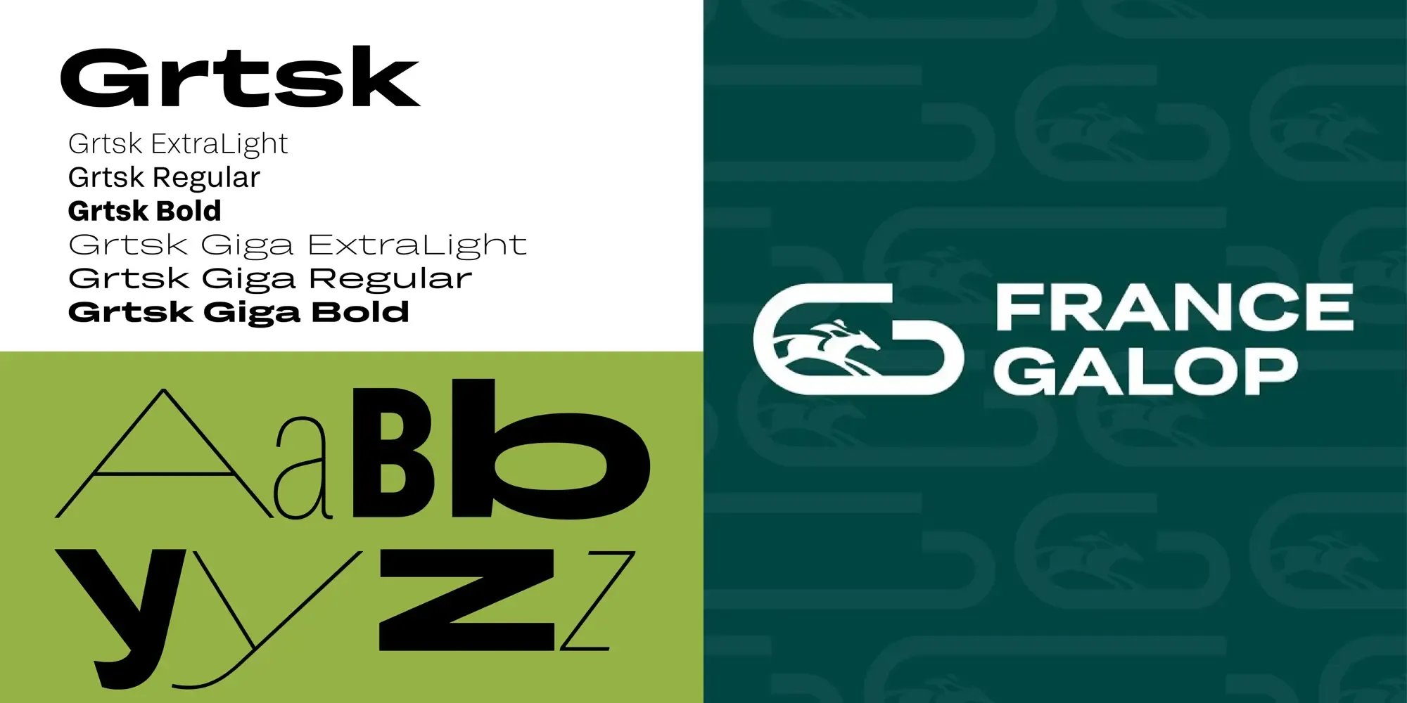
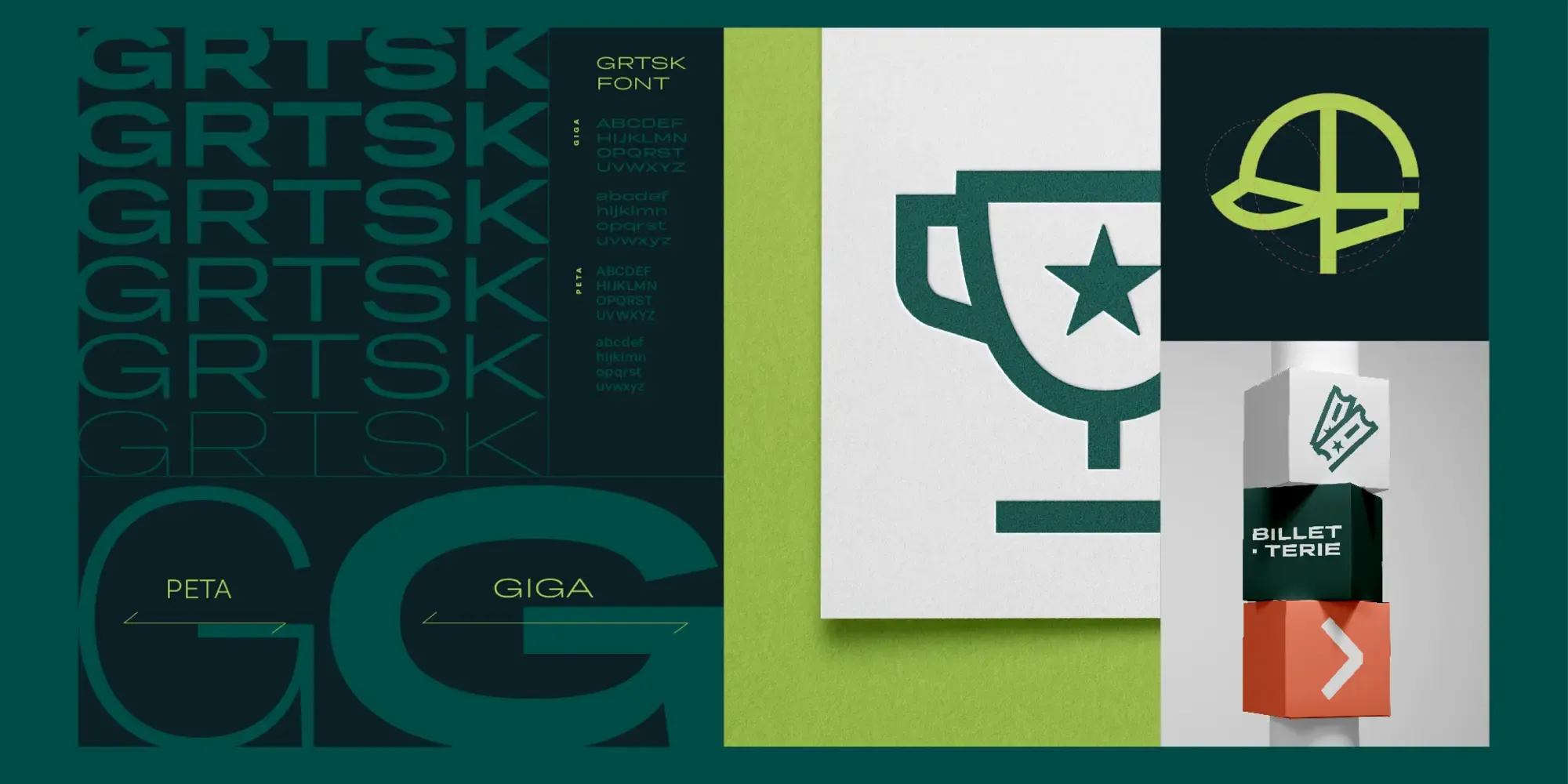
France Galop’s rebranding employs a range of Grtsk weights and styles, including Regular, ExtraLight, Bold, ExtraLight Giga, Regular Giga, and Bold Giga. This variety allows for a nuanced and dynamic visual language across different media and applications.
-
Regular and ExtraLight: These weights are used in body text and secondary information, providing readability and a touch of sophistication without overpowering the main design elements.
-
Bold: The Bold weight is utilized for headlines and key messages, ensuring they stand out and capture the viewer’s attention immediately.
-
Giga Variants: The ExtraLight Giga, Regular Giga, and Bold Giga weights are employed for the logo and major branding elements. These variations offer a strong visual hierarchy and help create a memorable and distinct brand identity.

A Cohesive Identity
The integration of the Grtsk font into France Galop’s branding ensures a unified and consistent visual identity. The font’s geometric shapes and balanced proportions contribute to a professional and polished look, while its flexibility allows for creativity and adaptability across different platforms and materials.
Conclusion
The choice of the Grtsk typeface for the new visual identity of France Galop showcases that one typeface in a variety of weights can create a unified but dynamic visual identity. The combination of various weights and styles of Grtsk provides a harmonious blend of clarity, elegance, and boldness, making it an ideal choice for a prestigious organization in the horse racing industry.
We are so happy with their choice and implementation of the Grtsk typeface.