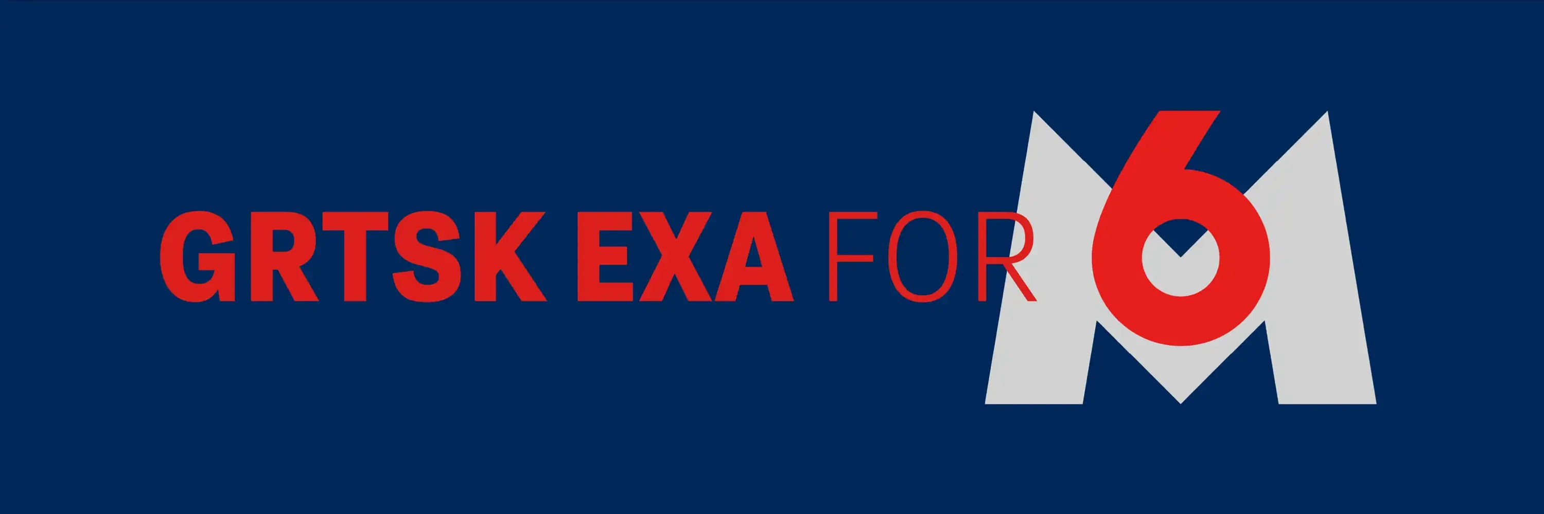
Grtsk for M6
Grtsk Exa: The Perfect Fit for M6's Dynamic Branding
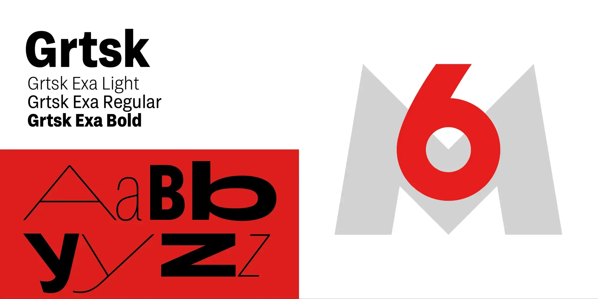
The usage of our Grtsk typeface by Gédéon for the broadcasting company M6 showcases how a well-designed font can enhance a brand’s visual identity. M6, known for its innovative and dynamic programming, has integrated Grtsk Exa into its show titles and announcements, creating a cohesive and striking visual experience for its audience. M6 licensed three different weights (Thin, Regular and Bold) of the Grtsk Exa font. This means that a wider variety of title designs can be created when combining both the bold and thin weights.

Why Grtsk?
Grtsk is more than just a typeface; it’s a versatile and modern design tool that brings several advantages to any project:
-
Versatility: Grtsk is available in various weights and styles, M6 chose to only license Grtsk Exa. Grtsk can be tailored to fit a wide range of applications, from bold headlines to readable body text.
-
Clarity and Readability: With clean lines and a geometric structure, this font ensures maximum legibility across different media, which is crucial for both on-screen and print materials.
-
Modern Aesthetic: Its contemporary look and feel make it an excellent choice for brands that want to appear current and stylish.
Grtsk Exa in Action
M6 leverages the Grtsk Exa typeface in several key areas to enhance its branding:
-
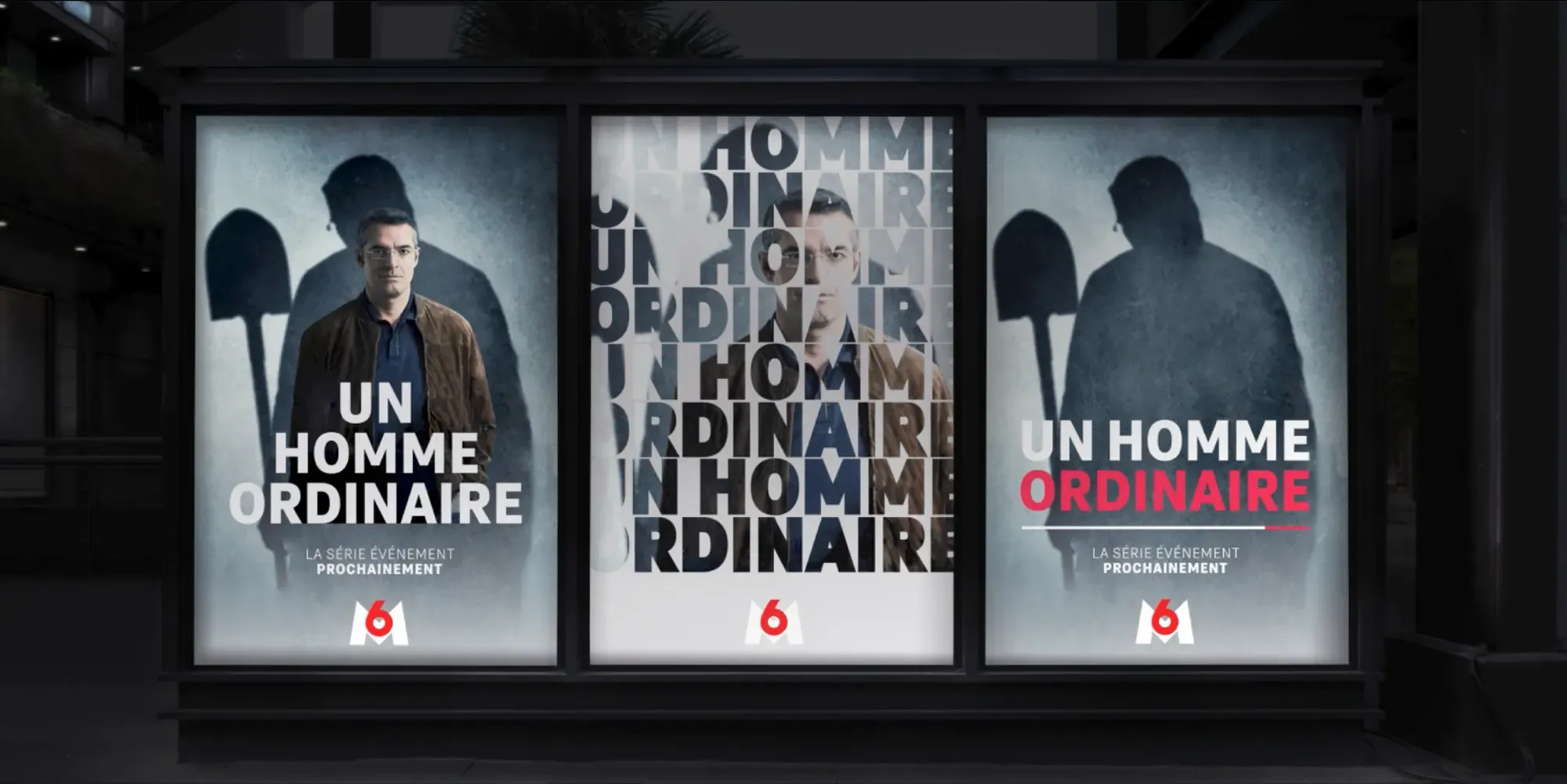
Show Titles: The bold and distinctive style of Grtsk Exa is used for the titles of M6’s shows, giving each program a unique yet cohesive look.
-
Announcements: For on-air announcements and promotional content, the font’s clarity ensures that messages are conveyed effectively to viewers.
-
Logo Integration: M6’s logo, often seen alongside the Grtsk Exa typeface, benefits from the font’s clean lines and modern aesthetic, creating a seamless visual identity.
Conclusion
The use of Grtsk Exa by M6 highlights how a well-chosen typeface can harmonize and elevate the appearance of a brand. The choice of two weights from the Grtsk Exa font play a huge role in harmonizing these different shows and events to fit into one brand identity. The font’s versatility, readability, and modern design make it an ideal choice for M6’s dynamic and innovative content. By integrating Grtsk Exa into their titles and announcements, M6 not only enhances the viewer’s experience but also solidifies its brand identity in the competitive broadcasting landscape.
We are so happy with their choice and implementation of the Grtsk typeface.