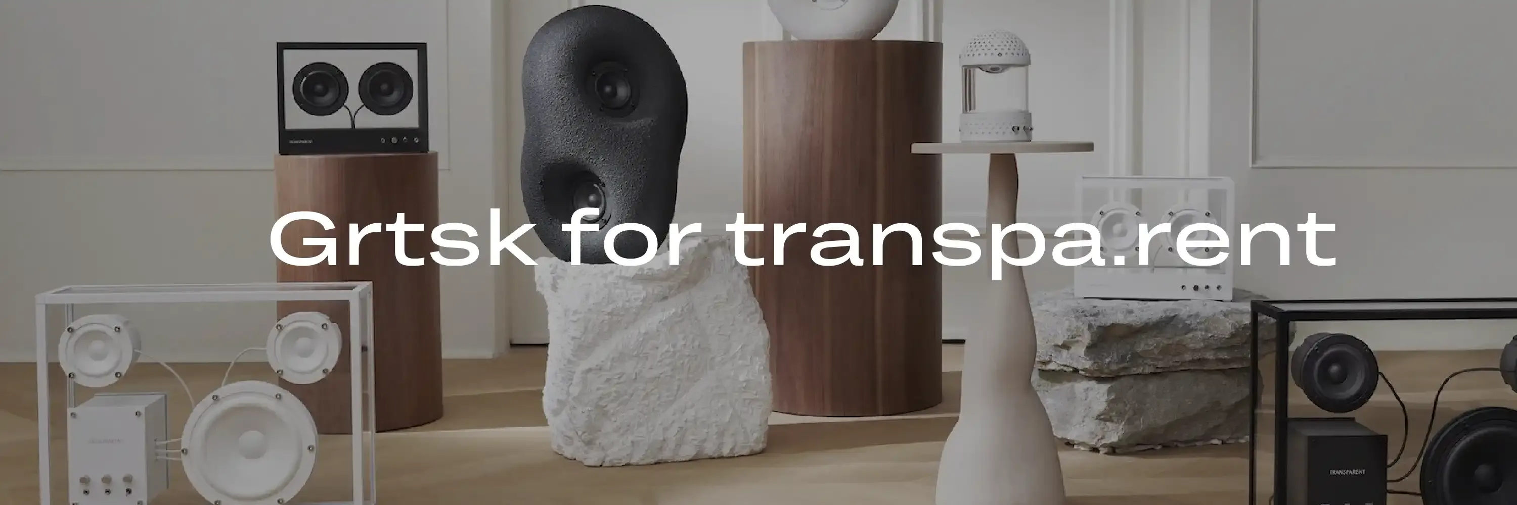
Grtsk for Transparent
Grtsk: Elevating the Transparent Hi-Fi Brand's Digital Presence
Transparent, a leading Hi-Fi brand known for its minimalist and high-quality audio products, has chosen the Grtsk font for their website’s text content. From titling and body copy to small caption text, Grtsk enhances the digital experience with its modern and versatile design.
![]()
Why Grtsk?
-
Modern Simplicity: Grtsk is characterized by its clean and contemporary design. The minimalist aesthetic of the font aligns perfectly with Transparent’s brand ethos, which emphasizes simplicity and elegance in their products and overall brand image.
-
Versatility: One of the standout features of Grtsk is its versatility. The font’s ability to adapt to various text sizes and formats makes it ideal for Transparent’s diverse website content, ensuring consistency and harmony across titles, body copy, and captions.
-
Readability: In the digital realm, readability is crucial. Grtsk excels in providing clear and legible text, whether it’s in large headings or small captions. This ensures that visitors can easily navigate and absorb the information on Transparent’s website, enhancing the user experience.
-
Sophisticated Appeal: Grtsk brings a touch of sophistication to Transparent’s website. Its refined letterforms and balanced proportions add a subtle elegance that complements the brand’s high-end audio products, reinforcing the perception of quality and attention to detail.
![]()
Grtsk in Action
Thanks to Grtsk’s clean and modern lines it can be easily utilized for both titling, body copy and small captions. Transparent has employed Grtsk across all typographic levels on their website, creating a cohesive and engaging digital presence. The font is used effectively for the various hierarchical elements of typography, ensuring a harmonious design and user experience. By leveraging Grtsk’s visual impact, Transparent enhances the readability and attractiveness of their content without distracting from essential information. The consistent use of Grtsk across all text elements helps maintain a stylish and professional brand presentation, reinforcing the high-quality image of Transparent’s products. This strategic application of Grtsk not only improves the aesthetic appeal of the website but also supports Transparent’s communication goals by ensuring their message is conveyed clearly and effectively.
![]()
Conclusion
The choice of the Grtsk typeface for the website of Transparent is a perfect fit, the clean and minimalistic aspects of the Grtsk typeface is highlighting the clean and modern design identity of Transparent’s products. The versatility and readability of Grtsk makes this typeface especially applicable for web design.
We are so happy with their choice and implementation of the Grtsk typeface for these wonderful products.