Ilya FY for Jho
Introduction
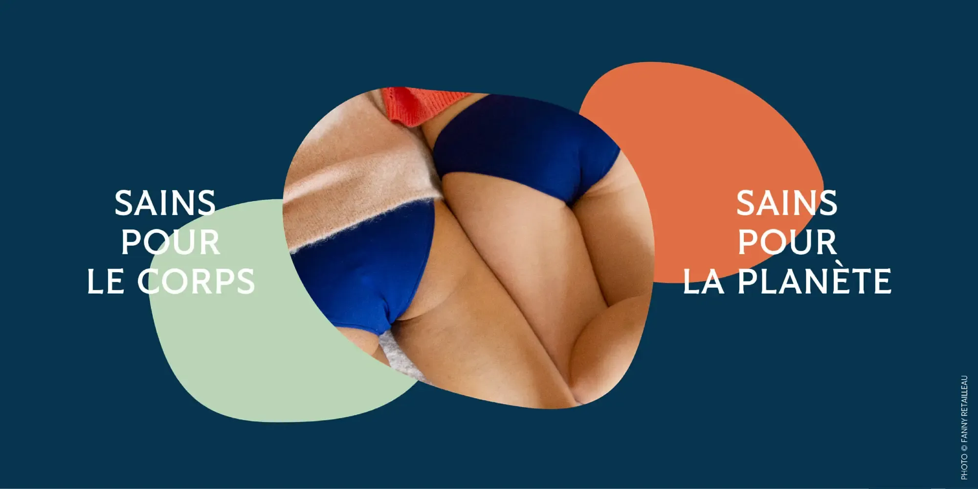
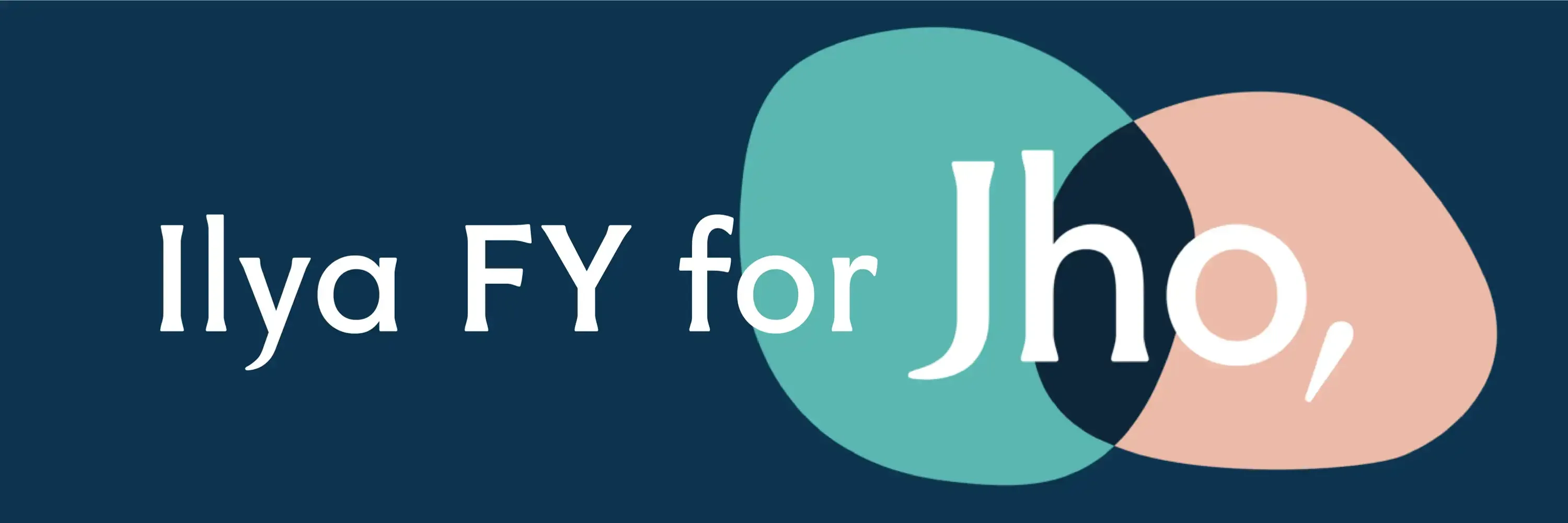
The company Jho’s features the Ilya FY font. It is used for their new logo, and thus plays a prominent role in their brand. Ilya FY was chosen for its ability to embody the brand’s ethos and elevate its visual identity.
Why Ilya FY
-
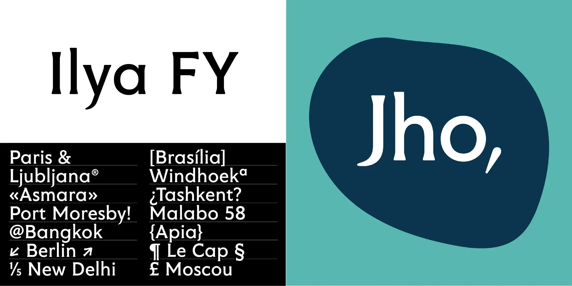
Unique Character: Ilya FY’s soft triangular serifs and rounded shapes create a distinctive and approachable look.
-
Versatility: Its design is both professional and friendly, making it suitable for diverse branding needs.
-
Readability: The font’s tall stature and well-defined characters ensure clarity and legibility.
Ilya FY in Action
-
Logo Design: Jho’s new logo prominently uses Ilya FY, reflecting the brand’s sophisticated yet welcoming image.
-
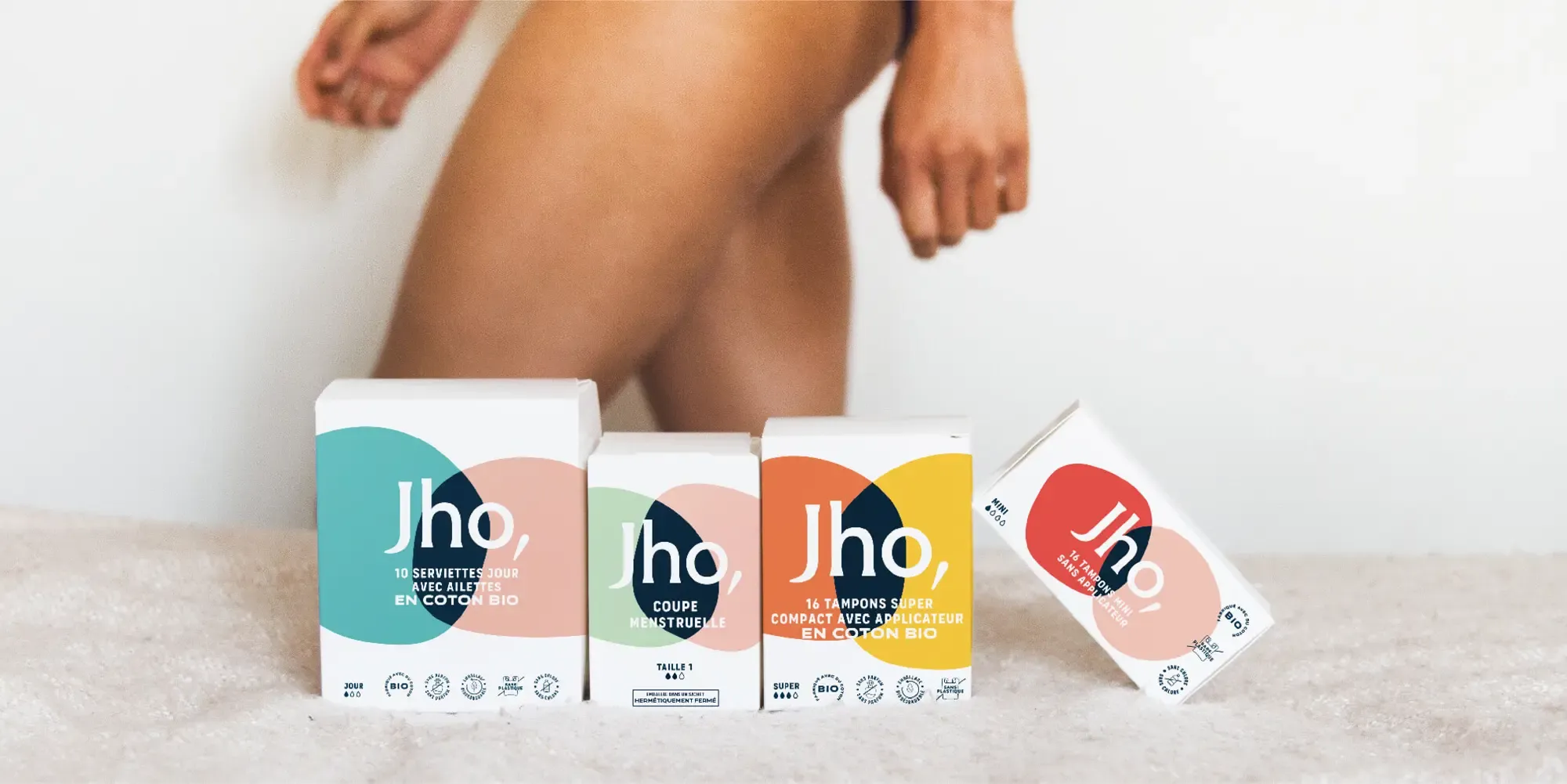
Consistent Branding: The logo featuring the Ilya FY font is featured across Jho’s website, product packaging, and marketing materials, ensuring a cohesive visual identity. It is additionally used for the logo of their podcast ‘les étapes’.
-
Adaptability: Ilya FY performs consistently well in various formats, enhancing Jho’s brand recognition.
Conclusion
Ilya FY’s distinctive characteristics make it an excellent fit for Jho’s rebranding. Its blend of friendliness and elegance complements Jho’s brand identity, ensuring a cohesive and engaging visual presentation across all platforms.