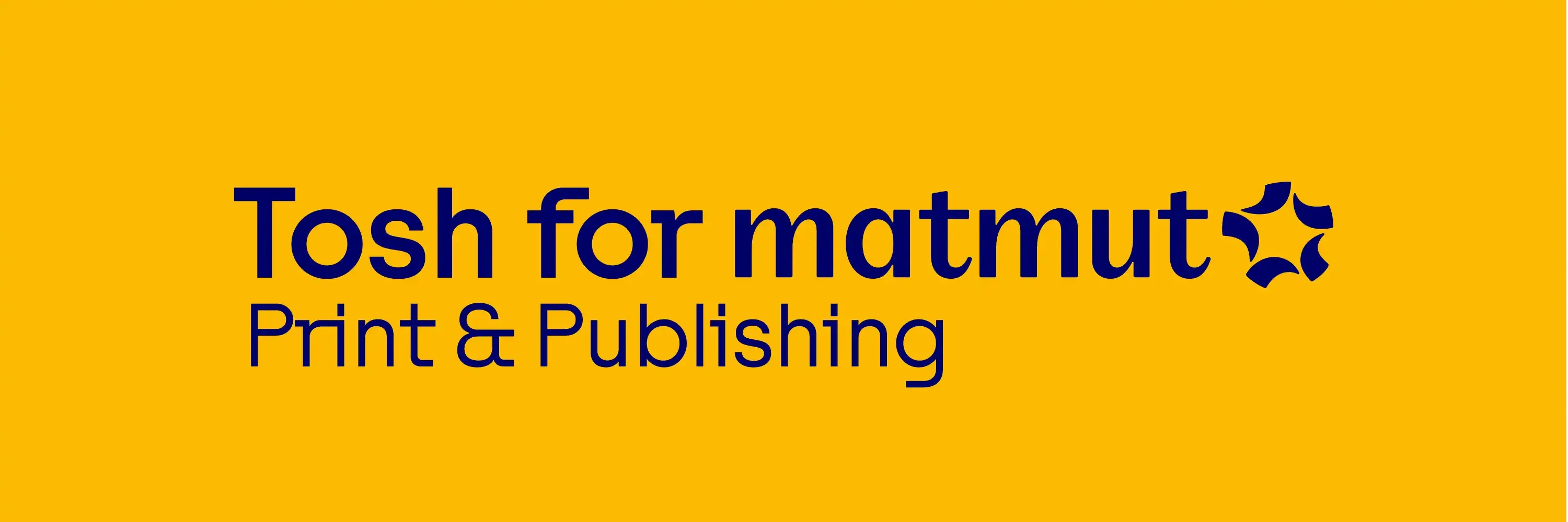
Tosh for Matmut
Tosh A: Elevating Matmut's Rebranding with a Contemporary Twist
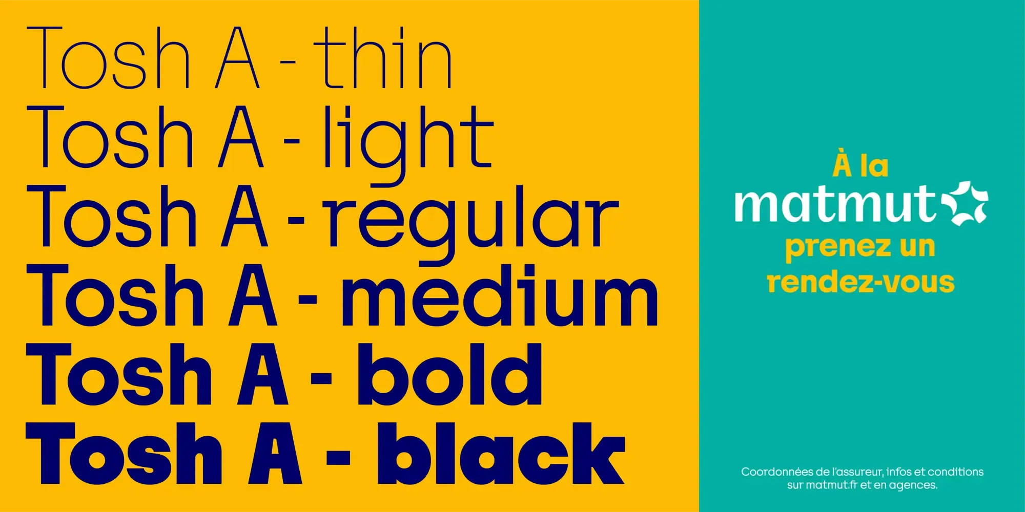
Matmut, a leading insurance company, has chosen the Tosh A version of the Tosh font for their rebranding efforts. This strategic choice was driven by Matmut’s need for a contemporary typeface that genuinely mixes sturdy and lively elements, perfectly aligning with their new market positioning.

Why Tosh A?
-
Contemporary Appeal: Tosh A embodies a modern design that resonates with today’s aesthetic preferences. Its contemporary appeal helps Matmut project a forward-thinking and dynamic image, which is essential in the competitive insurance market.
-
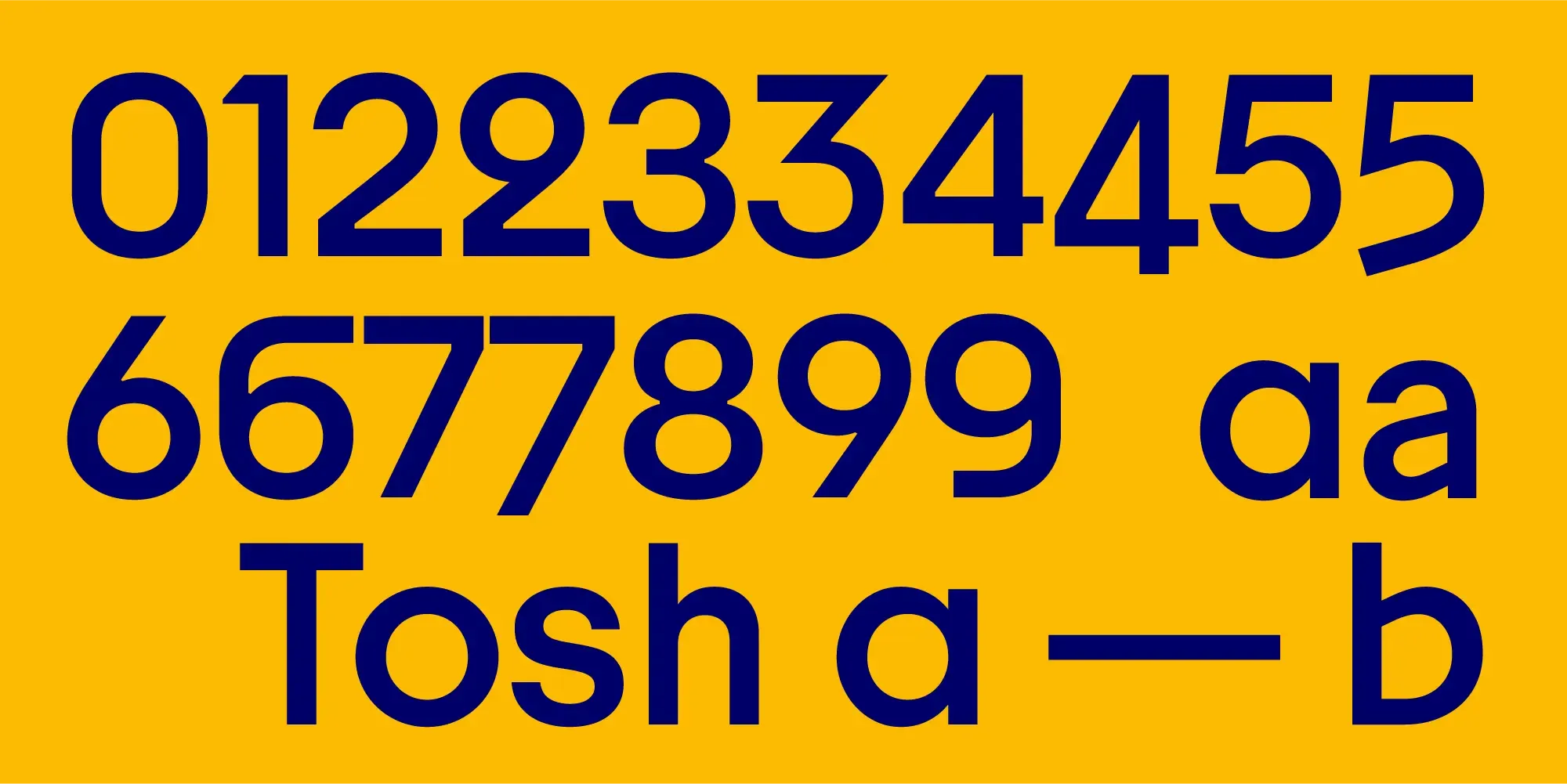
Sturdy and Lively Elements: Tosh A uniquely combines robust and energetic characteristics. This blend ensures that communication texts are not only reliable and professional but also engaging and vibrant. The typeface effectively captures the balance between strength and approachability, which is crucial for an insurance company.
-
Versatility in Communication: Although Tosh A is not used in Matmut’s logo, it plays a pivotal role in their advertising, headlines, and short paragraphs. The font’s versatility allows it to enhance various communication materials, ensuring that the brand’s messages are delivered clearly and effectively.
Tosh A in Action
Matmut has successfully integrated Tosh A into their rebranding strategy, creating a cohesive and appealing visual identity. Here’s how Tosh A contributes to Matmut’s communication efforts:
Advertising: In advertising campaigns, Tosh A stands out with its bold and lively design. It captures attention and communicates messages with clarity and impact, making advertisements memorable and effective.
Headlines: For headlines, Tosh A provides a striking visual presence that draws readers in. Its combination of sturdy and lively elements ensures that headlines are both authoritative and engaging, setting the tone for the content that follows.
Short Paragraphs: In shorter text blocks, Tosh A maintains readability and style. The font’s design allows Matmut to convey detailed information succinctly while keeping the reader’s interest, reinforcing the brand’s professional yet approachable image.
Conclusion
Matmut’s selection of Tosh A demonstrates a keen understanding of typographic principles. The typeface’s contemporary flair, seamlessly blending robust and spirited elements, is no accident. Tosh A was the perfect choice to elevate Matmut’s rebranding, making the brand’s voice feel both modern and approachable, yet reliably strong. This choice allows Matmut to resonate closely with clients of all ages. By leveraging this typeface in their advertising, headlines, and short paragraphs, Matmut not only sharpens their visual identity but also stakes a distinctive claim in the competitive insurance market. This is a stellar example of how a well-chosen typeface can speak volumes, embodying the brand’s essence while engaging and reassuring its audience.
Tosh A gives Matmut a new voice that speaks to clients of all ages, including younger generations. We are very pleased with their choice and implementation of the Tosh typeface.