
Vesterbro for This is Incense
Vesterbro Poster: Elevating the 'This is Incense' Brand Identity
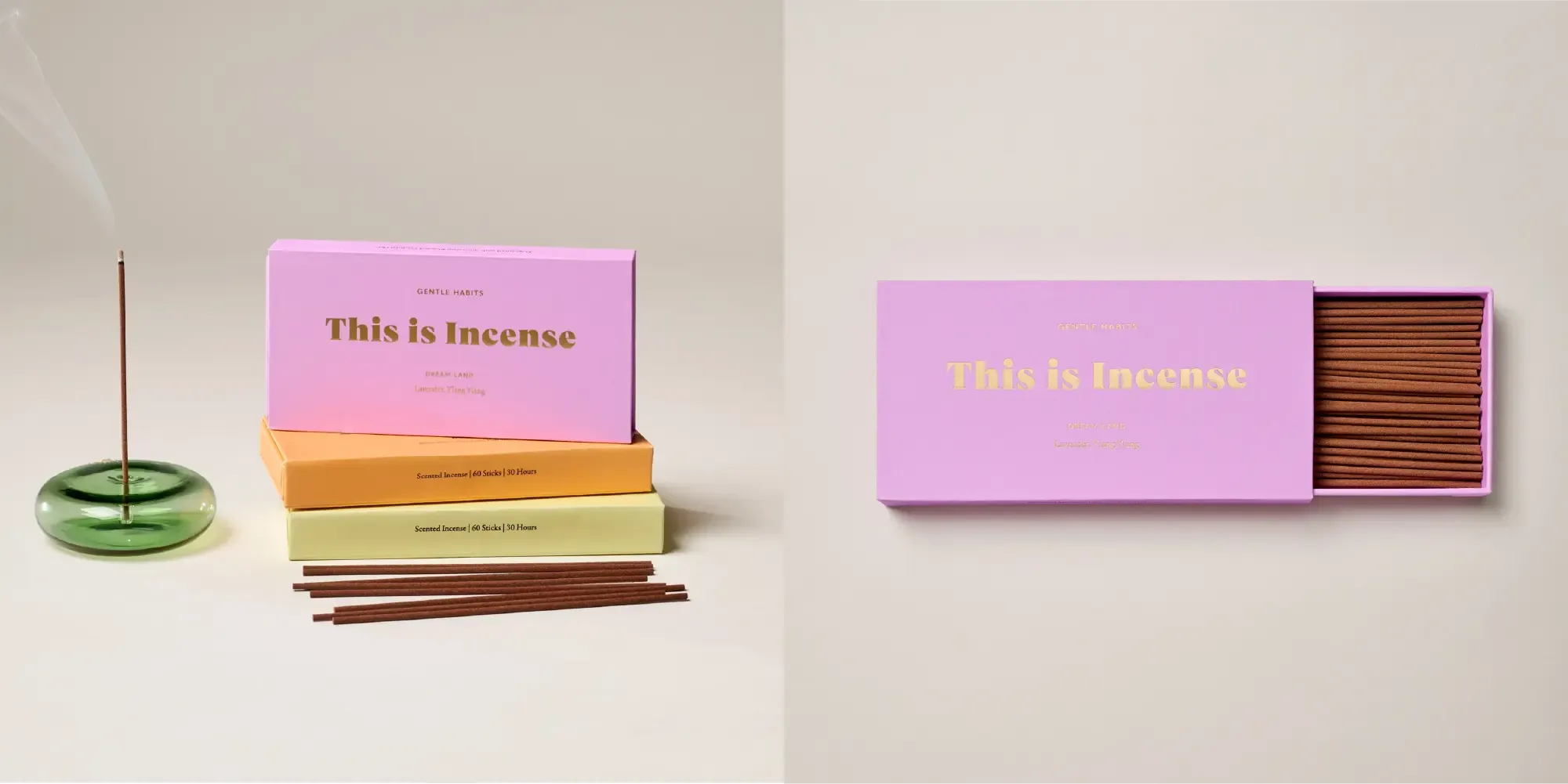
Gentle Habits, the company behind the “This is Incense” brand, has chosen the Vesterbro Poster font for their brand logo. The decision to use Vesterbro Poster was driven by its bold and impactful characteristics, perfectly aligning with the essence of the “This is Incense” brand.
Why Vesterbro Poster?
-
Bold Impact: Vesterbro Poster is designed to make a statement. Its bold and robust letterforms ensure that the “This is Incense” logo captures attention immediately, making a strong impression on customers. This impact is crucial for a brand that seeks to stand out in the market.
-
Elegant Curves: Despite its boldness, Vesterbro Poster features elegant curves and refined details that add a touch of sophistication to the logo. This balance between strength and elegance mirrors the “This is Incense” philosophy of offering high-quality, thoughtfully crafted products.
-
Modern Yet Timeless: The Vesterbro Poster font combines modern design elements with a timeless appeal. This blend ensures that the “This is Incense” logo remains relevant and appealing over time, reflecting the enduring quality of Gentle Habits’ products.
-
Versatility in Branding: While Vesterbro Poster was specifically chosen for its impactful appearance in the logo, its design also offers versatility. The font’s distinctive style ensures that the logo remains recognizable across various branding materials, from product packaging to digital media.
Vesterbro Poster in Action
Gentle Habits has successfully utilized the Vesterbro Poster font to enhance the brand identity of “This is Incense.” Here’s how the font contributes to the brand’s visual appeal:
Brand Logo: The “This is Incense” logo, crafted with Vesterbro Poster, stands out with its bold and memorable design. The font’s impactful nature ensures that the logo is easily recognizable and leaves a lasting impression on consumers.
Product Packaging: The boldness of Vesterbro Poster translates beautifully to product packaging, ensuring that “This is Incense” products catch the eye on retail shelves. The elegant curves and robust letterforms enhance the visual appeal of the packaging, reinforcing the brand’s premium quality.
Conclusion
The Vesterbro Poster font plays a vital role in the design of “This is Incense”. With its bold impact, elegant curves, and timeless appeal, Vesterbro Poster perfectly complements the high-quality, thoughtfully crafted nature of Gentle Habits’ products. The font’s ability to create a strong and memorable visual identity has helped the “This is Incense” brand to stand out in a competitive market.
We are so happy with their choice and implementation of the Vesterbro Poster font.